|
7/11/2021 2 Comments ID 331 through ID 333ID 331: ???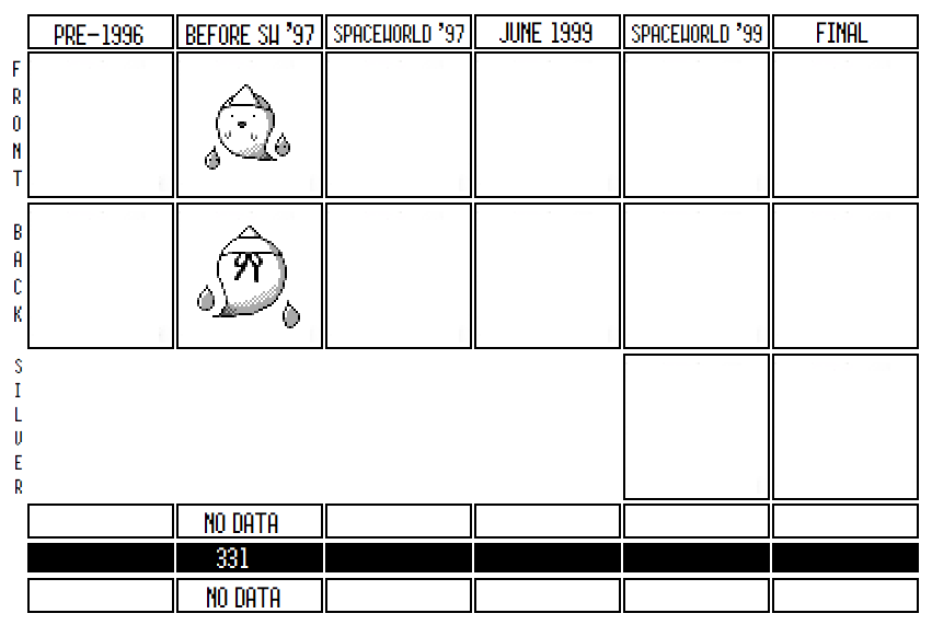 It’s a cute ghost Pokemon! It’s a bit generic, in that it looks basically like a normal white ghost like you’d see on Halloween decorations, but it has some recognizably Japanese features. First, it’s wearing a hitaikakushi, an old Japanese burial bandana that’s been connected to ghosts in Japanese culture. It’s also surrounded by what look like two Hitodama, or incorporeal dead souls that light up like lanterns (essentially a Japanese version of the European Willow-O-The-Wisp).
It’s not entirely clear where the hitakaikushi actually come from, or even what the correct name for them is. The hitaikakushi was probably, at least briefly, used in 17th century Japan as part of the clothes dead bodies were dressed in before they were buried, but no one's sure why a white triangle hat was worth putting on their head. Some people theorize that the triangle on the bandana was supposed to be a sort of “heaven’s crown” that showed the person had ascended to heaven; others just say that it’s pointy so it can be used to fight off bad spirits. Whatever the reason, Japanese culture often spirits of various sorts wearing this bandana. It's so common, most Japanese people probably don’t even really know what it is or why its there, but associate it with ghosts nonetheless.
ID 331 also looks remarkably similar to one of the enemies in the Pocky and Rocky series, as you can see here: 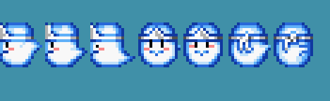 Pocky and Rocky, a very underrated top-down shooter, came out in 1992, so it was much earlier than Pokemon and could conceivably have inspired 331. However, I don’t think that’s likely. More plausible is that the two designers drew from the same sources and so came up with coincidentally similar designs. Pocky and Rocky is almost entirely designed around Japanese mythology, and most of the enemies in the game have something to do with Japanese myth and folktales. Given that 331 was also based on Japanese myth, its easy to see how both games could have settled on the same design. As another coincidental example, see how Animal Crossing's Wisp looks almost identical to 331 as well: 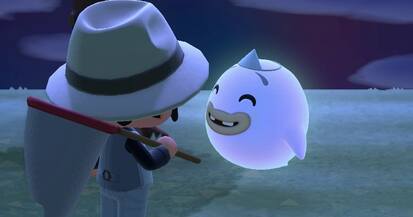 Furthermore, this isn’t even the only time Pocky and Rocky’s sprites match one of these unused Pokemon. Note how Pocky and Rocky 2 had an enemy based off the Yuki Usagi, the same inspiration for ID 306:  Again, it’s probably coincidental. So what’s going on with this ghost, and why is it unused? There’s are two plausible explanations for it. First, it could be a holdover from the design of Red/Green. The sprite is certainly pretty plain and a simple concept, so it could have fit in with some of the very earliest concepting for Pokemon. In fact, at a stretch, you could even imagine that this was the original idea for the generic scary ghost sprite used in the Pokemon Tower:  Sure, they look different, but the basic design of their bodies are identical, and they even has a similar sort of face. I’m not completely sold on this idea, but I do think it’s at least worth thinking about. Maybe ID 331 was made as a nice version of the evil ghost? Overall, I don’t think the “holdover from R/G” theory is very plausible, given that the three Gen I Ghost Pokemon all share a similar palette and aesthetic, and two of them were designed by Tajiri really early on, which makes it unlikely they had earlier designs so drastically different. Instead, given how close 331 is to Norowara (327) and Kyonpan (324) on the Korean Index, I think it’s far more likely that it was created around the same time as they were, as part of a brainstorming session. Given how all three were probably designed by Atsuko Nishida, it was probably the case that she was given the directive to develop more ghost types for Gold and Silver, and she came up with three of them inspired by different mythology: Kyonpan was based on Chinese mythology, Norowara on voodoo, and 331 on Japanese ghosts. Kyonpan and Norowara were chosen as the best two designs, linked together in an evolutionary line, and Nishida refined and reworked their designs, while 331 was abandoned. This also explains why the spritework on 331 seems much simpler than the surrounding Pokemon: because it was abandoned, it likely never got more refinement than a first draft. It's pretty obvious to me that the reason 331 wasn’t chosen comes down to its generic design. Kyonpan isn’t just a zombie: it’s also a panda and also has a jumping theme. Norowara isn’t just a voodoo doll, but also has a plush bear look to him as well as a grin full of personality. 331 is not only straight out of Japanese mythology without a twist, but it’s so by the numbers that it almost perfectly resembles a generic enemy in a completely different video game. While I’m sure that 331 would have been refined and made more interesting had it continued to be worked on (maybe it was, and this is the early-early origin of Misdreavus?), as it is there’s no real surprise why it didn’t make it further. ID 332: Kotora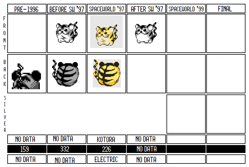 The most infamous missing number of them all! Kotora is extremely beloved in the Lost Pokemon community, and it’s not hard to see why: it’s a great design, and it’s adorable. Kotora could have easily become a recognizable star of the Gen I or II lineup, and it has become something of a mascot for all the missingnos of the early generations. Kotora was clearly popular with the Pokemon designers too, because even though it was rejected in Red/Green, they brought it back for Gold and Silver before eventually letting it go once again. In both cases, it’s likely that it was rejected because of how hard it was for it to find a unique niche in the games. First of all, to state the obvious, Kotora is based on a tiger. However, its body, based on its shape, might also be based on a Dorei bell, or an ancient earthenware bell used at Shinto shrines for ceremonies and prayer. Since the tiger is one of the twelve Chinese Zodiac signs, a good amount of these bells are made to look like tigers, and so the round shape of Kotora could intentionally be mimicking those bells. Or it just could be a cute design; who knows. 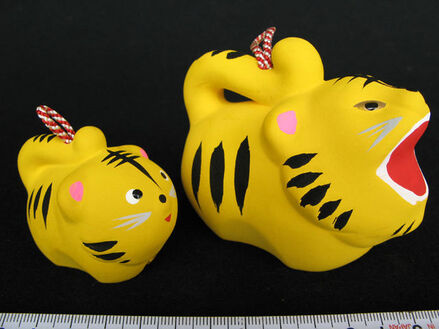 Kotora was first discovered when the Spaceworld ’97 leak happened and it was found in the Pokedex along with forty other unused designs. People immediately fell in love with it. There is a ton of Kotora fanart out there, and Kotora has gained enough notoriety at this point that, out of all missing designs, it's even recognizable outside the Lost Pokemon community.
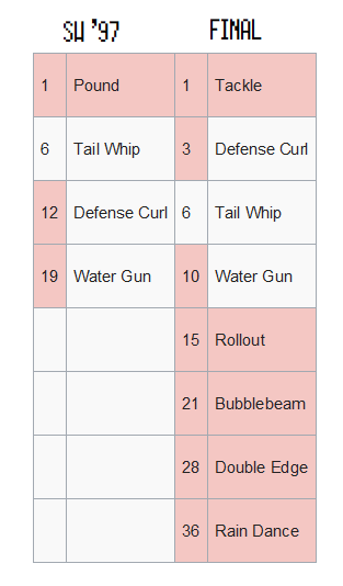
(Top left is Pit Baldriz, Top Right is @kotoraganda, bottom left and the keychains in bottom right are @raciebeep. In addition, @raciebeep makes tons of cool things featuring Kotora and other Missingnos, and you should definitely look her up and support her!) After Spaceworld ’97 was uncovered and Kotora's face was seen for the first time, Helix Chamber followed up with an even more interesting discovery! When they released their find of early Red/Green backsprites, they also discovered a backsprite there that was indisputably Kotora (and its evolutionary relatives). Which means that Kotora actually predated Gold and Silver, and was a reused design from the very beginning of Pokemon. This fits: if you think about it, Kotora is a design much more in-line with the sensibilities of Gen I. It’s clearly an Animal+ design, like Seel, though at least it has its bulbous, spherical body to give it more character than Seel. It also makes sense because a tiger is a pretty obvious animal choice to base a Pokemon design on: sure, Meowth's also a a cat, but Meowth and Persian are very different designs and were taken in more of a house-cat direction than a tiger. Saying that, It was designed pretty late in Red/Green’s development, given its late Index number of 159. Interestingly, the Kotora line formed a three-way Lightning/Ice/Fire trio with the Goldeen and Ponyta lines. This isn’t apparent in the final games, because Goldeen and Ponyta lost their first evolutions by the final and Kotora was deleted completely. 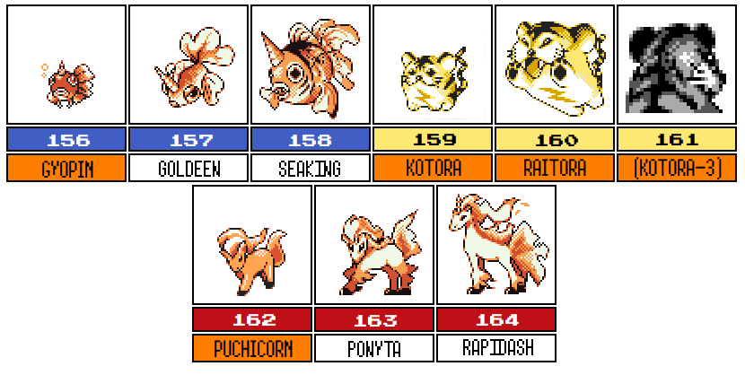 There's two interesting things to note about that. First, note that all three of the first stages here were brought back in Spaceworld '97, though none of them made it to the final. Significantly, Gyopin and Puchicorn were reconceived as baby Pokemon, but Kotora, despite being the same stage as them and a mirror to them, was not treated as a baby Pokemon in Spaceworld '97. Obviously, part of this is because Gyopin and Puchicorn had to be fit into existing lines and Kotora didn't, but it's also a reminder that, as originally conceived, Puchicorn and Gyopin weren't designed as baby versions. Just keep that in mind once we start talking about baby Pokemon on the list. Second, note how as late as Era 5 in Red/Green's development, they had still not conceived of the main Water/Fire/Grass triad that defines the Gen I games. The Charmander and Squirtle lines were not completed until after Kotora/Ponyta/Goldeen, and while the Bulbasaur line had been made right before it, there's no indication that Game Freak had yet considered to make Grass tie in as one of the three types that countered each other. Meanwhile, while the internal index has no examples of Grass/Water/Fire triads, Kotora/Ponyta/Goldeen fit right into a huge amount of Fire/Water (Ice)/Electric elemental triads made up to that point in development, including: Articuno, Zapdos, Moltres; Flareon, Jolteon, Vaporeon; Magmar; Buu/Junx; Electabuzz, etc (the fact that some of these are Ice and not water is a probably a hint that Ice and Water weren’t distinct types until later into development). 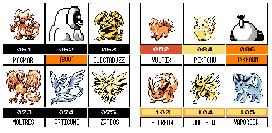 Note that the probably-Poltoed follows directly from the Pikachu/Raichu line, was probably water type, and fits the Fire/Electric/Water ordering that the Eevee line had. The unused fighting fish Pokemon line is directly before Vulpix and could potentially be the water part of the triad as well, though it would have been out of order type-wise (though it matches the order of Goldeen/Kotora/Ponyta). In the final games, Fire/Water/Grass form a rock/paper/scissors countering system while Electric barely interacts with them. It probably wasn’t always the case. For whatever reason, it seems that late into Red/Green’s development, Game Freak decided to mix up the main elemental trio and decided that there should be a grass starter, not an electric one. That also explains why the Bellsprout and Oddish lines were the very last Pokemon developed for Red/Green: once they decided that Grass would be the third in the elemental triad, all of a sudden grass became much more important to the game’s balance, and they developed a few more so that the new elemental trio would be more obvious in gameplay, and to give Squirtle and Charmander adopters a Grass Pokemon if they needed one. Which brings us back to Kotora. We don’t know why Kotora didn’t make it to the final Red/Green, but I have three ideas of what might have happened. My first theory has to do with this elemental triad switch. When Game Freak switched the elemental triad to Water/Fire/Grass, it not only made Grass Pokemon more important to the game’s overall balance, but it also made electric Pokemon less important. Note that in the final culling of the internal index, Pikachu lost a third evolution and Kotora was completely deleted; four electric Pokemon didn’t make it, including an entire line. Meanwhile, only Cactus was deleted as far as Grass types go, Fire type only lost Ponyta’s pre-evolution, and while water lost more--Wartortle’s original evolution, Goldeen’s first evolution, the two deleted squid Pokemon, Politoed, the fighting fish—it was already a type that dominated the internal list. It seems plausible to me that Kotora was deleted because there was less need for lots of electric Pokemon in the final because they no longer fit into the central elemental mechanic in the games. On the other hand, Kotora could have been deleted simply because it was just less far along, concept-wise, than Pikachu or other comparable electric Pokemon. Kotora doesn’t have a moveset in the Red/Green data we have, which implies that they weren’t sure where it would fit in the game, or that they hadn’t yet had time to work on it. Pikachu already had a movelist in that same data, however, and if Game Freak was that far along before they started looking for Pokemon to delete, it makes sense to delete the ones that are less integrated into the game. Thirdly, I also wonder about Kotora's potential to fill a unique role, given the existence of Pikachu. All of the moves Pikachu knows Kotora could conceivably also have had, and when push came to shove, Pikachu was probably the more popular Pokemon internally. As cute as Kotora was, it couldn’t compete with what would become the mascot for the entire series. Kotora was brought back for Gold and Silver and even made it into the Spaceworld ’97 demo, which is more than we can say for ID 309, another holdover from Red/Green (though of course Politoed, another holdover, made it in as well, heavily modified). But even when it was brought back, they still may have faced the same problem of trying to make it fit a unique niche. Compare the SW ’97 movesets of both Pikachu and Kotora: 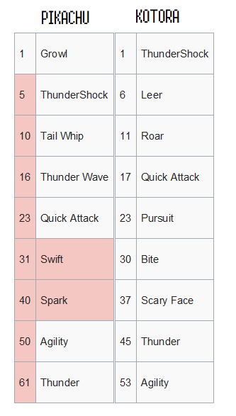 Out of nine moves, Pikachu and Kotora shared four, or nearly half: Thundershock, Quick Attack, Agility, and Thunder. All of these moves are learned at a comparable level to each other. Of the other moves they don’t share, five of them fit similar roles: Pikachu has Growl and Tail Whip, while Kotora has Leer, and Pikachu has Spark (65 power, paralyzes) while Kotora has Bite (60 power, flinches). The main flavor difference between the two was that Kotora had access to Dark moves (Bite, Pursuit) while Pikachu didn’t, and Kotora has a “manipulate switching” theme going on (Pursuit, Scary Face, and Roar). Maybe these are enough differences to justify both of their existence? I feel if I were Game Freak and I needed to cut two Pokemon, Kotora and Raitora just don’t justify their worth given their movesets. There is one more sprite of Kotora found on the scratchpads, which has an updated and refined face and no thunderbolt on its belly. This at least hints that Kotora was worked on a little more after May 1998, but it’s gone by at least April 3, 1999. The lack of a thunderbolt is intriguing, but inconclusive: were they thinking about changing Kotora’s type, maybe to Normal, to give it a more definable niche? Or was this just an unfinished sketch without the thunderbolt? My bet’s on the latter, but it could really be either. We do have evidence that Kotora and Raitora were replaced by Teddiursa and Ursaring, obviously inferior Pokemon with worse designs (at least, in my opinion). Teddiursa, at least, was not built off of Kotora, but was made out of a rejected design for the original fire starter, Honoguma (that’s a story for a different entry). This is speculation, but it looks like Teddiursa was added while the team was testing out new ways of catching Pokemon, and there’s evidence in the game’s files that they had originally envisioned using the Honey mechanic, later used for Gen IV, in Generation II. My suspicion is that they added Teddiursa to the games out of an interest in experimenting with Honey and deleted Kotora and Raitora at this point to make room. By the time they realized they weren’t using honey, they didn’t have time to go back to Kotora, and everyone’s little tiger friend was lost to history. I think it’s most likely that Kotora was forgotten, but there are two theories that it was reworked and put into later generations. Some people argue that Spheal, with it’s bulbous body and surprisingly similar mouth, was a redesign of Kotora made into a seal Pokemon. Other people note that Shinx, from Gen IV, has the same typing as Kotora did and a similar flavor (an electric cat). The two look completely different, but it’s worth noting that Shinx has a similar moveset to Kotora’s—it shares Leer, Bite, Roar and Scary Face. Given that Gen IV has a lot of designs that may have been heavily reworked versions of the rejected Gen II designs (such as Tangrowth and Lickylicky) it is quite the possibility. My bet is that neither of these were directly Kotora redesigns and that the moveset similarity is a coincidence, but I think either Spheal or Shinx are plausible descendants. 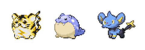 ID 333: Raitora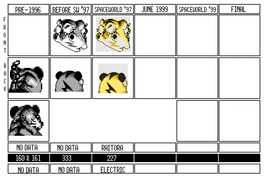 Though less well known than it’s more rotund child, Raitora is still nonetheless beloved. A grown up version of the little electric tiger, Raitora’s sprite is a bit more distinctive because its in an action pose and seems to be loving every second of it. First, a quick quibble about Raitora’s sprite. For some reason, other interpretations of Raitora, such as those done by Helix Chamber, see Raitora as less circular than Kotora and with a body that better matches that of an actual tiger. In fanmade poses, he’s often drawn with a drawn out midsection and a distinct head. I don’t see that at all here. To me, Raitora’s sprite shows it to be clearly as bulbous as Kotora, just larger and in the midst of a jump. I guess it's a matter of how you’re looking at it, but I feel like I’m seeing a different sprite than other people.  Moving on from its look, Raitora is mostly interesting because of how it was seemingly two Pokemon when it was first designed, in Red/Green. There, as mentioned, the Kotora line was a three stage evolutionary line, while in Gold and Silver, Kotora and Raitora appeared alone. So what happened? And is Raitora based on the second stage, the third stage, or a mix of the two? First of all, it’s easy to imagine what happened to Raitora. Three stage lines were relatively common during the development of Red/Green, but as Atsuko Nishida has commented, they were easy to cull as the team cut the 190 Pokemon slots down to a more manageable 150 (/151). You see this all over the Red/Green beta sprites: Zubat, Psyduck, Ponyta, Pikachu, Goldeen, and Cubone at least were all part of three-stage lines before they were cut to two. Part of me wonders if one of Raitora’s evolutions was cut earlier than the rest of the line in Red/Green, and that when they were ported over to Gold/Silver they just took the two stages that had survived the longest. It’s impossible to know. But which evolutionary stage was Raitora, exactly? The backsprite from the first evolution seems to fit perfectly with Kotora, but is Raitora the middle stage or the final evolution? Both backsprites don’t match Raitora’s Gold/Silver back sprite all that much, though the middle stage is a bit closer. At the same time, the final stage's backsprite has a black patch running down the middle of its head just like the Gold/Silver backsprite, and it’s face--as much as you can see from the back--looks pretty close to Raitora’s. Raitora could be a mix of the two, but that seems unlikely to me: why redesign a completely new Pokemon when you have two other designs to choose from and rework? If I had to guess, Raitora was probably the reused second stage, and the third stage was abandoned earlier, in the same way Gorochu was abandoned but Pikachu and Raichu were kept. However, I don’t have much to back up any of that. While we're on the subject of Raitora, there's one other thing that intrigues me. We have no move data from this line's Red/Green incarnations, as stated. We have backsprites, so we can't see the lightning bolts on their chests. In other words, the only indication we have that Raitora and friends were electric type in Red/Green is the evidence of the Ponyta/Goldeen triad, as stated before, their angular tails that could be lightning bolts, and the versions of Kotora and Raitora in Gold/Silver. In other words, we didn't have a lot. I'm not sure, had we not seen Kotora and Raitora in Gold/Silver, if anyone would have guessed they were Electric type on the other information, and that seems amazing to me. If something so core to Raitora could barely be figured out from the backsprites, then what else are we missing about the other rejected designs? Like Kotora, Raitora is a super cute Pokemon with a great design (even if it does lean towards a simplistic Animal+ design). It’s a shame Raitora was scrapped: Kotora and Raitora would certainly have been as popular as Pikachu and Raichu. Alas. I’m sure there’s a parallel world close to ours in which Kotora is the mascot for the series and Pikachu didn’t make it to the final.
2 Comments
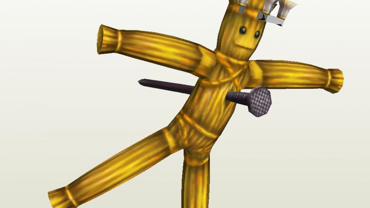
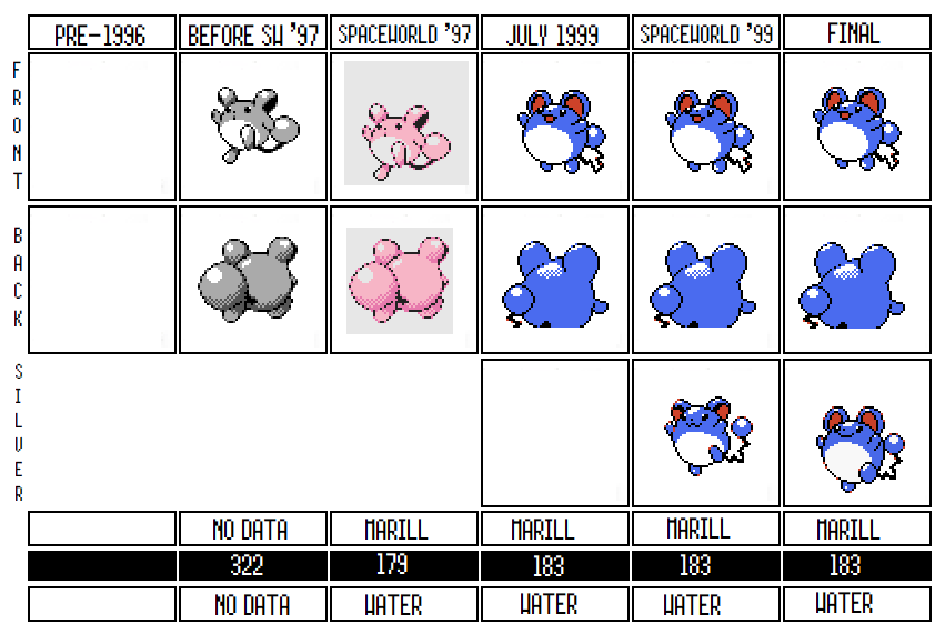
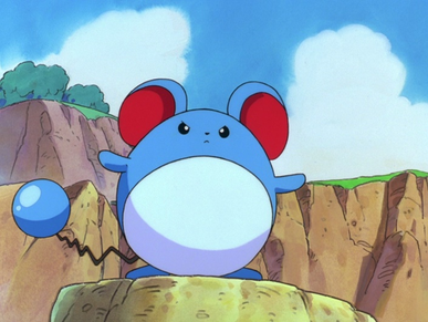
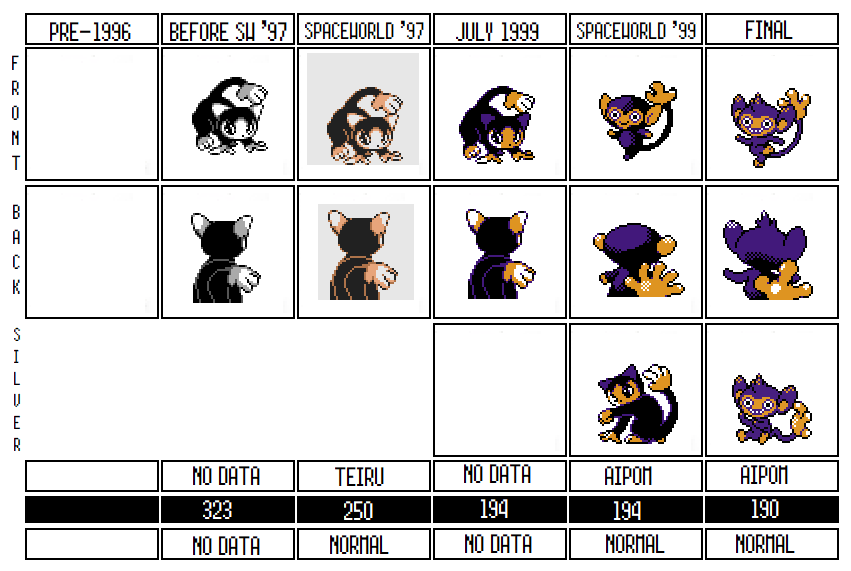
ID 326: Politoed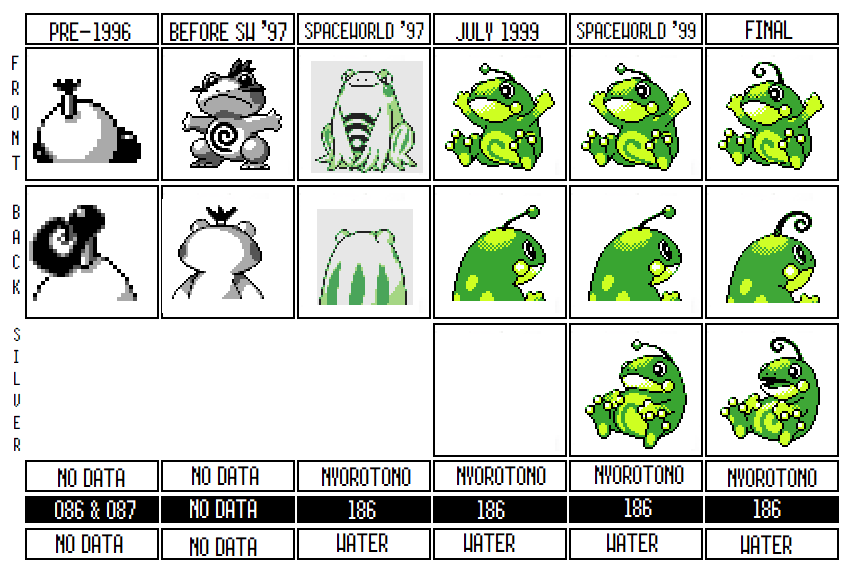 There are a ton of reasons to delve into the development history of Politoed. Not only is Politoed probably the earliest alternate evolution found in Gold/Silver—a category of Pokemon like Crobat and Slowking that very much define Gold/Silver’s lineup—but it's also a very early creation that went through at least two complete reworks. Not only that, but Politoed also solves a development mystery that has hung over our heads since the leaked files of Pokemon Red/Green were examined in 2019. So first, lets start with the mystery. In February 2019, when Helix Chamber released a leak of data from the Pokemon Blue source code, the most exciting discovery they had found were the backsprites for almost forty unused Pokemon designs. The Pokemon community was fascinated to get a glimpse the development of the lineup. The problem was, because Pokemon Blue overwrote all of the original Red/Green frontsprites with new ones, the source code Helix Chamber found only had back sprites. Some of these could be linked to Pokemon in the Spaceworld ’97 demo by comparing the Red/Green sprites to what we found there (and a few had enough evolution data for them to connect the dots). For instance, take Mikon and Kotora: 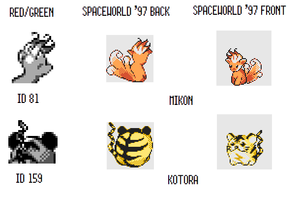 On the other hand, some backsprites were…less than obvious. Take these two (Internal Index #86 & #87): There’s maybe a topknot? Some sort of bulbs on its head (or are they boxing gloves)? Maybe they’re Japanese samurai, or sumo wrestlers? Helix Chamber guessed Sumo-wrestling frogs. Regardless, these were a mystery with no answer in the history of Gen I, and since we were unlikely to ever get front-sprites, there wasn’t much more to investigate. However, the 2020 source code leak gave us the scratchpads for Gold and Silver, which happened to have a very early design of Politoed. Now, from the front sprites, this doesn’t look all that significant. It’s a frog, probably trying to hug you: 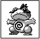 But then you take a look at the back sprite of this early design, and all of a sudden it comes into focus: The mystery Pokemon were Politoed! It’s a new drawing, obviously, but it’s unmistakable. The topknot is the same, and the weird blobs on the side of the face in the original backsprite can now be clearly seen as frog cheeks. Even the shading on the back of the head is near identical. ID 87 looks a little different, so it was probably an evolution; maybe the two of them got merged together in the earliest Gold/Silver designs for Politoed (this probably also happened to Kotora's two original evolutions). This tells us a ton of things! First, we now know that the unknown designs in slots 086 and 087 of the Gen I internal index were originally, like Helix Chamber thought, frog Pokemon! This raises even more questions. Were these frogs independent from the Poliwag line, or just an alternate design for the same line? Were they ever concurrent, or were these leftovers from a time before the Poliwag line? Was Politoed originally blue like they were? My instinct says they were designed as a completely separate line of Pokemon, for a number of reasons. First, ID 086 and ID 087 are part of Era Three, the era in which evolution was first created and experimented with, and they’re smooshed between a whole bunch of other evolutionary lines. None of those surrounding Pokemon evolve from Pokemon created in Eras I or II, but Poliwag was created during this period. This probably means that they were created in isolation as a distinct family. We do start seeing Pokemon created to be evolutions of earlier Pokemon in Period B of Era III, but not in the sequence we find #86 and #87 in. Furthermore, Poliwhirl appears at the end of Era III, right next to Poliwrath and preceded by Machop, Zubat, Ekans, and Paras, all Pokemon which were created to as evolutionary relatives to Era II Pokemon, just like Poliwag. It’s far more likely that these frogs were created together while Poliwhirl/Poliwrath were created as relatives to Poliwag later when they were designing Pokemon to throwback to that group. This all makes me wonder if the swirl on this early Politoed’s belly was always there, or if it was only added when Politoed was reworked into an alternate evolution for Poliwhirl. The swirl would be too similar to the other line otherwise, and in Poliwag it's supposed to depict the intestines that you can see through the skin of certain tadpoles; this wouldn’t make sense as a feature of a full grown frog unless it was already based on Poliwag. So maybe the original design didn’t have the swirl, or maybe these frogs were originally different takes on the Poliwag line.  Whatever the case, ID 086 and 087 were dropped from the final version of Pokemon Red and Green, probably relatively early since there wasn’t any move data for them in the Blue source code. That makes sense: there’s no real reason for Red/Green to have two distinct frog evolutionary lines and so one of those ideas was dropped. But interestingly enough, this early Politoed design was brought back for the early development of Pokemon 2, and though this design didn’t stay for very long, it shows how at that early stage older Red/Green rejected designs were being reconsidered and reworked. This also answers, for me at least, why Politoed always looked so different from the rest of the Poliwag line. Poliwag, Poliwhirl, and Poliwrath are all very consistent (maybe too much in the case of Poliwhirl and Poliwrath, which often look almost identical). But Politoed has a completely different palette and its far more obviously based on a frog. That always seemed weird to me. But if Politoed was originally, designed as a completely different species, then even though it went through two design overhauls, that DNA is still to some degree present in the final design, explaining its departure from the Poliwag look. 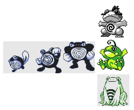 What’s especially interesting about this is that it gives us good evidence to think that Politoed was not originally designed as a branching evolution for Poliwhirl. Instead, it seems like at this early stage of development they were brainstorming which Pokemon to include in the new roster and someone brought back the old rejected frog design as a possibility. It was still too close to Poliwhirl to be its own distinct Pokemon line, but then one of the designer may have had an idea: why not have it be an alternate choice of evolution, like Eevee? They invented the Heart Stone (which doesn’t work in Spaceworld ’97 but was clearly supposed to be the evolutionary method to turn Poliwhirl into Politoed), liked the idea of branching evolutions, and then decided to start designing more. It’s not a coincidence that Slowking is only nine entries later than Politoed, and that Crobat is only two after it. Politoed very likely sparked the idea of branching evolutions, and other designers took the idea and experimented. Which drives home another point. I’ve said all along that the Korean Index is probably (loosely) chronological, and can give us insight into the design decisions and the evolution of the Gold/Silver development along the way. Politoed is the best evidence yet that the Korean Index is in fact chronological. First of all, Politoed, along with Ampharos and Kyonpan—both Pokemon found similarly at the early beginnings of the index—all happen to have pre-Spaceworld ’97 designs. This could be coincidence, but all of these Pokemon, all early in the list, all having pre-Spaceworld ’97 designs heavily implies that this part of the index was early in the development of the games. Second, the fact that we can pinpoint how Politoed was a rejected design from Red/Green (not to mention 309 and Kotora/Raitora also being Red/Green designs) helps demonstrate how early this part of the list is. But maybe most importantly, note how Politoed, the first branching evolution on the list, just happens to be an old design repurposed to be a branching evolution, while Slowking and Crobat were likely designed specifically for that purpose. The fact that Politoed comes right before them and also provides us an explanation for how the branching evolution idea happened in the first place is strong evidence that these Pokemon were designed in this order. Saying all of that, let’s talk about Politoed’s visual design. Atsuko Nishida very likely designed it. Not only does it show off her style, but 086 and 087 were created after Nishida was hired and are found between a ton of other Nishida designs in the Red/Green index. If 086 and 087 were Nishida designs then, it stands to reason that she was the one who revived it and redesigned it (at least the first time). From interviews, its also likely she had a hand in Poliwrath, so she was probably the biggest hand in adding a new evolution to the Poliwhirl line. The early design on the scratchpads doesn’t appear in the Korean Index, which makes sense: the Korean Index usually shares designs with Spaceworld ’97 and was likely abandoned as a sprite index only a few months after the Spaceworld ’97 build. We don’t know the palette that the earliest design had, but the SW ’97 design has a green color like the final design, and I don't see any reason to doubt that coloring. By Spaceworld ’97, Game Freak had completely redesigned it from the old "Sumo Frog" design into a cocky looking four legged frog. Its stomach still has the swirl design, but other than that its completely different. For whatever reason, by June 1999, the developers had redesigned it again to make it look even more like a frog. My guess is that they were moving towards “cuter” designs, and they hoped that the new Politoed would look friendlier in its new design. It’s antenna changed for the final and it’s Silver sprite got reworked, but by June 1999, Politoed’s design had been finally decided on. Almost. If you notice, Politoed's final back sprite has three dots on its back. These dots were actually removed for international audiences and Pokemon Crystal, showing that the design team wasn't quite happy with Politoed's design even as the game was being shipped. It's cool to compare these dots with the Spaceworld '97 sprites: the SW '97 frog had three stripes down its back, in the same place as these dots in the final. Despite the two designs looking completely different, the three dots were actually adaptations of the stripes on the SW'97 sprite! It doesn't mean much, but it's nice to notice that sort of minor continuity. Personally, I don’t really like any of the designs for Politoed, but I absolutely hate the final design and I can’t fathom why anyone thought it was a good idea. At least the Spaceworld ’97 version looks a little like Poliwhirl: if its palette had been shifted to the same blue, it probably would have made a great evolutionary relative. But the Poliwhirl family never looked particularly like frogs, and so the transition to such a literal interpretation of a frog is jarring and has always annoyed me. I get the need to make more varied, more cute designs as the final went ahead, but I think in this case they made a mistake and should have stuck with the original. In the end, Politoed’s more interesting for what it can tell us about the development of the game than it actually is as a Pokemon. It had no movepool in SW ’97 except for level one moves, which was typical of how Gen I Pokemon which evolved via stones: all of them could no longer learn new moves once they evolved. By the final, it’s learned a couple of new moves, like Perish Song, to make it more distinct from Poliwrath. As well, by April 1999 it had swapped the (now obsolete) heart stone evolutionary method for a new type of evolutionary method. By 1999, if Poliwhirl was traded to another player while holding the King’s Rock it would become Politoed. This method, absent in Gen I, was used a lot for new evolutions in Gold and Silver: Politoed ended up having the method in common with Slowking, Steelix, and Porygon 2. Overall, it’s fascinating to learn how the Pokemon team reused and reworked older designs, and it's great to have that old Red/Green mystery solved. It turns out that Politoed, of all Pokemon, surprisingly had much to teach us. ID 327: Norowara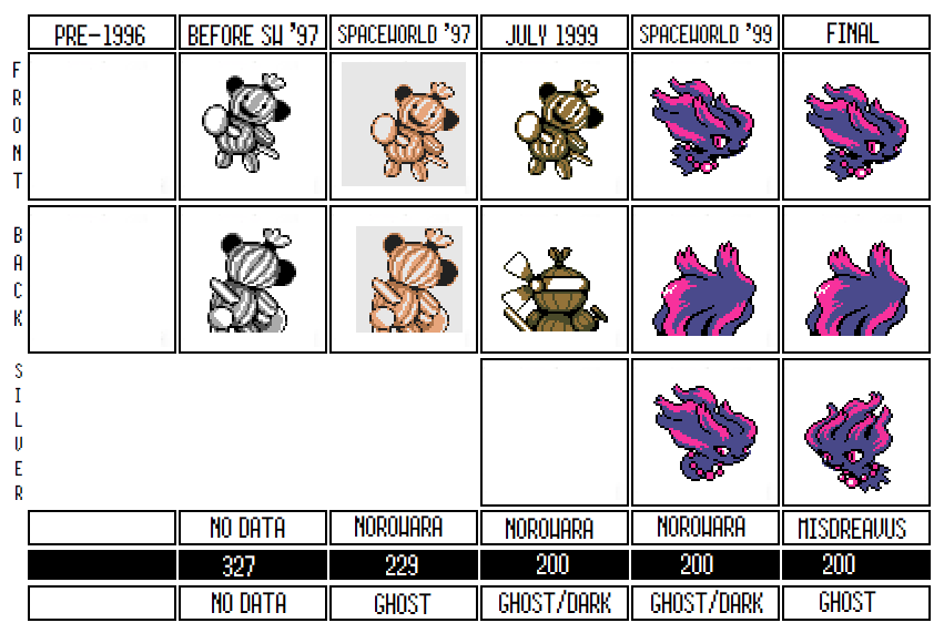 I’ve talked about Norowara a bit in the Kyonpan article, but there’s still a lot more to discuss here. Most importantly, Norowara existed a bit longer than Kyonpan and it looks as though they were playing with making it into a single stage Pokemon, which is much more love and care than Kyonpan got. In the end, Norowara didn’t make it into the final game, but it got closer than many other rejected Pokemon. Norowara’s name is either just a play on the verb “to be cursed” (norowareru) or it’s a portmanteau of that verb and the word “straw doll” (wara ningyo). Norowara, unsurprisingly from the name, is based on a voodoo doll; for anyone not completely familiar with the trope, a voodoo doll, when given a piece of hair or somesuch material from a person, can be used to curse that person. Any damage or manipulation of the doll will be duplicated on the cursed person. Thus, if the doll was burned, the person feels hot. If a nail is plunged through the doll’s heart, the person would experience a heart attack.
This happens to be the exact flavor behind Norowara and its signature attack, “Nail” or “Nail Down.” “Nail” was an early version of the final move “Curse”; like Curse, when Norowara used the move it would damage itself to make the opposing Pokemon take heavy damage over the next few turns. In many ways it was, and is, the perfect move for a Voodoo Doll Pokemon. It had a few tweaks by the time the final came out: namely, Curse had a different effect if a non-ghost Pokemon used it, and its type was changed to ??? instead of Ghost. But even in the final, the animation of Curse still shows a nail being driven through the user, and it still damages them as though they were hurting themselves to hurt the opposing Pokemon. It’s strange and kind of cool to realize that this move’s animation was actually designed around a Pokemon we never got! 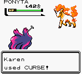 Of course, in SW ’97, Norowara only learned Nail Down at level 100, which ensured that it would almost never see this move in normal play. And, of course, it was set to evolve at level one, so if you wanted to get Nail Down—hardly Hyper Beam or some other overpowered move you would work for—you’d have to prevent it evolving into Kyonpan every single level. Again, part of me wonders if this level up requirement was an error or set as a debug tool, but the way Norowara learns similar but different moves to Kyonpan makes it seem as if the gimmick was to evolve it only when it had learned the moves you wanted. I’ve heard one person speculate that even this strange evolutionary method was part of its flavor: the act of mashing the B button to prevent it from evolving was akin to pushing the Nail back in to Norowara. I can’t say whether this was intended, but it’s a pretty gruesome image. Norowara’s design is drastically different from just about every other Pokemon from the time, which means it isn’t much of a surprise that it didn’t make it to the final. While Pokemon based upon artificial objects have become more common in later generations, in Gen I and II there weren’t really any candidates in this category except Electrode and Voltorb, making Norowara already an outlier. It also has a tool (the Nail), which is uncommon as well: only Farfetch’d, Cubone, and a few others were seen with tools. Tajiri was very particular that Pokemon had to make sense as part of the ecosystem of the Pokemon world and Norowara might have been dropped for that very reason: it’s hard to see how Norowara would even work as a natural creature in any sense. The closest we have to Norowara is Banette, which could have been inspired by it. Even if you think it those are weak reasons to drop Norowara, there’s the fact that Norowara’s entire theme is based on hurting itself. Banette is dark but even then, it isn’t self-harming and smiling the entire time! My theory is that the hurting-itself theme was a bit too adult for Gold and Silver, and that they decided to find something else a little lighter to replace Norowara with. 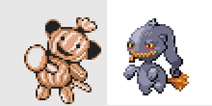 Maybe one reason to think that Norowara was too dark is the peculiar backsprite it uses in June 1999. Note that this backsprite depicts an entirely different design: its got a Nail in its hand, no ears, a bandanna, and looks a little like it's ready to fight. Could they have been retooling Norowara as a warrior to distance it a bit from the mutilation theme? Maybe. On the other hand, this backsprite could have been used in error in June 1999 and could, in fact, date from even earlier than the Spaceworld ’97 design. Kyonpan also had an earlier backsprite available, so this Norowara one could date from the same time and Kyonpan's. While I am pretty certain that one was an early, pre-Spaceworld ’97 design, Norowara’s is trickier: it’s not as sketchy, it’s colored like the later ’99 sprites and not like the ’97 sprites, and its design seems to be moving away from the voodoo design, which implies it’s a revision. But it could really be either. It’s interesting to see regardless. Norowara got further along than most of the rejected Spaceworld ’97 designs. Like I said, it still existed by June 1999--even after Kyonpan was long gone--and they even worked on it enough to revise its typing: by June 1999 Norowara was Ghost/Dark. Ghost/Dark certainly matches its theme more, but it’s a typing with no weaknesses and has thus been avoided almost entirely by Game Freak, likely because it’s a very powerful combination. Given that Misdreavus, which directly replaced Norowara, was changed back to Ghost, I doubt Norowara would have kept that typing. Interestingly, while most rejected Spaceworld ’97 Pokemon only had placeholder stats, Norowara actually existed long enough to have stats! It was designed with high attack and special attack, low defense, and very low speed, which probably would have made it hard to use at all without getting knocked out. By June 1999, its moveset had also been revised, but it was clearly unfinished: its previous moveset was just replaced with one level 1 move: Curse. It seems likely they had deleted its old moveset because it was so closely tied to Kyonpan, and never quite found the time to come up with a new moveset before they deleted our straw friend. …Or sort of deleted. The evolution of Norowara’s design to Misdreavus’s really straddles the line between a radical rework and a completely new design, and even though they certainly aren't the same Pokemon, Misdreavus still feels to me like it carries some of Norowara's DNA. Norowara and Misdreavus look completely different and have different movesets, but at least early on Misdreavus still had Norowara’s Ghost/Dark typing. Not only was Misdreavus still using Norowara's name by SW'99, but its original Silver Pokedex even used the name Norowara to refer to Misdreavus: Misdreavus (Prototype): “Whenever you feel like someone is tugging the hair on the back of your head, it means a Norowara has appeared behind you.” Misdreavus (Final): “It suddenly bites down and tugs on the hair on the back of people's heads, and is delighted to see their startled reactions.” Before it became Misdreavus, Norowara even had its own Pokedex entry, something few other rejected designs got. It’s a bit of a stretch, but I can see a slight similarity between this and Misdreavus’s proto entry, enough to imagine that they’re still talking about the same creature: Norowara: “It lives quietly in places that no one goes near. Rumor has it that calling out its name will curse you.” Misdreavus’ entry says that it sneaks up on people and pulls your hair; Norowara’s says that it curses you if you talk about it, implying that it’s stalking you where you can’t see it. I'll admit it's not much, but these seem like similar concepts. If they were trying to lighten Norowara, Misdreavus shows the results of that, given how its Pokedex entries continually characterize it as a prankster. Even though Misdreavus grew out of Norowara originally, the final design has a completely different moveset. Gone is Curse (or Nail Down), and Misdreavus’ new signature move is Pain Split; thematically similar in that Misdreavus is still hurting itself to hurt the opponent, but with a less visceral image of a creepy doll stabbing itself repeatedly with a nail. Whether Misdreavus was the natural evolution or a completely new design, it fulfilled the goal of softening Norowara: the same concepts are intact, but it has been transformed into a fun loving ghost rather than a suicide ghost. There’s just one more aspect worth talking about with Norowara. Some of the data we have shows that some items worked differently before July 1999 than they did in the final. One of them was the Love Ball, a special Apricorn ball made by the NPC Kurt for the player. In the final, the Love Ball has an increased chance of catching Pokemon of the opposite gender. But earlier in development, the Love Ball just had an increased catch rate when you used it to catch Kurt’s favorite Pokemon. Among these were Slowbro, Porygon, Unown, Grimer, and yes, Norowara! On the one hand, this suggests that Norowara may have been intended to be available earlier in the game than Misdreavus, which is bizarrely only found in the final dungeon at night. On a lighter note, it’s a bit heartening to me that someone besides me loved Norowara. Unfortunately, it didn’t have many more friends outside of Kurt, and Norowara was deleted before it reached the final. 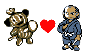 ID 328: Hoppip (Hanekko) Let's move on to everyone's favorite smiling plant ball thing. It's Hoppip! Hoppip, Skiploom, and Jumpluff all featured a very different theme and design in Spaceworld ’97. They also all seem to have been designed together, unlike, say, Ampharos and its earlier evolutions, which were designed completely separate. As they were revised, they seem to have been revised as a trio: all our evidence suggests they were worked on at the same time and reworked as a group rather than individually. Most of what I say about Hoppip will also apply to Skiploom and Jumpluff, but its worth looking at each individually. This entire family is Grass/Flying type, a typing that didn’t exist otherwise in Generation I and Generation II, which leads me to think that the original brief for the Hoppip line was to imagine what a Grass/Flying Pokemon would look like. The task fell to Atsuko Nishida, who decided on an incredibly cute design merging together a cat and a flower. Hoppip, Skiploom, and Jumpluff all started with names that were portmanteau’s involving cats: Hoppip was originally Haneko (leaf-cat), Skiploom was Poponeko (dandelion-cat) and Jumpluff was Wataneko (Cotton-cat). Her original design for these depicted a cartoonish cat in various stages of jumping, with a sort of plant on the head of each.  It isn’t clear why these designs didn’t make it to the finish line; in my opinion, the Spaceworld ’97 designs were great and far superior to the final ones. Maybe someone thought the cat part of the design was too obviously cute, or they wanted to emphasize the flower part of the design. Maybe someone was concerned that they didn’t look enough like realistic creatures because they just bounced around on the ground without limbs (the final versions all conspicuously have hands and feet). My guess is that, while cute, the cat part of the design detracted from the original design mission to make a Grass/Flying Pokemon: after all, what does the cat part have to do with that? As a result, they got redesigned to more closely resemble seeds so that their flavor of being blown around by the wind could be more obvious. Still, it doesn’t seem as though the Flying part of their design really came through in the final product: both the Spaceworld ’97 and the final movesets lack any flying moves whatsoever. You can tell that the original cat design of Hoppip was refined a few times before it was finally dropped and turned into the little critter it became. First, closely examine the backsprite it has in the June 1999 data, and you’ll find that its tail is in a different position from the SW ’97 back and front sprites. As well, there’s another version of the cat design on the scratchpads that has updated shading and a different tail, showing that they played around with it a bit more. Notice on that scratchpad design how it’s mouth has changed to delete the cat-like smile; instead, it’s been replaced by the simpler mouth that defines the final Hoppip. Certainly, even though it still had its tail, this is more of a transition design than anything else. 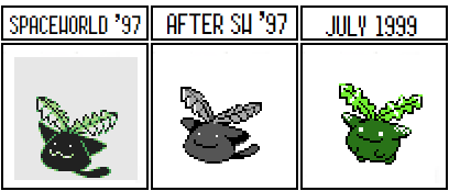 At first glance, that middle design seems almost identical to the Spaceworld '97 design. But if you look more closely, it's clearly a midpoint between the two, with shading, ears, and a smile more reminiscent of the later design. By June 1999, the front sprite depicted Hoppip’s new design (with the wrong palette) but the backsprite is still the old cat design. They started to design the new backsprite by Spaceworld ’99, and of course it's complete by the final. During this period, its name also changed, first into “Hanebozu” (leaf-green onion?) before changing to the final’s “Hanekko” which could be a mix of leaf and root but also looks suspiciously like a slightly different spelling of its name back when it referenced a cat. Skiploom and Jumpluff have similarly suspicious name changes: Skiploom started as Poponeko and ended as Popokko, and Jumpluff went from Wataneko to Watakko. The final design is less distinctive and interesting in my opinion, but better carries the flavor of a seed Pokemon tossed around by the wind. It also more closely resembles the more abstract designs of the final Gold and Silver, whereas the cat design feels much more like a cute design you’d find in Red and Green. 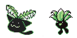 ID 329: Skiploom (Popokko)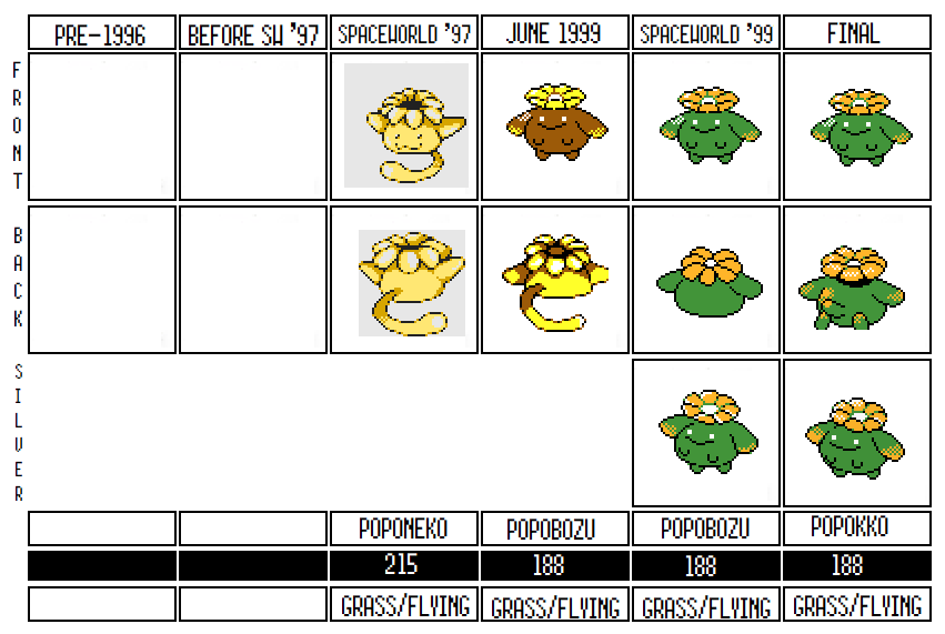 Skiploom, just like its buddy Hoppip, went through a transformation on its way from the Spaceworld ’97 build to the final. Originally named Poponeko (dandelion-cat), Skiploom started life much like Hoppip did; as a cute cat with a flower on its head. Like Hoppip, it looks like Skiploom’s cat design went through a couple of permutations before eventually being dropped by Spaceworld ’99. You can see this in the newly drawn cat-backsprite in the June 1999 files, demonstrating that they redrew the cat design at least another time after SW '97. But unlike Hoppip, its even more clear when looking at Skiploom's sprites that the transition from SW'97 to the final design wasn't a complete rework: instead, it was a gradual process of cutting off its tail and adding arms and legs. If you examine the June 1999, SW99, and final backsprites right next to each other, its clear the body stayed the same and the tail was replaced by limbs. Again, this seems to be (weak) evidence that maybe the problem with the early designs was that they didn’t function naturally enough as realistic creatures so the designers added hands and feet to make them work better. Like I previous remarked, these backsprites demonstrate that the Hoppip line was worked on simultaneously with each other as the designers continued to rework them. All three of them have a redrawn backsprite in June 1999, and all three of them have an unfinished new backsprite in Spaceworld '99. Notice how the SW '99 sprites are all unfinished in the same way, all lacking arms and legs: Jumpluff had a little more work done to it, but it still follows the pattern of the other two: by Spaceworld '99 they had a body sketch as a backsprite that still lacked limbs and shading. I’ve already complained about the final sprites, but I do want to point out that one effect of removing the cat aspects of the line means that Hoppip and Skiploom ended up looking very similar in the final, with only their palettes and their flowers really differentiating them. If you compare Hoppip and Skiploom when they share the same palette (like Hoppip did in the June 1999 bank), they look closer still. Sure, the original sprites were also similar to each other on an anatomical level, but the tails and the action poses in the sprites gave them each a much more unique feel. It’s a shame that was lost in the final designs, making them feel a lot less like evolutionary relatives and more like riffs on the same idea. 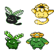 Moving past sprite designs, lets check their move sets. If you look at the move pools of the Hoppip line and compare them to the final, there are a few things worth noting. The only real change between the move lists is that in Spaceworld ’97 the Hoppip line had pretty generic Grass moves: Absorb, Razor Leaf, Growth, etc. Very boring. The designers must have known this, because by the time the final came around, they came up with the theme that the Hoppip line disperse powders into the air. This gave them a nice niche for this family by giving Skiploom and company the three status-causing powder moves: Sleep Powder, Stun Powder, Poison Powder. Overall, that makes them much more interesting gameplay wise. Also interesting is that in both SW '97 and the final, Hoppip and friends have “Cotton Spore.” In Spaceworld ’97, the move only appears on the Hoppip line and the Mareep line. Since Mareep is so much further in the Korean index and Ampharos has no cotton on its body to speak of, this suggests that “Cotton Spore” was originally designed as the signature move for the Hoppips and added later to the sheep since it was a natural fit. That’s interesting, since of course Jumpluff is the only one of the line to have cotton in its design, but it looks as though an early Pokedex entry for Skiploom (that was deleted and completely replaced) was trying to come up with a reasoning to explain how it used cotton spore and the other powder moves: Skiploom Pokedex, August 17th 1999: “When the wind blows it around, a seed-like substance is dispersed from the top of its head.” By the final, Hoppip and Skiploom became much stronger gameplay-wise, even if they got weaker aesthetically. Their transition was also pretty straightforward: lose the tail, add arms and legs, and voila. Jumpluff, on the other hand, changed a bit more drastically. ID 330: Jumpluff (Watakko)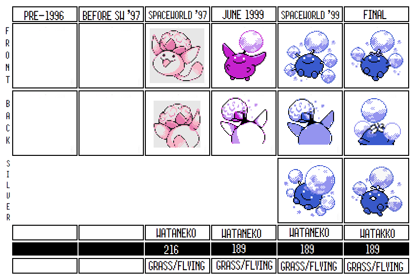 On to Jumpluff. Originally a cute pink cat creature with a cotton sprout on its head, Jumpluff underwent the same transformation into a generic circular creature that its compatriots faced. But Jumpluff underwent a few more revisions along the way and ended up having a different style of cotton spores added to its design, rather than just losing the tail and growing legs like Hoppip and Skiploom. The thing on its head isn’t actually cotton, despite the name of Cotton Spore, its pseudo-signature move. Since Skiploom is based on a dandelion flower, Jumpfluff is probably more closely based on the lifecycle stage where a Dandelion sheds its flower and becomes a clump of seeds, ready to spread into the wind. Much like Jumpluff’s Pokedex entry, which mentions how the wind carries it across the globe.  Like Hoppip and Skiploom, Jumpluff was originally an adorable cat creature with a plant on its head, and its first redesign took it in the exact same direction that Hoppip and Skiploom's finals had gone: 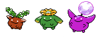 They certainly all look like a consistent evolutionary line at this stage. However, for some reason it was decided that Jumpluff needed more work. My suspicion was that Jumpluff didn't look different enough to make an impressive final evolution, but there could be lots of reasons. So they kept working on it. The first redesign went much further and replaced the one cotton spore on its head with five, making the entire design quite busy. In the final, they paired it back to three spores, and made the two not on its head were made into extensions of its arms. This continues the pattern of the Hoppip family gaining arms and legs for their final designs. 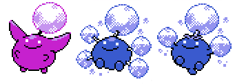 Beyond this basic story, there’s something interesting happening with Jumpluff's backsprite in June 1999. The backsprite has clearly been redrawn from the SW’97 design, but the coloring is very off compared to the other backsprites, or even compared to Hoppip and Skiploom’s back sprites. It’s also interesting because its cotton spore is different from virtually every other design: it has some of the same texture as the SW '97 cotton spore, but it's still distinct. The June 1999 backsprite, in fact, looks closest to the SW ’97 sprite but without the tail, which makes me think there was another transition front sprite between SW’97 and June 1999, just like I've suspected with Hoppip and Skiploom. By SW’99, Jumpluff is still using this odd backsprite, but its been colored it in with the new palette. Compared to Hoppip and Skiploom, Jumpluff was slightly behind in the redesigns as they hadn't yet made a sketchy backsprite that reflected its final design.  Other than these sprite changes, there’s not a lot extra to cover with Jumpluff. I think the redesign worked better here than it did with Hoppip and Skiploom. Though I still adore the cat design far more, Jumpluff is a much more original and interesting Pokemon than the other two are in the final, and the idea of a dandelion Pokemon riding the wind is genuinely inspired. It’s too bad that the other two forms had to suffer so that Jumpluff could work better, but sometimes that’s the nature of design: you have to give up something you like so the whole product can improve.
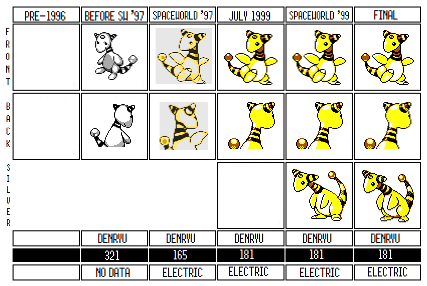
Period 1c is a transitory period in the development of Gold and Silver. On the one hand, there are still a few Animal+ designs and rough designs that were clearly brainstorms. On the other, many of these designs show evidence of having a lot more work put into them than the previous subsections. Almost all of them made it to Spaceworld 97 and a substantial portion making it all the way to the final in some form or another. While these seem to still be from the same early concepting period that characterizes Period One, they also show evidence that there was a more intentional design to them. In part, that’s because it appears that most, if not all, of Period 1c was a block of designs made by Atsuko Nishida. As one of the main designers (and known as the designer of “cute Pokemon”) Nishida’s designs tended to be successful and well liked by both the design team and the public. While her influence is definitely apparent in 1a and 1b, this section seems to be entirely hers. She likely drafted and redrafted this section more than the earlier sections, which could be a reason they look more finished. As well, Nishida is a good designer and knew the audience of Pokemon well; as a result, many of these Pokemon could have made it to the final simply because her imagination matches the sensibilities of the games so closely. ID 321: Ampharos (Denryu) |


 |  |
There is a further theory that Kyonpan and its relative Norowara are supposed to be based on plush animals as well as dead creatures. Though it’s more obvious in Norowara’s design, you can kind of see it in Kyonpan as well, especially in that its Ofuda (a tag found on ghosts or to ward ghosts away) looks a little like a tag you’d find on a stuffed animal. If that is the case, then two deleted items found in Spaceworld ‘97’s data—the Quick Needle and the Hidden Needle—might be related to them. They don’t do anything in the demo, but they may have powered up Kyonpan and Norowara, or they might be evolution items and explain Kyonpan’s bizarre evolution requirements. If this plushie theory is correct, it would also potentially mean that Shuppet's line may have been inspired by this line. I will admit than Banette and Kyonpan have a very similar pose:
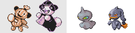
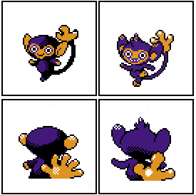
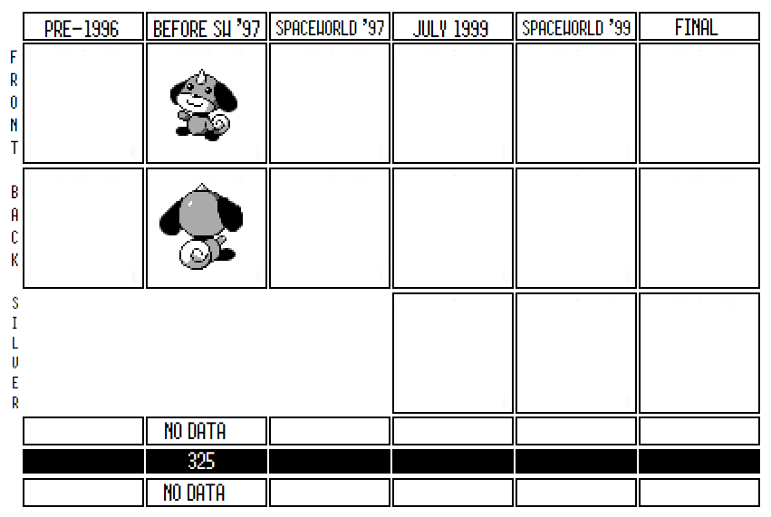
Kyonpan was one of two Ghost type Pokemon found in Spaceworld ’97, the other being Norowara, which evolved into it. While Norowara survived for a great deal longer--its sprites were touched up and its typing changed before eventually being reworked into Misdreavus--there are only a few small footprints left by Kyonpan after Spaceworld '97. It seems clear that it got erased by Sudowoodo: not only do Kyonpan’s sprites appear on Sudowoodo’s scratchpads (the database used to pull Pokemon sprites from after the Korean Index had been discarded), but we know that as late as April 1st, 1999, Sudowoodo’s typing was still Ghost type, and it was only changed to Rock on July 18th, 1999, shortly before its stats were changed to reflect its new identity. It’s not clear if Sudowoodo replaced a slot already up for deletion, or if Kyonpan was specifically removed to make room for Sudowoodo (which after all had a plot purpose and needed to fit somewhere). Regardless, Kyonpan was definitely gone by July 1999.
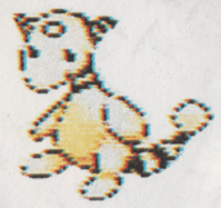
Like Ampharos, Kyonpan is one of the few Pokemon for which we have an earlier backsprite (found on Sudowoodo's scratchpad), which suggests that the design in the Korean Index had overwrote an even earlier iteration (alas, we don't have a front sprite for it!). This backsprite shows Kyonpan with an even more obviously Mandarin robe, its arms outstretched like they're stiff, and a hat more in line with Chinese iconography:
Like Ampharos, Kyonpan is one of the few Pokemon for which we have an earlier backsprite (found on Sudowoodo's scratchpad), which suggests that the design in the Korean Index had overwrote an even earlier iteration (alas, we don't have a front sprite for it!). This backsprite shows Kyonpan with an even more obviously Mandarin robe, its arms outstretched like they're stiff, and a hat more in line with Chinese iconography:
It isn't 100% certain whether this backsprite was designed before or after Spaceworld ’97. On the one hand, it was found on the Scratchpads, which were created after the Korean Index, which might date it to that time period: after all, if it was an earlier design than why would they port it over to the scratchpads? On the one hand, it looks a lot rougher: the head is a weirder sort of oval, the shading is weaker, and the hat seems to be crudely drawn on its head. In addition, this backsprite looks much closer to the myth of a Jiangshi, which suggests that the other design used this as a starting place but tried to abstract away from the explicit references, making it more unique. My feeling is the evidence suggests that this was in fact an earlier design.
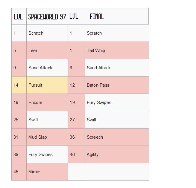
There are a ton of irregularities with Kyonpan in the Spaceworld ’97 demo. First of all, Norowara evolves into Kyonpan at level one, which is bizarre and completely unlike any other Pokemon. This was possibly a placeholder for a different evolutionary method they hadn’t implemented yet, because it makes it easy for debuggers to get whichever Pokemon they wanted to test. Still, given how much Kyonpan and Norowara’s movesets differ, it could have actually been an intentional experiment with a Pokemon family that could make a better moveset by strategically evolving at the right time.
The moveset itself is odd too. Take a look at Kyonpan's moves, compared to its pre-evolution, Norowara:
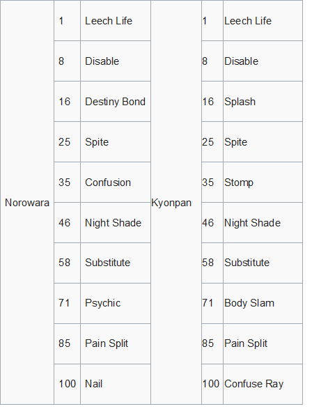
The first thing to notice is how different the two sets are. Most evolved Pokemon have the same moveset as their predecessor, except that the moves are typically learned at higher levels. But Norowara and Kyonpan learn their moves at the same level. Even more interesting, they don't even learn the same moves. They share a lot of their movesets, but Kyonpan learns moves that are more physically oriented: Stomp instead of Confusion, Body Slam instead of Psychic, etc. Game Freak was certainly trying something interesting here.
Kyonpan also learned Splash, of all things, which is of note because of how bizarre a choice it is. At first I thought this was an error, but apparently Splash better translates to “Hop” in Japanese, which fits Kyonpan’s theme as a hopping Vampire. Stomp, likewise, goes with the hopping theme, and Leech Life certainly makes sense for a Vampiresque Pokemon. Of course, let's not forget that Splash is a completely useless move. Maybe the developers wanted to punish a player that evolved Norowara too early? I have trouble believing that Splash would have stayed in the moveset in a final version of Kyonpan, or at the very least would have been moved to a level one move.
Even if this was an experiment to have two evolutionary relatives who learned different types of moves, I don't think this moveset would have stayed even reasonably similar should Norowara and Kyonpan have made it to the final. First of all, this gimmick of switching to learn physical or special attacks seems flawed: if you don’t know their level up moves from a guide or something, this would make a very annoying dynamic. As well, the moveset goes all the way to level 100, when you probably won’t even be level 60 by the time you fight the elite four in Gold and Silver. The moveset would have definitely have been condensed to lower levels. I also think that the idea of a Ghost Pokemon having so many Normal physical moves is probably also something they’d change, given how unusual it is for Ghosts to have Normal type moves, and given that their weakness is that its difficult to hit Normal type Pokemon. Maybe they would've eventually decided on making Kyonpan a Normal/Ghost?
There are two reasons why Kyonpan probably didn’t make the cut, both of them compelling. Most likely is that as Pokemon reached international popularity, Game Freak seems to have decided to consciously make their designs less Japan-centric and more drawn from inspirations recognizable in the West. For instance, Spaceworld ’97’s map was consciously designed to look like Japan, while the final shied away from such an explicit connection. In the context of appealing to an international market, a Pokemon based on a very specific Chinese reference would be lost on Western audiences, and probably needed to be dropped.
As well, Kyonpan looks cute, but it is a gruesome reference. A Pokemon that sucks the blood of others, is a rotting corpse, and is based on a Vampire or zombie is probably just a bit too much for the family-friendly image Pokemon was trying to cultivate. Maybe there's some weird zombie Pokemon out there in Generations VI or VII I'm forgetting, but nothing else in the Pokeverse feels this much like a horror movie. Game Freak may have decided that a Vampire/Zombie didn't fit the aesthetic (on the other hand, wait until we get to Gligar's origins...).
However understandable their decisions, Game Freak clearly made a mistake here. Kyonpan is awesome and would have been a huge hit in Gold and Silver. Our world is a darker place minus Kyonpan’s inclusion.
ID 325: Proto Pudi?
To me, this might be the weirdest Pokemon design in the entirety of the Korean Index. I’m not sure exactly what to make of it, and the prevailing explanations don’t make a lot of sense to me. I have one convoluted explanation for the existence of 325, which I'll explain at the end here, but this is certainly, to me, one of the oddest sprites in the Korean Index.
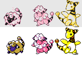
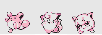
325 is a cute looking dog, waving, with a little horn on its head. It looks cartoony and anthropomorphized, in a way that resembles some of the “cute” Pokemon like Jigglypuff, Clefairy, and Pikachu. Below are the Korean Index sprites of those three Pokemon, for the best comparison:
325 is a cute looking dog, waving, with a little horn on its head. It looks cartoony and anthropomorphized, in a way that resembles some of the “cute” Pokemon like Jigglypuff, Clefairy, and Pikachu. Below are the Korean Index sprites of those three Pokemon, for the best comparison:
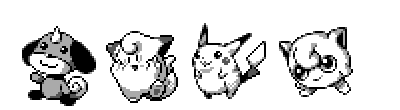
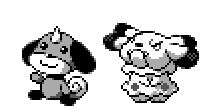
Most people who look at the index come to the conclusion that ID 325 is an early design for Pudi, the Growlithe baby pre-evolution found in Spaceworld ’97. Pudi appears in the Korean Index, much later, at ID 431. I can see the resemblance, but they’re also quite different:
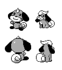
Okay, yes, there are a lot of similarities. Pudi and 325 share nearly identical tails and ears and their snouts are very close. On the other hand, 325 has a horn, which could be an indication that its based off of a Kirin, which usually has a horn. Arcanine's original design seems loosely based on a Kirin, which might serve as a link between 325 and the Growlithe line:
 |  |  |
In addition, 325 is sitting upright, has different feet, and looks altogether more human than Pudi. But the main factor for me is that 325 looks nothing like the Growlithe line, and it’s nearly impossible for me to imagine that it was ever meant as a pre-evolution of Growlithe:

These are the sprites for Growlithe and Arcanine found in the Korean Index, which chronologically makes them the best comparison. And as you can see, 325 sticks right out. It's drawn and shaded differently, its fur is a different color, it even looks bigger than Growlithe. Not to mention it has a horn, which neither Growlithe or Arcanine do. So what’s the deal?
Here’s my best explanation. I think 325 was originally created entirely separate from the Growlithe line as a cute mascot dog Pokemon. There wasn’t a lot of work put into it, and it doesn’t look like it was significantly revised or even that the shading was done in any detail on it. This slot for a mascot dog was eventually filled by Snubbull, created just a bit down the way from this design as ID 363:
Here’s my best explanation. I think 325 was originally created entirely separate from the Growlithe line as a cute mascot dog Pokemon. There wasn’t a lot of work put into it, and it doesn’t look like it was significantly revised or even that the shading was done in any detail on it. This slot for a mascot dog was eventually filled by Snubbull, created just a bit down the way from this design as ID 363:
You can see that even if they look quite different, Snubbull shares a similar upright pose to 325 and has about the same proportions for all of its features. Its going too far to say it’s a redesign, but it certainly looks like Snubbull was created with 325 in mind. However, whoever created 325 (probably Nishida) still liked its basic design and kept it in mind for later. Once the team came up with the idea of baby Pokemon (which we'll discuss once we get to Pichi, Elebaby, and Cleffa), Nishida probably repurposed 325’s basic look into a Growlithe pre-evolution.
Of course, it needs to be said that I'm in the minority here, and I can absolutely see the argument that 325 was originally meant to be a pre-evolution for Growlithe. Using my same logic, you could make the case that, given that 325 fits so badly with the Growlithe line, that's exactly why it was reworked! As another researcher, FrenchOrange, has pointed out to me, sometimes early designs are bad and they take a lot of iterations to make them fit what you want them to do. Just because 325 does its job badly doesn't mean that it wasn't designed with that job in mind.
Having stated the other case, I do think my speculation, that 325 was originally unrelated to Growlithe and only later made into Pudi, is also a pretty safe bet. Whatever you believe, I don’t think that this design ever got very far, mostly because Snubbull came along quickly after and obsoleted it. As cute as 325 was, it doesn’t really fit into a Pokemon game yet; it clearly needed to be reworked until it fit the design sensibilities of the team more completely.
 RSS Feed
