|
5/24/2021 9 Comments ID 315 through ID 320 (Sneasel)ID 315: ???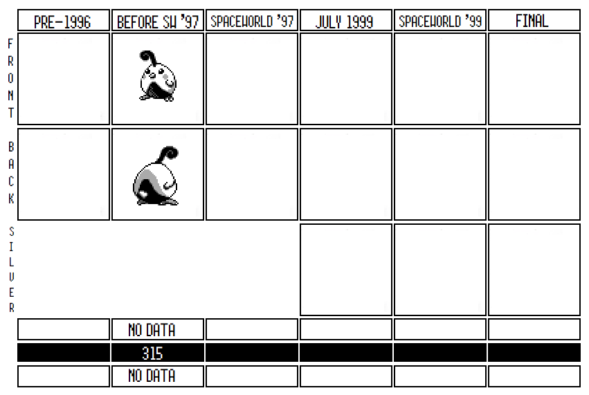 This guy is really cute! I like his fat body and his chicklet design. The eyes and the cheek spots resemble Pikachu and 305-308 to me, which makes me think Nishida designed him. He's probably based on a quail, but other than that, there’s not a lot to know about this mon. However, I think we can speculate enough to know what their goals were when designing it and why it didn’t quite make it into the 1997 build of the game. First of all, it’s pretty clear that there’s an evolutionary link between 315 and 316 as they both have a musical theme. While 316 is most easily identifiable as a G-Clef (as seen below), 315’s plumage is clearly based on a quarter note: 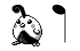 It’s not exact, per se; 315’s quarter note looks like it swirls back in on itself like a feather, so it could be a coincidence. If you're more conservative with your speculation than I am, you might point out that they try the "Musical Bird" theme three different times in the index, and 315, 316, and 392 might all be riffs on the same idea but not be strictly related. Musical notes are, arguably, a pretty obvious theme for a bird Pokemon: Game Freak used the same idea (probably independently and not related to this guy) for Chatot in Gen IV: 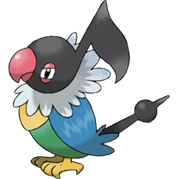 However, considering how close 315 and 316 are on the list, and how they both incorporate musical symbols into their designs, I lean towards the idea that they were designed as evolutionary relatives, even if the idea wasn't carried through very far in development. Personally, I like 315’s design way better than Chatot’s, which strikes me as not subtle enough about its connection to music. Given that Gen IV seems to have dipped back into earlier designs in a number of cases (Tangrowth, for one), it is possible Chatot is the heavily modified end result of 315, though I am reticent to ascribe too much connections between two generations so far apart. Chatot has a signature move of “Chatter,” which speaks to its theming as a loud songbird. There’s no moves in the Spaceworld ’97 moveset that indicate any sort of sound or music theme that could have been originally created for 315, unfortunately. That suggests is that 315 was scrapped too early to have a complete move set. The first new move in the Gold/Silver move list is Sketch, which is the signature move of Smeargle (Painter in the SW97 demo). Given that new moves seem to be have just been added to the end of the list as they came up with more signature moves for Pokemon (notice how Lugia’s signature Aeroblast doesn’t exist in 97 and was just added to the end of the list in the final), this probably means that new moves weren’t seriously added to the game until about the point that Smeargle appears on the Korean Index. Which just means that 315 was probably deleted earlier. It seems pretty clear why 315 was rejected. It shares a lot of design space with Natu, which is also a cute chick Pokemon, and there were limited slots for bird pokemon in the final but a ton of designs for bird Pokemon in the index. Given their closeness in the list and some telltale similarities in how they're shaded (look at their near identical feet, for instance), the dominant theory is that they were designed by the same designer, probably Morimoto but maybe Nishida. If that were the case, then it makes sense the designer made them both to fit the same slot in the game, and Natu was simply a more interesting choice. Personally, I think 315 was probably designed by Nishida and Natu by Morimoto, but even so its worth pointing out how close they are to each other. My best guess, given how explicitly Chatot is designed as “Music note bird,” is that the designers decided 315’s theming wasn’t obvious enough from its design and chose to reject it in favor of Natu. Which certainly makes sense to me: as much as I like 315, Natu exudes interesting mystery, while this guy is just a cute chick.  ID 316: ???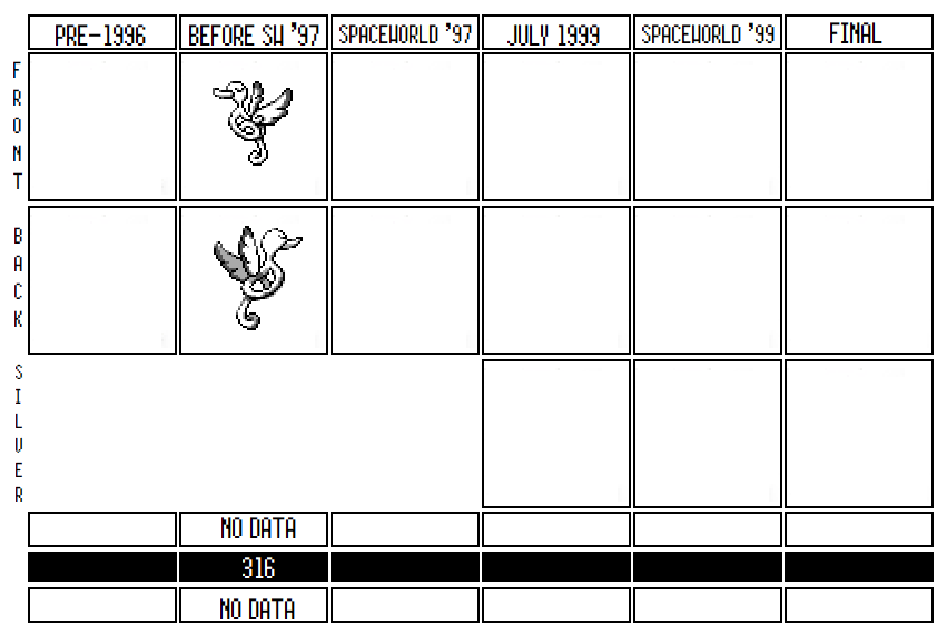 The little quarter-note Chick grew up into a G Clef Bird! Its beak is longer, it's sleeker, less fat, its nubs grew into wings, and it’s got a brand new smug look on its face. But the musical theme remains intact and in fact more pronounced in its evolved state. Like Chatot, 316 isn't just sort of shaped like a musical note; its body is literally a G-Clef, the sign used for most musical instruments:  Saying all that, something about 316 feels off. It’s a little too cartoony, even for a Pokemon, and certainly for the second stage evolution, which tend to be fiercer and less goofy. Compare 316 to Pidgeotto and Fearow before it: 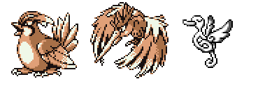 Both of these guys have a sense of enormity to them: a feeling that they’re large and to some degree dangerous. 316 is not large: even its backsprite shows its whole body and makes it feel small. In addition, its shape doesn’t look at all like a realistic body. Pidgeotto and Fearow have feathers, feet, a stomach, and a discernible tail. 316 doesn’t have any of that: it's a tube bent into the shape of a G-Clef. It’s also not clear how it moves around: is it always flying, does it bounce on its tail? Sugimori really didn’t like Pokemon that looked too artificial or not like a natural creature in some way, and 316 definitely doesn’t feel like a real creature that could exist in the environment. On top of all of that, 316's eye doesn’t look like any other Pokemon’s eye, instead looking like it was out of an anime or a manga. Overall, 316 feels like a sketch of a fun idea that would’ve needed to be reworked had it gone further. It's clearly at a first draft stage: the larger idea is there but they hadn't yet fleshed out what it acts like, how it functions, and what sort of a move set it could have. You can see with Chatot how they felt that a musical note for a head wasn't enough and they designed the rest of it around a parrot shape, even giving it a unique, non-musical, tail. 316 doesn't even have much of a specific bird it's drawing from. Maybe a duck given its beak? But while the beaks on the Fearow and Pidgey lines are often based off of real types of beaks, 316's looks like Donald Duck or something similar. It fits in with other brainstormed ideas from other parts of Period One, like 305 and 306; like them, it would probably have been redrafted a number of times before it went forward, but was instead abandoned while they put effort into the Pokemon around it with more promise. 316 could also be the bigger reason 315 didn’t make it to SW ’97. If Natu and Xatu had a complete two-form family, while 315 had an evolution that clearly needed work, it made sense for the designers to go with Natu and Xatu instead. It could even be that Natu and Xatu dropped their middle evolution to better fit into a spot that was originally taken by 315 and 316 in a pre-Spaceworld '97 build. Who knows for sure. What we can say is that, in the fierce competition of bird Pokemon in the initial versions of Gold/Silver, 315 and 316 clearly were not seen as interesting compared to Natu, Xatu, Hoothoot, and Noctowl. 317: Proto-Shibirefugu?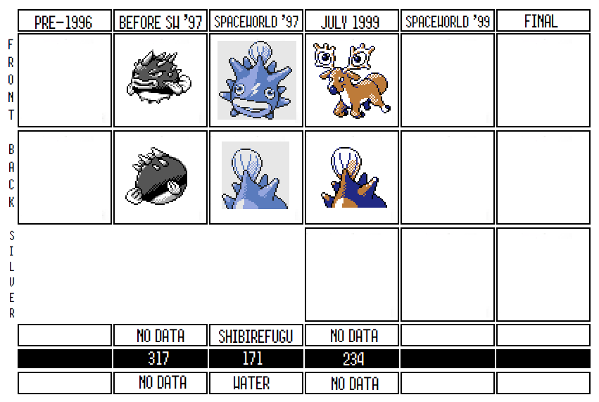 317 is pretty unique for the Korean Index. Unlike most other rejected sprites, 317 is clearly connected to a later finalized Pokemon, but it isn't clear exactly how. In this case it looks at a lot like Qwilfish and its rejected evolution, Shibirefugu. However, both Qwilfish and Shibirefugu appear later on the list in their own entries! So what's going on with this spiky guy? As far as I can see, there are five possibilities that could explain the existence of 317: 1) 317 was a rejected Red/Green design, which went on to inspire Qwilfish and/or Shibirefugu. 2) 317 was an early design of Qwilfish. 3) 317 was an early design for Shibirefugu. 4) 317 wasn’t a design for either, but was split into both Qwilfish and Shibirefugu. 5) 317 was an in-between evolution between Qwilfish and Shibirefugu. I’m going to consider each of these possibilities in order. 1) 317 was a rejected Red/Green design, which went on to inspire Qwilfish and/or Shibirefugu. This feels likely to me. 317, like many of these early designs, is very clearly an “Animal+” design, in which a regular animal is slightly modified or given one extra characteristic. In this case, it’s barely even "Plus": 317 is just a puffer fish with a cartoon face. But it fits in perfectly with the designs from development in early 1993, in which Game Freak was creating simple representatives of the Pokemon types inspired by real life animals. 317 fits perfectly next to Deer, Seel, Mankey, Tauros, and Farfetch’d. 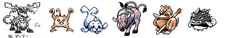 Of course, this could be coincidence. A lot of the other Period 1 Pokemon early in the Korean Index are Animal+ designs, and it is possible that during Period 1 the Gold/Silver team was also brainstorming fauna to populate the new game, exactly like the Red/Green designers were doing when they designed Mankey and friends. We can't really know for sure. Furthermore, if this theory is true and 317 really is a leftover from Red/Green, then how closely should we identify 317 with the Qwilfish line? That’s a hard question. Consider the other explanations and the evidence for and against: 2) 317 was an early design of Qwilfish. This is also possible. They both have a mean look to their eyes and Qwilfish’s backsprite, while not an exact match, is from the exact same angle as 317. It even has nearly the same line dividing its white belly from its top:  If this is the case, then Qwilfish might have been clearly redesigned by a different artist when they refined this early design. Qwilfish’s eyes are a completely different style from 317, and the puffer spikes are drawn in a completely different style on each. On the other hand, given the similarity of their bellies, this could have just been a second go by the same artist. Qwilfish does make a lot of sense as a redesign of this guy. The way its body has been made a globe and its spikes now take the place of the earlier fins both look like they were attempts to take the best parts of the puffer-fish design and exaggerate them into a more identifiable and iconic design for the Pokemon. Honestly, I'm pretty convinced about the Qwilfish redesign theory when I look at the backsprites. However, the theory has problems. If 317 is an earlier design for Qwilfish, then why does Qwilfish also appear on this list later, at 339? If the Korean Index is chronological, it would imply that these were put on the list around the same time. There’s not a good explanation for this. It’s possible that Qwilfish was originally a riff on the first design, and since the first design was from someone else, they didn’t want to overwrite it. It could be that the design team was going back and forth between both designs and kept both around. It could be that a different artist created Qwilfish but out of respect for the original designer added it later in the list rather than overriding his colleagues' work. Or it could be an indication that Qwilfish was created independently of 317 and their similarity was a coincidence. 3) 317 was an early design for Shibirefugu. I think there’s some good evidence for this as well. Shibirefugu is obviously larger than Qwilfish and matches the general shape of 317 much more than Qwilfish. Its lips are the same as 317, and they both share the same tail, even if their backsprites are completely different. At the same time, like above, you can tell that Shibirefugu has been refined quite a bit from 317: it’s fins, like Qwilfish’s, are now spikes to go better with its overall theme, and it has a lightning bolt on its head to hint that there’s something more to it than “angry puffer fish.”  Shibirefugu also appears later on the Korean Index, but there’s a more plausible story for why it exists alongside this previous design. Unlike Qwilfish, which is only twenty sprites after 317 on the index, Shibirefugu is the third from last Pokemon on the Korean Index, at ID 446. The last 25 Pokemon in the index are all found in Spaceworld 97 and the last few are just evolutions of Red/Green Pokemon or previous Pokemon found in the Index, which implies that they were all made very shortly before the Spaceworld 97 build. Since Shibirefugu is so close to the end, it’s possible it was designed right before Spaceworld '97 to replace 317, but since it was created so much later they just glued its design to the end of the list rather than overwrite the earlier one. That would suggest that Qwilfish was originally designed as a pre-evolution to 317, and then 317 was discarded to better match the design of Qwilfish. That would also explain why Qwilfish is found so close to 317 on the Index: because while 317 was still being considered, someone came up with a pre-evolution to go along with it. 4) 317 wasn’t a design for either but was split into both Qwilfish and Shibirefugu. This is kind of hard to say definitively, since even if 317 was made into one or the other it would have still influence the rest of the evolutionary line. 317 certainly has design elements of both Qwilfish and Shibirefugu: the general shape and tail of Shibirefugu and the pose and angry eyes of Qwilfish. It’s possible that when 317 way abandoned, they first took the best parts that worked and made it into Qwilfish, and then later when they decided Qwilfish should have an evolution, they went back to this original design and took more from it. It could be that 317 worked as a placeholder of “puffer fish Pokemon” and the Qwilfish line eventually was created to fill that gap. Of course, this is not much different of an explanation from any of the above: after all, how different is a direct redesign from an inspiration? Some of the designers could have thought of 317 as a jumping off point as they designed the Qwilfishes, while others thought they were directly reworking this earlier brainstormed idea. We can’t really know, but I don’t think it makes much difference. 5) 317 was an in-between evolution between Qwilfish and Shibirefugu. I think (5) is probably the only explanation for 317 that we can discount entirely, even though it was my initial theory before I started looking at the evidence. At first, it seems plausible that 317 could fit in between the two, because its an in-between size and because its lips look like a natural evolution from Quilfish’s puckered lips to Shibirefugu larger ones. But the timing doesn’t seem to work. Shibirefugu was designed at the very tail-end before the Spaceworld ’97 demo. That means there probably wasn’t space in the design timeline for all three to have coexisted together. Even beyond this, the Pokedex for Spaceworld ’97 doesn’t seem to have a gap for 317. The last few Pokemon added to Spaceworld '97 are all thrown in at the end of the Pokedex, like Togepi and Riifi. If there were a third Pokemon in the Qwilfish line, you’d expect either 317 or Shibirefugu to be out of order and haphazardly added to the end of the list, but neither is. In Spaceworld ’97, Quilfish evolves into Shibirefugu at level 18, which is pretty early and doesn’t seem to leave any room for an unused evolution between the two. Sure, that could have been the original level at which Quilfish became 317, but it seems both too high to be the level a first stage became a second stage, and too low for it to be the original level a second stage could become a third stage. The level at which it evolves could have been adjusted, but again, there wasn’t a lot of time between Shibirefugu’s design and the demo, so it would have to have been done quickly. Even beyond that, Qwilfish and Shibirefugu are much closer in design that 317 is to either of them. Their spikes are similarly designed like bumps on a round body, rather than the slicked-back hair-spikes of 317. If it was a rejected middle stage, then Qwilfish and Shibirefugu probably had earlier designs that matched 317’s aesthetics more, but if that were the case, why were they updated and it wasn’t? Conversely, maybe you think that 317 was invented after Spaceworld ’97 as a briefly considered middle stage. Again, this seems implausible, simply because if it was created after the fact, then it’s design would have been more commensurate with Qwilfish’s, not an alternate way of designing a puffer-fish with completely different quills. There’s a lot of speculation to do here, but for my money, here’s what I think happened. I think 317 was an early design, probably from Red/Green but maybe from the initial brainstorm for Pokemon 2. Once it was designed, Qwilfish was created as a pre-evolution for it using its backsprite as a model. They probably knew they needed to redesign 317 to better match Quilfish, but it was a good enough placeholder design that they didn’t get around to replacing it until the very end of development before the Spaceworld demo, when they finally created Shibirefugu’s design and slapped it over 317. Saying that, any of the above explanations, with the exception of (5), could be true or false to some extent. It’s impossible to know. I’ll track what happened to Shibirefugu when we get to its entry (spoilers: it gets overwritten by Stantler!), and look at the move set and its changes once we get to Qwilfish. For now, I just wanted to explore the plausible connections 317 might have with either of them, and track where its design ended up. 318: Quagsire (Nuoh)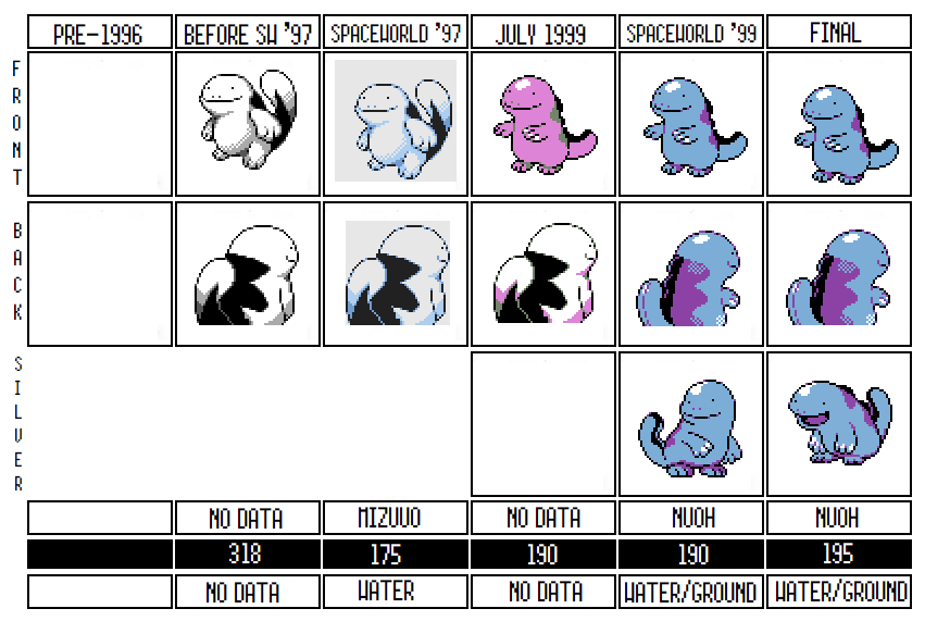 Another Pokemon that survived from the very beginning of Gold/Silver all the way to the final product! Quagsire, like Natu and Xatu before it, didn’t change drastically over the development of Gold and Silver. Its earliest sprite is still very recognizable, but has a larger jaw, an underbite, a larger arm, and a bigger tail. The jaw in particular gives it a thuggish look, while the final version focuses on its cuteness much more. The modern version also added shading to its head to give it a shinier, squishier look, in line with a salamander, while the earlier design, though still based on a salamander, was more muted in its inspiration. Even though Quagsire remained mostly intact, the early Quagsire of Spaceworld ’97 was a very different beast. First of all, the early Quagsire had a different name in Spaceworld ’97: while its final name was Nuoh (Maybe Swamp Salamander or swamp king) its early name was Mizuuo, which is either a play on Water Salamander or named after the Longnose Lancetfish, which is also called Mizuuo in Japanese. As mean looking as the Lancetfish is, I can kind of see it; both original Quagsire and the Lancetfish has the elongated lower jaw to connect them. It looks like its name was changed on 7/18/99, about a month before the Spaceworld ’99 build we have. A name meaning “swamp king,” if that’s what Nuoh means—or Quagsire for that matter—makes more sense for him anyway. Second, Mizuuo was just Water type, not Water/Ground as in the final. It isn’t clear why they made this change, but even the SW '97 Quagsire had a Ground move, so they may have revised it to provide type diversity. It could also have been because Salamanders are associated with the ground while the Japanese name for Lancetfish just means "water fish." The lancetfish is very much just a fish and has no connection to the ground type: 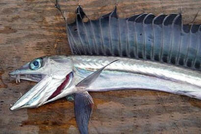 But the biggest difference between beta Quagsire and the final product was that Quagsire was originally a single stage Pokemon! Wooper doesn’t appear at all in Spaceworld ’97, or in the Korean Index, and it is very unfinished in Spaceworld ’99. The idea of Quagsire being a second stage Pokemon seems like it was a very late idea, well after it had been conceived. It makes sense: looking at them with this knowledge, it’s clear Wooper doesn’t share many similarities with Quagsire and could have even been designed by a different designer.  While they share the same palette and face, Wooper has differently styled feet and has sprouts coming from its head (which are from the Axolotl that Wooper, but not Quagsire, is based on). Wooper looks to me like it was created specifically to connect to Quagsire, but that they weren't designed in conversation with each other. Which, by the timeline we have, seems to be exactly the case. It’s unclear what exactly happened with its coloring, especially in July 1999. It started out as a light blue in Spaceworld ’97, which was in line with the very limited coloring that the game had before they remade it to fit the Gameboy Color. By July ’99, it had its modern look, but it was purple instead of blue, before being changed to the darker blue that was used in the final. It’s not certain whether this was an error, or if they were testing out this color before going back to blue; my gut says it was just an error since the shiny Quagsire of the final uses this coloring scheme and they could have easily gotten them mixed up. Quagsire’s 1997 movelist and it’s final movelist aren’t that much different, but the early set suggests a different type of creature than the goofy salamander we got. Let’s take a look: 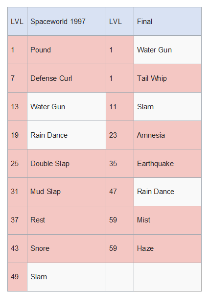 The first thing to notice here is that even though Mizuuo was pure Water type, it had a Ground move, "Mud Slap." Mud Slap was a move shared by a lot of Pokemon in Spaceworld ’97 (including Aipom, Skarmory, and Pidgey) but was turned into a TM only move by the final. Notably, none of the other Pokemon who learned Mud Slap in SW ’97 were Ground type (and two of them were flying, Ground’s mortal enemy!). So Quagsire could have had the move because it was given out to a lot of Pokemon, or it could be a hint they were already considering Quagsire as related to the Ground type. It got replaced with Earthquake in the final, which is a much better move—giving Quagsire some powerful late game moves—and fits its final Water/Ground typing nicely. It also has Rain Dance, which in Spaceworld '97 was something only the Squirtle line, the Poliwag line, and Quagsire learned, which might mean that Rain Dance was a move initially associated with Quagsire. It makes me wonder if Rain Dance originally had a different name and concept, or if part of Quagsire’s thing was that it danced! The Spaceworld '97 Quagsire was a much sleepier dude: it knows Rest and Snore in Spaceworld '97, which were absent in the final. Snore’s also nearly unique to Quagsire, in that only it and Snorlax knew the move in Spaceworld 97. This could make it a semi-signature for Quagsire, which would make sense given that its described as “leisurely” in its final Pokedex entry. Maybe it danced all day and snored all night! Anyway, Rest and Snore got replaced with Haze and Mist, conceptually moving Quagsire from a sleepy Pokemon to one that could create clouds of water vapor. Overall, I don’t think there’s a major change in concept that we can see from these two movesets, but clearly the focus of Quagsire shifted as they focused more on its identity as a water salamander and less on its lethargic nature. I like Quagsire. I think it's clear that even though it fits in with the “Animal+” basic designs from early in the Korean Index—like Gurotesu, 305, and 309—even its early sprites show a character and personality that most of these other early designs lack. Looking back on it in the context of the other discarded sprites, Quagsire’s a bizarre design, and I can’t help thinking that if it didn’t make it to the final, it’d look just as bizarre to us as some of the more out there rejected designs. But since we’ve all had twenty plus years to love Quagsire, we’re used to it. It’s a reminder that as unfinished as any of these other Pokemon are, we might have grown to familiarity with any of them. ID 319: Inoshika?  ID 319 is a boar with antlers. It’s another Animal+ design, like Quagsire started and 317. Fortunately, we’re almost done with these sorts of designs as we get to the end of Period 1b, as most of the Animal+ designs are in the early parts of the index. Once again, this suggests these early Pokemon in the Index are sketchy and less developed than later designs, that this early brainstorming period was drawing from real world fauna possibly to populate the new games, and that at least some of these possibly have an origin as far back as Red/Green. 319, for instance, would fit right alongside Seel, and 309 both of which are real world animals with spikes on their heads, and both of which were designed around 1993 for Red/Green. Not to mention 304 and 317, both of which are Korean Index Pokemon which could have been early Red/Green designs as well.  However, despite 319 sharing a lot of the generic design philosophy with some of the surrounding Pokemon designs, it seems to have a more interesting origin story. Most obviously, it looks just like this monster from Dragonball Z:  This was the Inoshikacho, a beast that terrorized villages and was originally raised by the character Master Shen. As you can see, Inoshikacho shares the antlers and the general boar shape with 319, though 319 lacks the butterfly wings. So where did Dragonball Z get this creature from, you ask? You might think it’s a mythological animal in Japan, but in fact it was a reference to the card game “Koi Koi.” 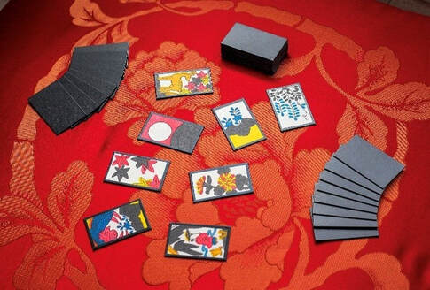 Koi Koi is a point scoring game where you match the cards into different sets that score different points. One of the hands in Koi Koi is the “InoShikaCho” hand, or, translated, the “Boar, Deer, Butterfly” hand: 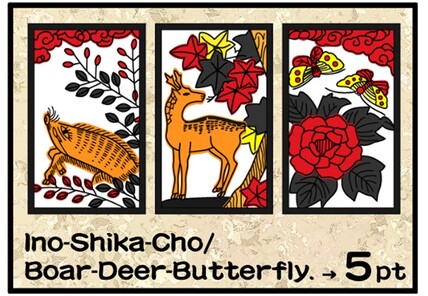 Dragonball Z’s monster, Inoshikacho, was a very literal interpretation of this Koi Koi hand. Inoshikacho was a boar with deer antlers and butterfly wings, matching the hand in an amusing, silly way. Now 319 doesn’t have the butterfly wings, but otherwise it looks suspiciously close to the Inoshikacho of Dragonball Z, right down to the angry looking face and the oversized, round body. It isn’t for certain that 319 was based on Inoshikacho from the show (though it first aired ten years before the Korean Index, giving them plenty of time to draw inspiration), and it may have been that 319 was just based on a mix of two forest animals, like how Arcanine mixed a tiger with a dog. However, I think the evidence is strong enough to support the theory that at the very least 319 got its inspiration from Koi Koi. If only we knew what 319’s Palette was supposed to be; if it was purple we’d know for certain where the inspiration came from.
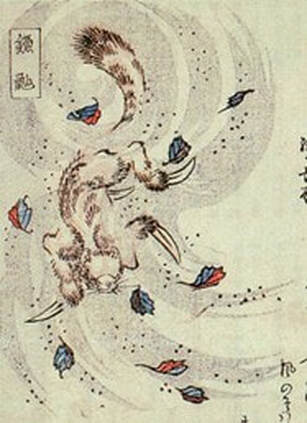
So what happened to InoShika (BoarDeer)? Obviously we can’t know for certain, but some of the same explanations which apply to earlier Animal+ designs apply here. Inoshika, at least superficially, doesn't look very original as a design and like 304 or 309 it could just have been deemed not unique enough. As well, if it was originally created as a Dragonball reference, the designers may have treated it as too-on-the-mark, or thought it wasn’t far enough away from the inspiration for comfort. It could also always have been a joke and never seriously considered. There’s a sliver of a chance it could have been made into Piloswine or Swinub (really Piloswine, since it was created first), but it’s not especially likely. There’s no indication of the Ice typing that typifies the Swinub line here, and there’s not even a tiny piece of Swinub or Piloswine that refers back to the earlier Inoshikacho inspiration. Moreover, InoShika was scrapped before Spaceworld 97, so if it went on to become Piloswine it would have been readded after it was abandoned, which is very unlikely. Instead, the Piloswine line might have been loosely inspired by the fact that a boar Pokemon had been rejected: seeing an opening for a pig type Pokemon, one of the designers might have created Piloswine to fill the gap left by the rejected InoShika. We can’t know for sure, but by instinct is that there’s no real connection between this guy and the pigs that took its place. He’s still cute though, even if he’s not quite up to the caliber of the other designs. ID 320: Nyuura (Sneasel)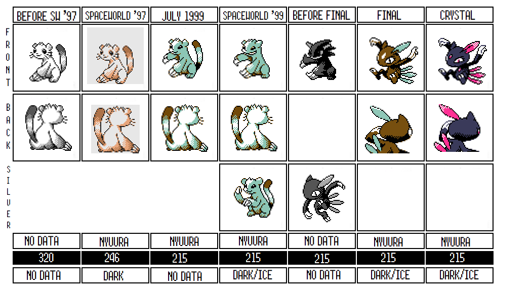 Sneasel’s a unique Pokemon, in that it went through more sprite changes and redesigns than any other Pokemon on the Korean Index (with the possible exception of Wobbuffet). It’s also an early Animal+ type design, but one that got reworked over and over until it no longer looked like a simple animal anymore. It also seems to have barely made it into Spaceworld 97, then redesigned barely a few months before the final release of Gold/Silver, and then redesigned again for Crystal. It’s a lucky Pokemon, one that could have easily been rejected many times along the way. The consensus is that Sneasel was based on the Kamaitachi, a yokai, or mythological spirit, in Japan that looked like a weasel with sickles for hands:
Kamaitachi are supposed to be fast moving weasels who fly through the air in dust devils and slice people who get too close with their claws, giving their victims papercut-like wounds. I’ve seen it said that even though they cut people, they heal the wounds too so they don’t bleed and only hurt later, so that the Kamaitachi won’t be blamed for the wounds, giving them a trickster-like persona. This resemblance is a lot more obvious in Sneasel’s early designs, where it explicitly does look like a weasel, though its arms look pretty harmless to me, and certainly not sickle like. It also seems like a Kamaitachi Pokemon would be Flying type more than any other type, though an underhanded dust-devil-demon certainly also fits the Dark type, even if the sweet weasel sprite of early Sneasel doesn’t. It’s name, Nyuura or Nyula in Japanese, seems to be a portmanteau of “sneaking in” and “weasel,” establishing that even in its earliest versions, Sneasel was a crafty and underhanded sort of Pokemon. That’s probably one of the reasons it got revised so much, since the sweet smiling looking face of its Spaceworld ’97 design hardly gives off sneaky vibes at all. This first design feels similar to many of the other Animal+ designs of this early part of the list. It’s clearly a weasel, or maybe a cat of some sort, with large claws. Even though it seems to have been created early, its Pokedex number in Spaceworld ’97 is 246, sandwiched right between legendaries (which are normally at the very end of the Pokedex) and then Togepi, Snubbull, Aipom, and Riifi, all Pokemon which were reshuffled into more appropriate spots in the Pokedex by the final and Pokemon that we have also have some reasons to suspect were added to Spaceworld ’97 at the last second. Because it's so late on the list, Sneasel was either originally designed as a legendary--unlikely given its understated design--or it was a last minute addition which they hadn't yet found an appropriate space for in the Pokedex. Given that by July of 1999 it has a new Pokedex number, it's likely Sneasel was simply added in late after the 1997 Pokedex was mostly finalized, and moved later. That Sneasel was an early design but added late to the actual game is one possibility. On the other hand, Sneasel's also a prime suspect of a Pokemon that may have overrode something else which used to be in this Index slot. Given that it was entered into the 1997 Pokedex so late, at the point that they seemed to just be adding additional Pokemon without a pattern, Sneasel could have been designed right before Spaceworld ’97 and thrown in as one of the last designs. The fact that the sprite might be missing a right arm also hints that it may have been added later, since even the sprite might not be finished; it’s unclear to me if its right arm is simply at its side, or if it was always supposed to be visible like the later revisions and just wasn’t drawn in yet. If this is the case, Sneasel is unchronologically inserted into the Korean Index, and was probably designed closer to the end of 1997, around Shibirefugu, Tyrogue, and Ledian. However, as much as this is a possibility, its concept fits in much better with these early Era 1 Pokemon, especially since it seems to have started as an underdesigned idea based upon a real life animal. Ledian's original design also matches this earlier aesthetic, but most of the other Pokemon created towards the end of this list were more developed, complicated designs, and most were evolutions of other Pokemon. The fact that its concept (of sneakiness) doesn’t match its design much further makes me think it was created during the initial brainstorming session for the games and then input in at the last second when they needed a few more designs and they scanned back through the early parts of the index. What I find funniest about Sneasel is how the designers clearly knew that it didn’t look scheming or mean enough to fit its concept, and every single redesign seems to have had the goal of making it look more menacing. Notice how after the first design, they first change its smile very subtly into a smirk and a second hand is added to give it more of a combat pose. Then, the next revision outright changes that smirk into an evil grin, made its claws slightly pointier, and adjusts the ears a bit to make it look less sweet. We then have a completely bizarre design (the Sonic the Hedgehog Sneasel as some have dubbed it) in which the designer drew over all its fur to make it into something spikier and darker, continuing the trend of making it look more like a demon. At that point, it seems like the original designer gave up and someone else redrew it completely, loosely based on the same Kamaitachi origin but completely reimagined.  It isn't certain whether the Sonic design was ever the design they were working with or whether it was just an alternative sketch they experimented with and then discarded. It’s also not really clear exactly when it was made, but it seems to be an evolution of the Spaceworld ’99 design and not the other way around (and we know the Scratchpads, from which this is taken, are post-Korean Index so it’s after those designs). The final design is also interesting because of just how late it was created. By Spaceworld ’99, most Pokemon—though not all—had their final designs, even if their poses hadn’t quite been figured out. The exception tended to be new Pokemon not seen before that build, not older Pokemon like Sneasel. And yet Sneasel is still based upon its drastically different earlier concept even at this late stage of development. That seems to suggest that Sneasel was a Pokemon they just could not figure out until the very last second. Spaceworld ’99 was a build from August 1999, and the final was released three months later in November, so Sneasel would have been one of the very last Pokemon to be redesigned! And given that its new design is so drastically different, there wasn’t much of a turnaround to finalize it. In fact, it’s Pokedex entry as of August 17th still mentions its crescent shaped claws, which are features of this earlier design, showing that even as they were writing the entries they were still thinking in terms of the cute-weasel design for Sneasel. In fact, Sneasel’s final design wasn’t even fully finished when they released Gold and Silver! First of all, unlike most Pokemon, there was no alternate Silver sprite for Sneasel. Both games used the exact same sprite. The scratchpads seem to have an unpolished design for a Silver sprite, but it was clearly not finished and discarded for lack of time. Secondly, they kept working on Sneasel’s design after release and then changed it quite a bit for Crystal, which seems very bizarre to me. Look at all the differences. First, Crystal has a completely different palette: while Crystal is black and pink, the Gold final sprite seems to have inherited the brown palette from all the way back from its Spaceworld 97 design. Its blue ears are refined into pink feathers; its white spot on its head is clarified as a pink jewel, and its eyes are clearly reworked and redefined to give it more character. All of these (except maybe the palette) are small tweaks, but they are tweaks you’d expect to see on a rough draft before the final, not after it. Additionally, look at their back sprites, and notice how the pose had been shifted a little to better match the front, the eye is drawn much better, and the back feathers-- which lack shading in Gold--are given some shading and refinement in Crystal:  I don’t normally look at Crystal's designs, but in this case I think it’s instructive to show just how down-to-the-wire they must have been with Sneasel. It's very likely that they had someone redraw it at the last second and they had very little time to provide them with feedback and revisions. Instead they incorporated all of that revision work into the development of Crystal. It’s kind of amazing, in retrospect, how iconic and beloved Sneasel has become given how last minute it was.
Before we finish, I want to talk about Sneasel’s move set for just a second. Sneasel was original just a Dark type Pokemon, and while it was given the Ice type by Spaceworld 99 (maybe earlier if you think its cool blue palette was because of the Ice-type) its move list was never updated to give it any access to Ice-type moves. In fact, the Spaceworld 97 and final movelists are remarkably similar. Between the two, it lost Tail Whip (given that its new design didn’t have a tail), Sand Attack, and Pursuit, and it gained Agility, Quick Attack, Screech, and Beat Up. But most of those move changes aren’t that significant, and they still fit the same themes: Pursuit was replaced by Quick Attack, but they both imply Sneasel’s fast and a hunter; it lost Tail Whip and it was replaced with Screech, but both are similar moves and Screech fits the final design more. The only significant move change was Beat Up, which was Sneasel’s signature in Gold and wasn’t yet created in Spaceworld ’97. Given that it was added to the very end of the list—in fact, the last move in the Gen II move list-- and surrounded by other moves for Pokemon that were only created after Spaceworld ’97, it seems like the decision to give Sneasel a signature move was almost as late as its design change. This is just further confirmation that even while Sneasel was one of the earliest Pokemon to be created, it was probably the last, or one of the last, to be finalized. Sneasel’s design is really interesting to me, and it shows just how much fiddling the design team did to designs that they weren’t entirely happy with. It’s a testament to the quality of these games just as much as it shows how up-in-the-air and chaotic the development of Gold and Silver were. If there’s one really important takeaway from Sneasel’s journey, it's that Sneasel's revisions show just how far some of these “Animal+” designs could have diverged from what we saw in the Korean Index, had they been kept around longer and worked on more. Sneasel's example lends credence to the theory that ID 300 is an early Celebi, since it shows how far some designs were revised, and it suggests that it's possible some of these other Animal+ designs may have become other Gold/Silver Pokemon that we can't predict simply because their final designs are unrecognizable here in the Korean Index. As well, Sneasel shows just how much the design philosophies of the Game Freak team had changed from the beginning of Gold and Silver’s development to its end. In 1996, they were designing simplistic Pokemon designs based upon normal animals with a twist. These designs were in many way indiscernable from the early eras of Red and Green. But by the end they had moved far away from animal designs, and were in the process of revising out designs that were too obviously based on real-world animals in favor of more abstract designs (like Sneasel) or designs that at least had a hook (like Hoothoot, Lebyda, or Natu). Sneasel bridged the gap between the early design period and the late, and the ways it was revised provide us an archeological guide to how those periods in Pokemon's history were different.
9 Comments
Alex B.
5/24/2021 11:52:05 pm
Awesome! I must admit that I got a bit confused with Qwilfish and his lost relatives, but I loved the Quagsire section 😂❤️ luckily, pink Quagsire remains under the carpet.
Asmorano
5/25/2021 11:36:11 am
Thank you for the kind words! I just cleaned up the Qwilfish/317 section, so it might be a bit easier to follow now. I'm glad you like the Quagsire section, I was very happy with how it came out!
a
5/28/2021 05:20:46 pm
Another great article! My only complaint is that you got the relationship between Wooper and Quagsire incorrect. Wooper is based on a salamander larva, which look like axolotl. That's because axolotls have been selectively bred to never fully mature. In the wild they do become a more typical looking salamander.
Asmorano
5/30/2021 06:42:39 pm
Wow, that is way more information about Salamanders and axolotl than I knew! That's super interesting and I'm going to look up more info. Rest assured, this correction will make it in in the far, far future when I get to Wooper.
Jameson
6/4/2021 08:24:13 am
Super cool analysis! I didn't realize how late in development sneasel was still being revised. It's truly crazy that it then went on to being one of the most iconic creatures in Gen 2!
kumuhmuh
7/27/2021 05:44:41 pm
Managed to stumble upon these articles earlier today, and while write-ups on the early Pokemon games' development always interest me, the section on Sneasel in particular really stands out. The context here makes its inclusion in the final game seem almost slapdash, and the fact that it came so far makes me respect it a lot more in a weird sort of way. Excellent stuff!
Asmorano
8/21/2021 12:33:56 pm
Thank you so much, I was really proud of that section! I hope you're finding everything else equally interesting!
ScorpioTHK
5/23/2022 04:46:34 am
Another possibility for 319 may be a very literal interpretation of the “hog deer”, so named less because it looks like a pig and more because it runs with its head down like a wild pig does (to duck under obstacles instead of jumping them like most other deer).
Asmorano
10/29/2022 02:25:38 pm
That's a cool thought! I've never heard of a hog deer before now! Leave a Reply. |
AuthorMy name's Aaron George, and I'm both a historian and a fan of Pokemon, especially of development. Reach me at @Asmoranomardic ArchivesCategories |

 RSS Feed
