|
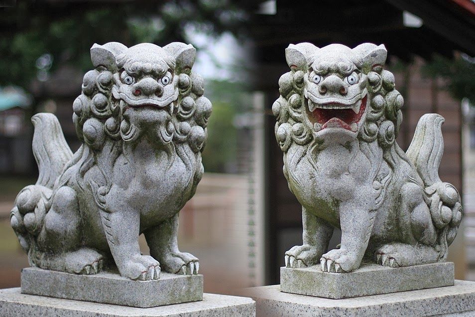
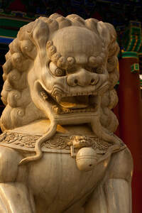
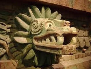
10/9/2021 4 Comments Period 1e (349 to 356): LeftoversHo-oh and Unown mark the end of Period 1d, in part because both are obvious Sugimori designs, and in part because Ho-oh easily dates everything before it to a 1996 build of the game. As a result, everything after Ho-oh is from an uncertain period of development, between the 1996 build and May 1998, with the vast majority matching the Spaceworld '97 build. In particular, the next grouping, Period 2, seems to be a point in development in which Game Freak was less focused on brainstorming ideas and more focused on filling out the roster for the new games based on what was needed. Except, after Unown, there is a transition period between the designs of Sugimori that defined Period 1d and the more focused ideas of Period 2. Period 1e, as I'm designating it, is a strange group of Pokemon that don’t see to fit with the designs before or after them. Of these eight designs, seven of them went unused in Spaceworld ’97 and none of them made it to the final game. Considering the hit ratio of the Sugimori-designed Period 1d, this set of designs should clearly be seen as separate. It’s a mysterious group of eight Pokemon, of which we know very little. Though we can’t for sure date these Pokemon to the same era of design as what came before them, I think it’s best to think of these eight designs as the last gasp of an earlier brainstorming phase of Gold/Silver design. Like Periods 1a and 1b, these Pokemon have an idiosyncratic design that often feels unfinished, or unlike more recognizable Pokemon-style designs. These eight often resembles Animal+ designs more reminiscent of Red/Green’s design sensibilities, and more like the earliest designs found in the Korean Index. These traits indicate that they were made earlier, rather than later, in development. While these could all be Morimoto designs (which would explain the bizarre look of some and the Animal+ sensibilities of the group), my guess is that these were made either by one more minor designer—such as Fujiwara—or were a collection of ideas made by people not normally in charge of Pokemon designs and dropped in after Sugimori’s section. This would not only explain why so few of them were developed further, and also why they look distinct from other designs in the index. At least one of them might be a Sugimori design, but the others don't fit him at all, which suggests that this was a bit of a dumping group for designs made by a multitude of people. Likely, designers beyond the big three (Morimoto, Nishida, and Sugimori) were given some latitude to offer their own ideas for Gold and Silver, but most of them were simply not up to snuff. Or alternatively, designs made by other members of Game Freak didn't have the same support that Sugimori or Nishida may have given to their own designs, so they languished without a devoted member of the team to refine them. Whatever happened to these, they're very interesting for how different odd they are. Period 1e seems to have had very little work done on it, and so it gives us an interesting view into what the first drafts of Pokemon looked like during development. While most everything else in these games was probably iterated multiple times, I'm not sure that most of this group was, and so we see them at their most basic, the closest to their inspirations before the designs were modified and made to fit better into the Pokemon world. These eight give us a privileged view of what Pokemon look like before they're Pokemon. Saying that, we know very little. What we do have has to be divined by a close interrogation of their sprites. Seven of these eight are mysteries, but I’ll do my best to dig up what I can. ID 349: ???  ID 349 is a big ol’ dog Pokemon covered in wavy fur. In fact, it’s a favorite of this website, in that my logo is an artist’s rendering of 349 with a deep blue palette! (thanks to @OrangeFrench!)  The Cutting Room Floor suggests that ID 349 is based off the Komainu, a statue found in Shinto Shrines of the mythological Shishi (lion-dog). The Komainu often are placed in pairs, representing yin and yang, and usually one has its mouth open and one has a closed mouth. They are supposed to protect shrines from dangerous spirits, and it’s important to put them in the right position or else they won’t work correctly. It’s a pretty well known statue, so you’ve probably seen it before even if you were unaware of what its name was:
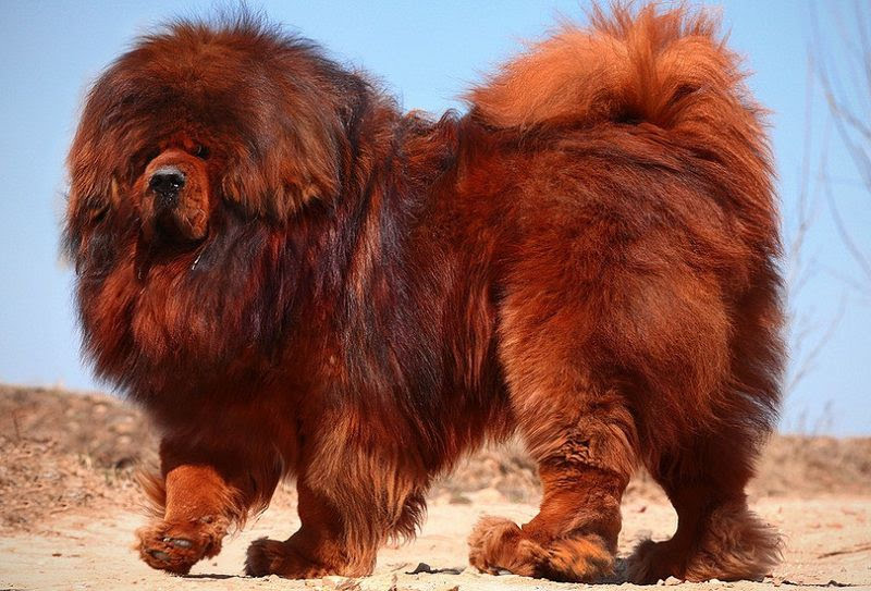
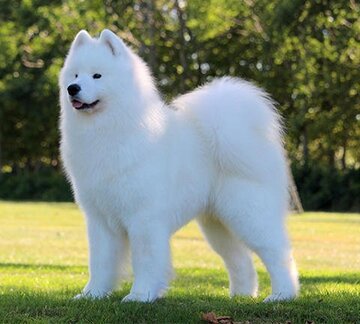
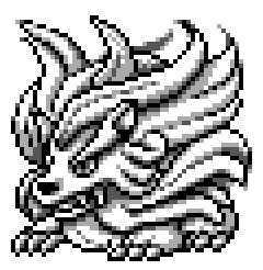 The resemblance isn't 100%, but I can still see why you might think this. Both a Komainu and 349 have a fierce face and billowing hair, and they both look like protectors or guardians. On the other hand, 349 could instead just be a large fluffy dog. There are lots of dog breeds that resemble it:
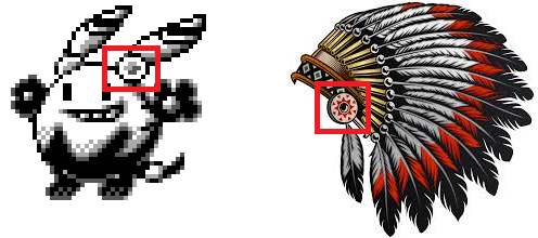
Because of 349’s close positioning to Ho-oh, it has been suggested by some (Dr. Lava, for instance) that 349 was originally meant to be a legendary counterpart to Ho-oh. While there is certainly no evidence that proves this idea wrong, there’s very little evidence for it, either. The theory is that, since the two are so close in the Korean Index, they may have been designed together, but given that 349 probably has a different designer than Ho-oh, that seems likely to be a coincidence. Ho-oh’s on its own in Spaceworld ’97, which makes it fit the pattern of Mewtwo from Generation I; there's no reason to think that it was always seen as part of a pair, since that pattern of mirrored legendaries in Pokemon games wasn't actually started until Ho-oh and Lugia. Besides, at the time it was a simple flying type, which doesn't have an obvious elemental counterpart. 349 could have been Ground-type to oppose Ho-oh, but 349 does not look like a Ground-type to me. I’m not sure what 349 thematically has to do with Ho-oh either, though they do both resemble Chinese mythological creatures. Furthermore, if 349 was designed after a Komainu, the obvious thing to do would be to pair it with another lion-dog, since Komainu are always paired in real life. There’s little connection between them and a Phoenix.  (Picture courtesy of @DrlavaYT ; original picture lovingly drawn by @Raciebeep) Still, there is something awfully regal about 349. It’s flowing hair and it’s fierce face suggest that this isn’t some garden variety Pokemon, but something hard to find, or powerful. One theory was that it was a third evolution in the Arcanine family, which would explain why it looks so formidable and powerful. Still, this doesn’t quite seem to fit either. As a design, it doesn’t look all that similar to Growlithe and Arcanine when put up next to them: 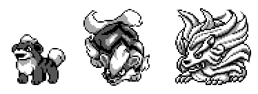 (I'm using the Growlithe and Arcanine sprites found in the Korean Index for the best comparison.) The biggest problem is that while Growlithe and Arcanine have quite a bit of dark shading to their sprites, while 349 doesn't. Maybe as it was reworked Game Freak would have changed its shading to better match the rest of the family, but just looking at them they don't seem related. 349 is, after all, a pretty rough draft, and Sugimori might have later redrew it later. I’m not completely discounting this idea, but I personally don’t buy it. The connection to Arcanine doesn't have to be this explicit, either. 349 may have went unused not because it was an unneeded evolution, but because it shares too much design space with Arcanine and therefore felt redundant. That would make a bit more sense why 349 wasn't brought forward into Spaceworld '97. I'm also curious what typing 349 was envisioned as having. Maybe it was just a Normal-type, but Normal-type Pokemon are often found commonly in the wild and this guy doesn't seem like fauna you'd run into in tall grass. 349 also doesn’t look much like a fire-type Pokemon (though a red-palette might change that), another reason I doubt an Arcanine connection. My best guess is that it was designed to be, strangely enough, a Flying-type. The wispy fur that surrounds its body gives 349 the illusion of a dog inside a cloud, or of wind blowing over its mane. Of course, it hardly makes a traditional flying-type, as those tend to be birds or at the very least have wings. While flying might be a stretch, we’ve seen stranger flying ‘mons in Gen I, like Gyarados or Dragonite. If it wasn't meant to be flying, I could also imagine that 349 might have been developed as an Ice type (its fur could be snow) or something else we can't really predict. I do find it intriguing how well 349 fits in with the Legendary Beasts, Raikou, Entei, and Suicune, at least in their original designs from Spaceworld ’97. Their sprites are not a perfect match to 349, for sure. All the beasts have small paws of about the same size, while 349 has large ones, for instance, and they all have a lankier body type than 349. However, like 349, all three beasts have fur styled into something resembling their element, and each of course resembles a dog (at least before the redesign): 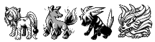 At least to my eyes, it fits right in! Saying that, I doubt that 349 is the long-lost fourth legendary beast. For one, the other three beasts are all right next to each other in the Index at 370, 371, and 372, far away from this shaggy guy. Furthermore, while those three were designed by Nishida (initially, then redesigned later by Munei Saito), 349 is definitely not a Nishida creation. Instead, my theory is that 349 might have been the inspiration for a set of three beasts. Game Freak may have taken the basic concept of a Komainu--a mythological lion-dog found in temples and shrines--and expanded that into elemental beasts. While doing, Game Freak may have decided to give each one a distinctive element to differentiate them more, especially since 349’s ambiguous leaves it with less identity than a legendary beast should have. That also explains why 349 wasn’t seen in Spaceworld ’97, and why its design is still a bit rough around the edges: they had already moved on to better designs on the same idea. Whatever happened, I do think it’s a shame that 349 never got worked on further. But I also definitely can see how the other legendary beasts are better designs, and why they made 349 redundant. ID 350: ??? 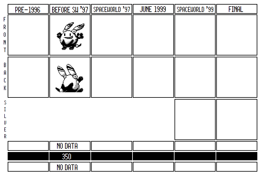 This is…maybe the weirdest design in the entire Index? I’ve stared a lot at this sprite, over and over, and I still can’t make much of it. I find the smile of this mystery creature very off-putting, and the entire design vaguely creepy. What was this guy meant to be? What was his inspiration? Why does his gaze follow me no matter where I move around the room? All of these questions don’t seem to have answers. The first thing that’s readily apparent about ID 350 is how oddly the perspective is drawn. While the body is shaded to make it look ovular, and the black pattern on its lower half gives the impression that the body is cicular, the smile on its face doesn’t match that perspective at all. Instead, the eyes and the mouth look like were pasted onto a flat surface, when they should wrap around the face a bit. Likewise, look at the circles on its ear-feathers. While those should probably be orbs of some sort, they’re drawn like they’re 2D objects that don’t seem to go with the body at all. As well, notice how its hands aren't shaded like most other Pokemon sprites: instead, they're kind of a fuzzy blur once you blow up the sprite. Little things like that make me think a completely different designer was on the job here.  The backsprite, oddly, seems slightly more touched up than the front sprite. For one, its body is shaped a bit more like an egg than the front sprite, and has a bit more depth to it. As well, 350's right foot is popping up just a little in the backsprite, giving it a sense of movement or hopping. It's a different, and probably improved, pose from the static front pose. Its hands are also different in the backsprite: they resemble its feet in the backsprite but are much larger and outstretched in the front sprite. Finally, I also notice in the backsprite how the black part of its body seems to be a bit bigger than the egg part, and it seems to be enveloping the egg-body a bit. In fact, from just the backsprite, the black lower half gives off a of a flower-bud vibe. The ear/feathers are still pretty 2D and still facing us despite the different angle. Beyond the ears though, the rest looks slightly more worked on.  It's odd that these two sprites seem to have subtly separate designs. They seem to have come from slightly different iterations of the sprite, which isn't too uncommon; still, I'd expect the front sprite, being a higher priority, would be the more recent sprite rather than the backsprite. Alternatively, they don't come from different times, but that they are both the first draft of the sprite. Instead of having multiple iterations, this could be rough enough that it was only drawn once, and the differences in the front and back come from the fact that it was never redrawn to match both sprites better. Given how weird and sketchy this sprite is, I'd certainly buy that it was never worked on enough to have gone through more than one draft. So…what is it? The spritework on ID 350 is noticeably worse than on the rest of the Korean Index sprites before it, and it's unlikely that Sugimori or Nishida played a part in this design. The most obvious answer is that it’s a rabbit of some sort, which makes enough sense. But what’s going on with its ears? They look a bit like the cape feather from Super Mario, and they don’t have opening like a rabbit’s ear would normally be depicted with. Those circles on the bottom might be joints: could this be a robot rabbit with opposable ears? Those circles also look like the circles found on Native American traditional headdresses, and so maybe the ear/feathers are supposed to be the feathers of a headdress? Anything seems as likely as anything else.
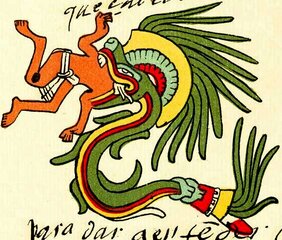
One theory is that 350 was designed as an early attempt at a “Pikaclone,” ie, a Pokemon which resembles Pikachu in order to cash-in on Pikachu’s popularity. 350 does have a general outline that resembles Pikachu, and it looks pretty good with a Pikachu style palette, as @Raciebeep has done:  Gold/Silver did have two Pokemon seemingly designed to cash-in on Pikachu’s cuteness—Marill (aka Pikablu) and Pichu—and so it is very possible that 350 was a very rough draft of another try at that sort of design. But what if, on the other hand, we interpret this sprite completely differently? Take a look again at the backsprite: what if the bottom dark section of 350 is something akin to an egg cup holder, and the top of the body is itself an egg? If that was the case, maybe this is an early design based around the same concept as Togepi: a cute egg ‘mon. Obviously, Togepi’s a much better realization of this concept, but given the shape and the general weirdness of the sprite, I could see an egg as the starting concept. Unfortunately, we’ll probably never know the answers to any of these questions, and ID 350 is always going to be shrouded in mystery. I doubt even Game Freak’s designers remember what was up with this design, since it was clearly very rough when it was abandoned. It seems clear that 350 was never going to make it past the brainstorming stage, and whatever idea was behind its design has likely now been lost to time. ID 351: ??? 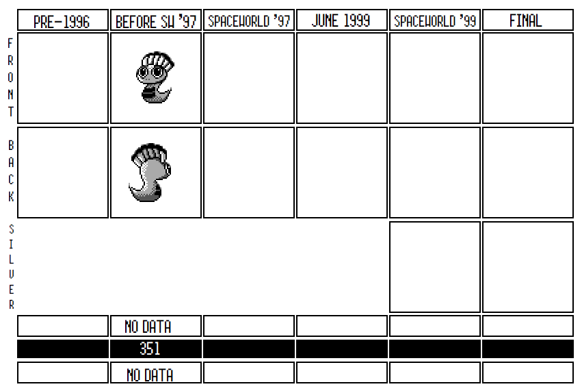 On the other hand, following up our creepy rabbit thing is a cute baby snake guy! I love this little dude, though we tragically have very little to say about him as well. Whatever Game Freak was going for with this guy, he probably just didn’t fill a needed niche. As a result, he probably never made it past the brainstorming stage. The feathers on this snake’s head resemble a native American headdress, another intriguing connection in the Korean Index to Native American cultural styles. We've seen this now a number of times: 350 had feathers on its head that could be connected to a Native headdress; Xatu is based on a Pacific Northwest Totem Pole and his missing middle form looks a bit like a Native American interpretation of a roadrunner; the Kokopelli-style early Celebi resembles Southwestern Native American mythology. This could suggests that all these designs were done by the same person--probably Morimoto--and lends evidence to the idea that everything in Period 1e were his designs. Either that, or the native American influences were something the entire team was interested in and they each kept experimenting on their own. 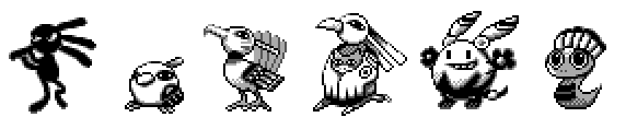 While the Natu line is Pacific Northwestern Indian influenced, and Kokopelli was from the Southwest, ID 351 seems more likely to have a South American influence. On the one hand, its headdress looks a lot like those from stereotypically worn by the Comanche and other American Plains Indians. However, he also looks a lot like a mini-Quetzalcoatl, one of the gods in Ancient Aztec religion. You can see its headdress in traditional depictions of Quetzalcoatl, which often give him a tuft of bright feathers right around his neck.
I know its not a real connection, but 351 also reminds me of the Great Serpent of Ronka from Final Fantasy XIV:  Of course, 351 isn’t yet Quetzalcoatl; he’s just a baby. Like Dratini, 351 has some growing to do before he’s a magnificent beast, and his shape and design all seem to suggest that he’s a first form of an evolutionary line. The problem is, there’s no real candidates for 351’s evolutionary relative. I’ve already mentioned how 344 (The Viking Ship) could potentially be the evolved form of 351, given the similarities in their head-tufts and the lines on their necks, but thematically they just don’t seem too similar. Maybe 350 was designed but never really followed up on? Maybe no one got far enough to imagine what this guy would grow up to be? He’s clearly not a complete concept, and like 350, it is pretty evident that the sprite is still in need of a lot of polishing. For instance, look at the curve of 351’s outline where its head meets its body on the backsprite: it not only looks awkward, but the line between the two doesn’t have any shading or anything to designate a difference between the head and the body, giving it an unfinished look. The backsprite's eye is also really strange: it kind of looks like a growth off the side of the head, and probably should have been refined. Finally, look at the tail on 351’s frontsprite. The tail is drawn in a single, simplistic swoop. It doesn’t really look like it's sitting on real terrain, or that it moves fluently: compare it to varying sprites of Dratini, which do a much better job conveying Dratini’s serpent like design:  In fact, Dratini (along with Ekans) are probably the reasons the designers never went further with 351. A serpent that grows into a large imposing monster is basically the exact design for Dratini, and it also heavily encroaches on Magikarp’s turf. While 351 is cute, I don’t really know what it could bring to the games even if it didn’t grow into something pseudo-legendary: what could a water-snake do that Dratini can’t? It’s possible that Game Freak thought the design was cute, but just didn’t know what to do with him. It’s also possible, given how sketchy everything around 351 is, that all of these Pokemon were never really considered and were mostly just throwaway ideas. As much as I think the little guy’s cute, he just doesn’t really seem to fill any important niches. ID 352: ??? 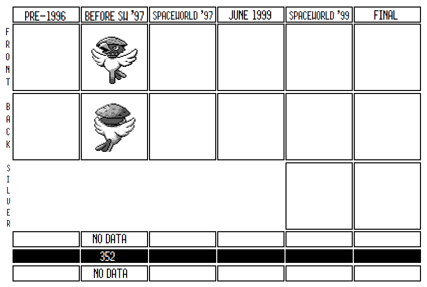 The Korean Index has a ton of bird Pokemon in it, and 352 is the latest in that long line of avian iterations. Of all the scrapped birds, it’s one of the better designs and it has a cute pun at its core. However, I don’t think 352 ever stood a chance: it steps on the toes of too many other Pokemon being introduced in Gold/Silver and doesn’t add enough on its own. 352 is a scarecrow, of course, with a conical hat resembling the hat that Asian (especially Chinese) laborers have been commonly depicted wearing. The hat is incredibly old and has been around forever, but is often used to signal Asian workers, at least in productions made in the west. Which is odd, because 352 is otherwise a design which draws from western inspiration. The idea of 352 is a simple pun: scarecrows are called that in English because they are meant to scare away birds, especially crows, from crops. But 352 takes "scarecrow" literally by imagining that it is, in fact, a scary crow! If you look close, you can even see a tuft of straw coming from 352’s neck, like a normal scarecrow. Of course it also doesn’t have feet, just one stake where it either hops, or is stuck in the ground (it’s hard to tell). 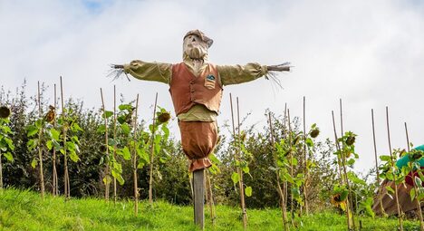 Funny enough, this is almost the same pun that created Stantler. While at first glance Stantler and 352 look completely different, their forms both derive from the same joke structure: Stantler’s Japanese name is Odoshishi, which is derived from the Japanese name for scarecrows, Shishi Odishi, or literally “Deer Scarer.” Thus, Stantler is a “deer scarer” that is also a scary deer. Stantler is a Japanese scarecrow taken literally, and 352 is an English scarecrow, also taken literally. 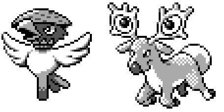 Like Hoothoot, 352 stands on one foot. According to an interview with Sugimori, Hoothoot was built off that core idea of a one-footed bird from his childhood; if he had originally just designed Hoothoot from that concept, it's possible that 352 was an alternate design for Hoothoot at one point. 352 also shares design space with Murkrow; even though it seems that 352 was designed first, once Murkrow was in the picture, they both assuredly fought for Pokedex space as the "crow" Pokemon. Given that Sugimori was the designer of Hoothoot, Stantler, and Murkrow, it seems very likely to me that 352 is a Sugimori design too. Which is a bit odd, since the rest of Period 1e doesn't look like his designs at all. 352 is drawn and shaded much better than 350 and 351, and resembles some of Sugimori's designs from Period 1d. I have no idea why a Sugimori design would be in the middle of Period 1e, unless I'm wrong and all of 1e are incredibly sketchy Sugimori ideas. It could also be that Period 1e wasn't the work of one creator, but that everyone's leftover designs were simply dumped after Ho-oh. Even if 352 made it into the games, it would have carved out a weird place. If it hopped around, it strikes me as crowding in on Kyonpan's turf, given that Kyonpan was based on a Chinese hopping-zombie. It was assuredly Flying-type, like all bird Pokemon, but it doesn't really look like it could fly at all, making 352 the weirdest flying type since Doduo. I'm also not sure how to construct an interesting moveset for 352: it doesn't have enough intriguing features to suggest any type of signature move, and whatever moveset it got wouldn't be that different from Pidgey or Spearow. 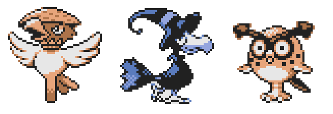 (352 colorized by @OrangeFrench)
352 does feels like it had a little more work put into it than those before it, but it probably never was seriously considered for inclusion in the main games. Hoothoot appears to have been destined to be included in the Pokedex from the beginning, and Game Freak already had too many bird designs. There’d be no reason for another one-legged bird to appear alongside Hoothoot. Even if they made room, once Stantler was added to the roster after Spaceworld ’97, would it really make sense to have two Scarecrow Pokemon, much less two based on the same joke? Murkrow fits an important role as a basic Dark Pokemon, to teach players about the new type, but I doubt 352 was ever going to play a similar role. I don’t really think 352 ever stood a chance for inclusion, even if the inspiration for it is, admittedly, pretty clever.
4 Comments
|
AuthorMy name's Aaron George, and I'm both a historian and a fan of Pokemon, especially of development. Reach me at @Asmoranomardic ArchivesCategories |

 RSS Feed
