|
Period 2a was, overall, a pretty straightforward section of the Index. There, we saw the Pokemon team create all three starters (though of course two of those starter lines would eventually be replaced), along with Pokemon like Rinrin and Skarmory that showed off the new typings the team had come up with. Alongside those were the first baby Pokemon, the first Pokemon made the breeding mechanic/Daycare system, and the legendary trio of these games. Period 2b, upon first glance, looks much stranger, and a pattern is initially much less apparent. While almost everything in 2a was used in Spaceworld ’97 (at least), about half of 2b didn't even make it that far. Much of 2b feels like a throwback to sketchier ideas, back into the Animal+ designs that characterized the first era of the Index, and it doesn’t seem ordered in a way that makes a lot of sense. After the logical ordering of the previous section, Period 2b is a 180 degree turn. However, once you examine this section more, a pattern does emerge. Notice first how almost exactly 50% of Period 2b is discarded, and the discarded designs almost always trade off with used designs. The pattern we see emerging is of two Pokemon in the Index right next to each other, one used and the other one discarded. What seems to be going on is that the Pokemon were in competition with each other. Both were made to fill the same concept or niche, and only one was chosen to appear in Spaceworld '97. Why did they switch to this pattern now? It could be related to how many slots in the Index the team had already used. By Period 2b we’re up to 78 new Pokemon designs, and even the final game only added 100 new Pokemon, so the team must have begun to know that the open slots for new Pokemon were getting filled. Rather than just throwing out more designs, it seems at this point the team started creating competing designs to fit the last niche's they needed for the new roster. It seems as though the designers were designing to a checklist, trying to create a Pokemon that fits in a needed role in the final game. Thus, Period 2b is defined by a series of “either/or” competing designs. The first two in this section are a Stork or Pichu, both of which fit the niche of designing something to do with baby Pokemon, and only one of which was chosen to make cut off for Spaceworld ’97. After that, we continue to see competing designs like this: Pokemon designed to fit odd type pairings, a choice of two bug Pokemon evolutionary families, woodland Pokemon who could live in forests, Ice or Fire dogs, and a pattern that’s more difficult to pin down. It looks like each slot in the next sixteen was paired up with the one around it, and the team was supposed to decide on one or the other for inclusion. It’s notable that exactly half of Period 2b found its way into Spaceworld ’97, and the rest was scrapped. It isn’t clear if Octillery and the Kudagitsune were part of this pattern; my gut tells me they are and I misplaced them in the previous section. However, they don’t have an obvious counterpart nature, so maybe not. On the other hand, it might be a mistake to imagine there was a direct contrast between every pair in Period 2b; the designers may not have thought about it that strictly. Maybe Octillery and Kudagitsune were a pair, but they weren't made to directly contrast each other. Anyway, as we go through this next section of the Index, I’ll try to focus on how each design contrasts with its rival, and speculate on exactly why one was chosen over the other. Counterparts: ID 378 and Pichu
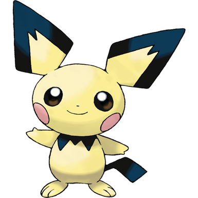
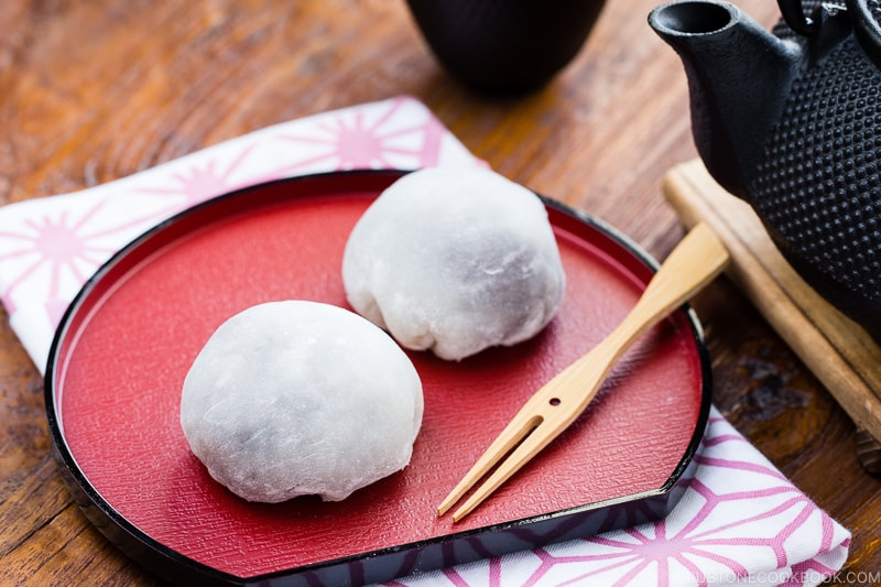
(On the left was created by Racie B; the right image is official artwork) To start off Period 2b, we have an odd pair. One's a Stork that didn't even make it through design long enough to appear in Spaceworld '97. The other is Pichu, one of the most memorable and beloved Pokemon of Generation II. The reason these two are competing in the Index is because they both represent alternate directions the team could've taken in regards to baby Pokemon and the breeding mechanic. Period 2a saw the first Pokemon designed with breeding in mind, and also showed us Cleffa, the first time a baby Pokemon was designed explicitly as a baby Pokemon (Elebebii was probably just thought of, originally, as the first evolution of Electabuzz). It’s likely that the team came to a crossroads at this point in development. Should they focus more on adult Pokemon (like Miltank) that interacted with the breeding/daycare system? Or should the team create more baby Pokemon, like Cleffa (and Elebebii) to capitalize on the system in a different way? From our vantage point, it’s easy to see what the right decision was. Babies added a natural incentive to play around with the breeding system, and were natural mascots for the series: take the most popular Pokemon, and make them chibi and even cuter! However, I’m sure there was at least some uncertainty about whether that was a good option: Cleffa is cute, but the team assuredly knew it was useless in battle. Making more baby designs would fill up the precious last slots of the game with Pokemon generally useless except for collecting. To choose Pichu over the Stork would be to swerve from the designs goals of Generation I, in which the Pokemon were, above all else, there to fight. Instead, the inclusion of so much babies would send Pokemon down a new genre path: that of a monster collector. We all know which direction the team went in. ID 378: ???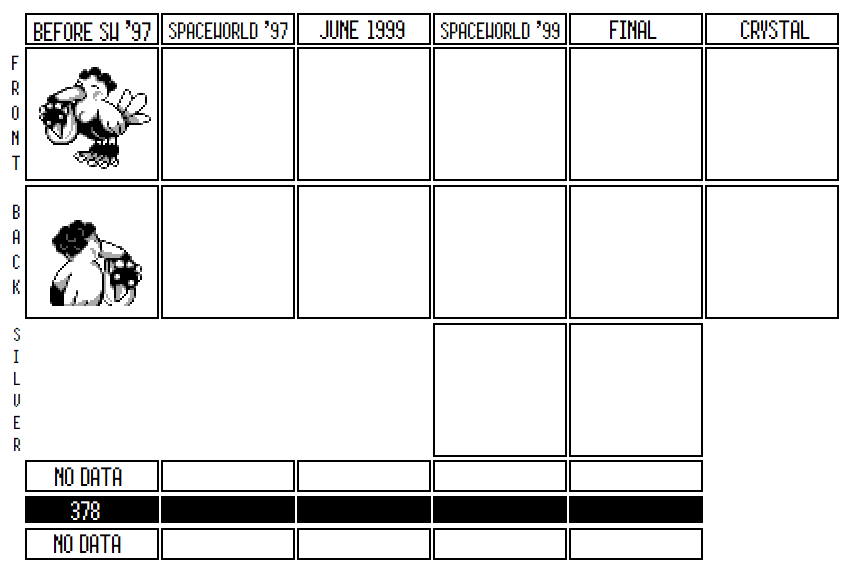 To start off Period 2b, we have an adorable stork guy. Look at it's happy mug, it's so excited to be here! The overall look of the design reminds me a lot of Nishida’s handiwork, though really, this could have been made by Oota or any of the newer designers for whom we don’t have much information. As cute as it is, the Stork clearly didn’t fit the design needs of Gold and Silver, and although there is some evidence here that it went through at least a couple of drafts, it’s nowhere to be found in Spaceworld ’97, leaving it somewhat of a mystery. In a lot of ways, ID 378 looks a lot more like a Generation I design than the style that the team has settled on since the beginning of Era II. It’s a lot cuter and less monstrous in design than what we got out of Generation I, for sure, but it is very clearly an Animal+ design, with very little interesting features besides its identity as a stork. However, the mythology surrounding storks and babies is apparently more uncommon in Japan, making this feel more unique than it does to western eyes. Saying that, 378 is not the first stork to have shown up in a Japanese game.  378 reminds me most of Pokemon like Kangaskhan, or the unused Marowak evolution. All three emphasize a motherly role in taking care of a baby Pokemon. There's also some Dodrio in this design, in its pose and its tailfeathers, though admittedly Dodrio is a much angrier dude. It’s likely to me that Kangaskhan was the inspiration for 378. By Period 2b, the team was deep into trying to figure out how the breeding mechanic would work, and creating another motherly ‘mon seems like a natural experiment to undertake. 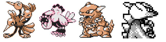 (378 colorized by @FrenchOrange) However, parent Pokemon are clearly a bad idea once we think about them more, and the whole idea of 378 kind of falls apart. First of all, if you bred 378, would it hatch already holding a baby in its mouth? And the baby looks significantly different than 378 itself, a coincidental callback to Kangaskhan's blue baby. The obvious thing to do would be to make the baby stork a pre-evolution. It could eventually evolve into 378, and get a baby in its own mouth! However, nothing like the baby is anywhere in the Korean Index, so the team likely never got that far before they decided against 378. But even if the team did design a pre-evolution to the Stork…then they just created another baby Pokemon! And if the team already committed itself to making more baby Pokemon (remember, babies are useless in actual battles, so presumably going the Stork route in development would have the primary perk of making more usable Pokemon), than why not make Pichu, rather than a generic bird baby connected to a Stork no one’s seen before? It’s pretty clear, then, that this concept was doomed from the start. On top of the other problems, 378 is yet another example of the huge amounts of uninspired bird Pokemon in the Korean Index. Given the heavy competition between new birds in the game—and the fact that Hoothoot, Natu, and the upcoming Murkrow are far more inspired designs than 378—it also seems as though the Stork already was competing for a crowded niche, even if you ignore the problems with its concept vis a vis breeding. 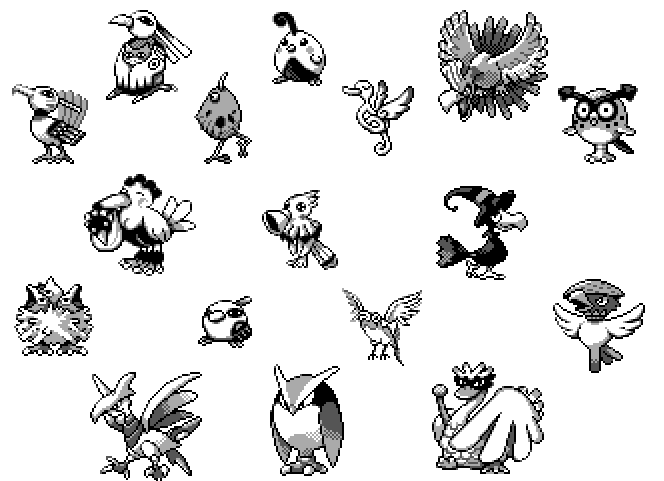 There are just...so many bird Pokemon in the Korean Index. Another possibility is that 378 was an even older design taken from Generation I's design and reintroduced as the team was brainstorming more ways to use breeding. This isn’t the only time old designs would return in a new context during Era II: two slots after this, ID 380 is a Squid that is suspiciously similar to unused Generation I backsprites. As well, wait until Period 2c to see how the team repurposed a lot of older Generation I designs into baby Pokemon. I don’t have a lot of evidence for this, except for the design similarities between 378 and Kangaskhan or even Dodrio. If it was repurposed for Gen II, it certainly got redrawn, since the sprite in the Korean Index doesn’t look like one initially drawn for Generation I. 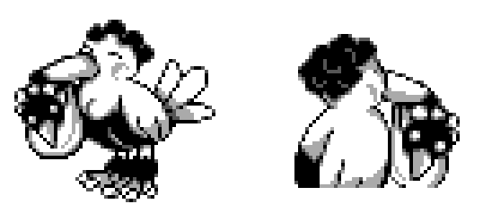 One thing that could be significant, or could be nothing, comes from a comparison of the stork's two sprites. The backsprite has a few discrepancies from the front sprite, such as it's lack of tailfeathers; this could be an indication that the front sprite was redrawn and there was an earlier design, or just artistic license. Anyway, for some or all of the reasons given above, 378 never saw the light of day, and because of that we know very little about how it would have functioned. Instead, the team quickly decided that its slot would instead be filled by ID 379: Pichu. ID 379: Pichu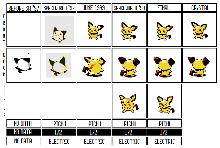 Pichu might be the Pokemon from Generation II with the most name recognition; really only Ho-oh is in competition. It’s the only Generation II Pokemon to feature in Smash Brothers, and Pichu is a regular presence in all sorts of spin-off media. While it certainly isn’t the crowd pleaser that Pikachu turned out to be, Pichu has a legacy that few other Generation II designs have. 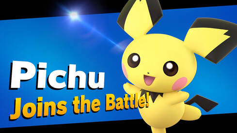 Pichu’s important because his place in the Korean Index denotes the point at which Game Freak decided to go all-in on baby Pokemon. Elebebii was probably designed around a different idea, and Cleffa was an experiment, but Pichu shows that the team had finally signed off on making this subgroup of Pokemon a feature of the new games. In addition, Pichu also seems to be where the team made another important change. While Cleffa was the first baby Pokemon designed, the team wasn’t sure what the design philosophy was going to be for a “pre-Clefairy,” and the sprite looks kind of odd. But with Pichu, the design team realized what was obvious: that babies should take what was successful about the parents’ designs, and exaggerate them, making them even cuter. Pichu’s initial design dialed the cuteness up to eleven. It did so by simplifying Pikachu as much as possible, into a round circular puffball with pikachu’s signature cheeks and some exaggerated ears. The Cutting Room Floor suggests that this initial design was meant to mimic a daifuku, or Japanese dessert. This was the same dessert that the original version of Pikachu was originally designed to resemble, which makes this theory about Pichu make sense. If Pichu really was based off a Daifuku, then it is possible that Pichu was, oddly enough, inspired by Pikachu’s lost original design, rather than just by chibi-fying the existing Pikachu.
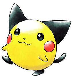
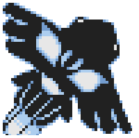
(Left is by @RacieB, right is a daifuku) Note that by the time of Spaceworld ’97, Pikachu’s design hadn’t quite evolved into the sleek, anime inspired design that Pikachu sports in Yellow, and that may have influenced the original design for Pichu. In fact, when you put the original Pichu up against the “fat pikachu” Generation I sprite, or the sprite from Spaceworld ’97, there a much more natural resemblance than if you compare Pichu to the final design in Gold. While Pikachu hadn’t quite evolved into the modern design we all know by the final Gold sprites, you can tell that the amendments to Pichu’s design, which made it sleeker and gave it a more identifiable neck, were made with this design change in mind, and that the final Pichu sprites much more match the thinner design for Pikachu. 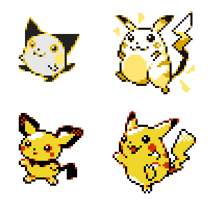 It’s also worth putting Pichu up against the early sprites for ID 306 and 307 as well, given their possible connection to the original design for Pikachu. Way back when, when we discussed ID 307 in Period 2b, I speculated that 306 was the original Pikachu design, brought back from the grave for another chance in Generation II. If 306 does have a connection to the original Pikachu, then maybe Pichu’s sprite was developed out of 306’s; they’re obviously different designers, given the differences in how the sprites are drawn (look in particular at the shading around the eyes), but maybe there are enough similarities to buy that 306 is related here? You be the judge. I’m also including 305 here, because it’s round ball design also has its own similarities with Pichu.  I really love this round Daifuku design for Pichu, much more than I like the final design. It’s elegant in its simplicity. However, the final designs for Gold and Silver often moved away from these sorts of designs, instead adding a lot of details that made the final pokemon resemble cartoons a lot less and real creatures a lot more (see, for instance, how Quagsire became less exaggerated, or how the Hoppip line grew arms and legs). The final Pichu design also better matches the final Pikachu design. However, we actually have a third design of Pichu as well! Unlike most of the other Pokemon in the Spaceworld ’97 build, there are some sprites of Pichu's awkward transition that the team experimented with between the original and final sprites. Behold: awkward derp Pichu! 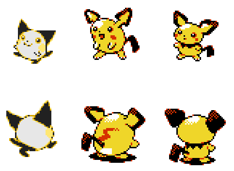 What’s weird about this is that the sprite isn’t used in the June 1999 sprites we have, only as the silver sprite in the Spaceworld ’99 files. Regardless, it’s definitely an earlier design, since June 1999 uses a back sprite that exactly corresponds with this guy. He’s clearly a rough design: the expression on his face looks weird, his ears are still being refined, and the pose is strange and unnatural. It’s clear Game Freak wanted to move away from the round puffball, but weren’t quite sure how to yet. Elements of this design were reused when the team created the final Silver sprite for pichu: if you pay attention, you can see that it has the same face and mostly the same tail, but that the rest of it was reproportioned and pichu was given a neck. It makes sense why the team were so slow to give Pichu a neck, as Pikachu didn’t really have one at this point in Pokemon history, and it would have been weird for him to lose his neck upon evolution. Funny enough, even if the no-necked design didn’t work very well in Pichu’s case, some later “Pikachu Clones” have this same body type:  Gameplay-wise, only one thing stands out about Pichu's evolution to the final. For the most part, Pichu follows the same pattern through development as Cleffa and Igglybuff. It initially evolved into Pikachu at level twelve (which doesn’t make a lot of sense lore-wise, as you can encounter Pikachus in Viridian forest at a much lower level than this). Then, like the rest of the babies (except for Elekid, Magby, and Smoochum) its evolution level was standardized at ten, then changed to a condition of high friendship. Otherwise, its base stats stayed the same, and it’s moveset followed what we saw with Cleffa. Initially, Pichu had the same moveset as Pikachu, just learned at a lower level, but by the final, Pichu had lost all of its moves except initial level one moves and the addition of Sweet Kiss. Pretty standard stuff. However, while the three babies (Pichu, Cleffa, and Igglybuff) were standardized to evolve with high friendship, Pichu was changed to a friendship evolution one month earlier than the other two. It wasn’t the first friendship evolution: Chansey and Espeon were the first to evolve with high friendship, while Umbreon and Crobat were changed to evolve with low friendship at the same time as these two (and then changed to high friendship when it became apparent a low friendship evolution was a terrible idea). Thus high friendship evolutions were an idea that preceded Pichu. Saying that…the friendship mechanic was initially developed in Pokemon Yellow, as a way of tracking how much your Pikachu in that game loved you, and what mood it would show off if you talked to it. Which means that the idea for a high friendship evolution might have been inspired by the bond you form with your Pikachu in that game. While Blissey and Espeon pioneered the idea, high friendship was a natural choice for a Pichu evolutionary method, given where the idea originated. The team may originally have decided on this evolutionary method as being unique to Pichu out of all the babies, and then only expanded it to Cleffa and Igglybuff when it showed promise. One last thing worth noting about Pichu is that the creation of Pichu formally closed off the possibility of the unused Raichu evolution, Gorochu, ever being brought back in a later generation. No Pokemon has ever had four direct evolutions, and so once Pichu was chosen to be in Generation II, Gorochu no longer had any space in the evolutionary line. To my knowledge, this is the first point in Pokemon’s development that one of those old unused designs from Generation I were formally trashed, with no chance to be reused. With the existence of Pichu, the designers had already changed how they conceived of the Pikachu family line. Most significantly, the creation of Pichu is an acknowledgement that Pikachu was the mascot for the franchise. Had the team known Pikachu would be the massive hit that it was, they probably would never have created Raichu in the first place: why encourage players to trade away the iconic fan favorite for a less beloved design? They even try to stop players from getting a Raichu in Yellow, by preventing the player’s Pikachu from ever evolving: that’s not behavior we’d expect from a team who believed in Raichu’s design. Had Gorochu existed, this would have just compounded the problem, by making Pikachu the insignificant starting member of a line that most players would evolve into Gorochu as soon as they could. However, by replacing Pichu with Gorochu, Pikachu’s predominant place in Pokemon is established: Pichu only exists to be a proto-Pikachu. While Raichu is still a problem, the evolutionary family is now much more Pikachu focused, promising that players won’t forget or discard the mascot of the entire series. Anyway, Pichu’s inclusion in the games marks the point at which the team decided to go all in on baby designs. Rather than experimenting with parenthood depicted through Pokemon, now the idea of chibi mascots is established, and from this point on in the Korean Index, the team would design nearly a dozen other baby Pokemon, so many so that most were cut from the final game. Between Pichu and the Stork, this was an easy decision for the team to make: other counterparts in Period 2b will prove to be much harder.  Counterparts: ID 380 and Mantine 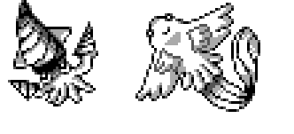 It’s a little less certain exactly what the trade off between the next two Pokemon in Period 2b was. My best guess is that the team was trying to design a water Pokemon with an unusual secondary type. Thus, the next two Pokemon pair Water with two types that you normally wouldn't see alongside it: 380 probably paired water with Ground, and Mantine paired it with flying. Yes, Gyarados had previously shown players what a Water/Flying Pokemon would look like, but Gyarados’s flying typing never connected much with its design or gameplay: it learns no flying moves, and its resemblance to a koinobori (and windsock shaped like a dragon) doesn't really stick out in a significant way, and is something completely lost to western fans. On the other hand, Mantine, in it’s original design of a fish with feathers, soaring through the air, is much more obviously designed after the brief: what would a water pokemon that could fly look like? Mantine can answer the question of how that typing would actually work, though admittedly even in Spaceworld ’97 it also didn’t learn flying-type moves. Mantine’s counterpart is ID 380, a squid that may have originated in Generation I. At first, 380 looks like a simply animal design, except for the fact that it has drill arms and a drill on its head. These augmentations clearly suggest that 380 was supposed to be Ground type, or at the very least, Rock type. There were no Water/Ground Pokemon up until this point, and so, like Mantine, 380 would be charting new territory. There’s also a nice symmetry in that while Mantine was a water Pokemon who could fly, 380 was one that burrowed in the ground. It isn’t clear why one was chosen over the other, though it is worth noting that Mantine was almost completely revised by the final games, suggesting the team wasn’t happy with how on-the-nose the designs of Mantine or 380 were. In the end, the decision between the two could have come down to game balance, or the team may have just liked Mantine more. We don't have a lot to work off of in speculating why Mantine was chosen over 380, so your guess is as good as mine. ID 380: ???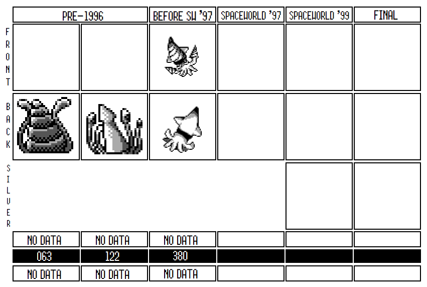 The unknown Pokemon occupying slot 380 in the Korean Index is intriguing for many reasons. First of all, it’s very likely a holdover from Generation I, where it was also unused. Secondly, 380 seems to be sporting an otherwise rare typing combination of Water and Ground. As I said above, this Pokemon was probably meant to compete with ID 381—Mantine—for a slot in Spaceworld ’97; in the end, Mantine seems to have been the more favored design. The Pokemon 380 reminds me the most of is Inkay, though obviously the design similarities are a coincidence. Both are designed after the same type of squid and that the same sort of triangle design on their heads. There's no way 380 was redesigned into Inkay, given how far apart in creation they. It's still kind of interesting to see a similar idea much later in Pokemon's lifetime. 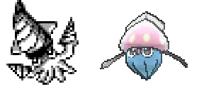 So far in the Korean Index, we have, admittedly, had a lot of water Pokemon show up: Gurotesu, pre-Gurotesu, Ikari, Marill, Quagsire, the Manboo family, Politoed, Quilfish, its aborted evolutionary relative, and the Viking boat Lapras-like beast. Obviously, the team wasn’t lacking any inspiration for water Pokemon. However, they were lacking diversity, and it could have been the case the team was having difficulty making these new water types appreciably different from what they already had in Generation I. Generation I was full of water types, and they had covered most of the archetypes available to the team, given the narrow range of water moves in these first two generations. The Tentacool family combined water with Poison and had the annoying bind effect; Gyarados and Magikarp gave us a weak Pokemon turning into a terrible dragon; Seel and Shellder were both water Pokemon that gained the ice type upon evolution, and one was offensively statted while the other one was a tank. Finally, Staryu and Starmie explored the design space for Special attackers, and alongside Slowpoke, they tried out the concept of water/psychic types. Compared to the diversity of typing and design space taken up by Generation I water types, what do we have in the Korean Index? Looking through them reveals a startling lack of diversity. Ikari, Gurotesu, and Manboo were also Water/Steel by the time of Spaceworld ’97, but they probably weren’t originally designed that way, especially since Steel wasn’t formally introduced as a typing until Skarmory. Ikari might have been the first idea for a Steel Pokemon, but given that Manboo and Gurotesu have their own evolutionary lines in the Korean Index, its very unlikely they were originally anything but pure water. Meanwhile, Qwilfish and Quagsire, while being dual-typed in the final games, were pure water Pokemon by Spaceworld ’97, which probably means the proto-Qwilfish that appears earlier in the Index was also pure water type. Slowking was Water/Psychic, but it didn’t really expand the diversity of water Pokemon you could catch, since it was attached to Slowpoke. Remoraid was pure water (though making it the “beam” Pokemon it did find a unique niche), as was Octillery. Politoed was pure water, Marill was pure water, and while we can’t say for sure, I can’t imagine what typing the Viking Ship Pokemon would have been except for pure water as well. So even if the team had designed a lot of water Pokemon, by this point in development all of them basically fit the exact same niche.  Thus, as the team got to the last few slots they had available in Period 2b, they might have decided they needed to fix the lack of diversity in their new water types. Thus, ID 380 and ID 381 were designed specifically to address that problem. While we’ll talk about Mantine in just a second, let’s look at exactly what’s going on with ID 380. The first thing that jumps out about 380 is the drills on its arms. While we can’t know for sure the purpose of these drills, they seem designed specifically to signal that this guy is more than just a water type. While the drills could be related to the rock type, it seems more likely that they indicate that 380 can burrow into the ground, and thus that it was dual typed as a water/ground type. Up until this point, Pokemon hasn’t had a water/ground type, though Omanyte and Kabuto were Water/Rock. If the team was trying to explore new design space, then it seems reasonable for them to find an unused typing combination and design a new Pokemon to that typing. That’s what we also see in the case of Mantine, and as I’ll talk about much later (at the very end of the Index), there’s reason to believe the team was considering making Quilfish Water/Electric, another unused type. So it isn’t a stretch to think that this is the origin story of ID 380. However, even if this was the inspiration, it’s got to be a bit more complicated. Notice how the back sprite of 380 conspicuously lack any drills, 380's most defining feature. While we’ve seen other instances of back sprites in the Korean Index that don’t match the front sprites, this is by far the most obvious case of that discrepancy in the entire index. Presumably, the lack of drills on the back sprite means that there was an earlier design without drills that got overwritten before 380 was scrapped. This could mean a few things. First, it could mean I’m wrong, and that 380 was initially designed not to a mandate to create a diverse water type, but simply brainstormed as another generic water type before being repurposed. Secondly, it could mean that 380 was always meant to be Water/Ground, but the first pass at its design didn’t make that obvious enough: it might have looked just like a normal squid and so the designer went back to it and added the drills. 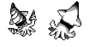 The third explanation, and the one that seems most likely to me, is that ID 380 wasn’t designed whole cloth to fit the need of a Water/Ground Pokemon: instead, it was an old design from Generation I, copied into the Korean Index and then repurposed to be a water/ground type. Under this theory, the team was asked to find other designs of water Pokemon they could use and make sure those new designs had the potential to be dual typed in some way. One member of the Pokemon team—likely Nishida—went in one direction to design Mantine, while another looked back through their old designs and came across two squids originally dropped from Red and Green. We have their backsprite designs, which you can see here: While we don't have any idea what these squids looked like from the front, RacieB has made fan art that approximates what they could've been: 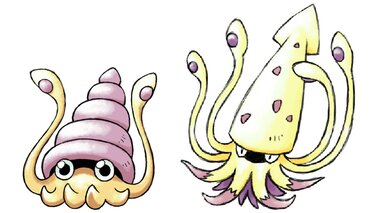 In Generation I, these were probably evolutionary relatives of each other, though its unclear which evolved into which. They were probably dropped for redundancy: Tentacool already filled the “sea creature with tentacles” theme and Omanyte already fit the idea of a sea creature with tentacles living in a shell. But while flipping through these old designs, someone on the Pokemon team may have realized that while they were redundant in Generation I, a squid Pokemon would be completely unlike what they had designed so far for the sequel games. Furthermore, it might have occurred to the team that the Squids could easily be repurposed into a dual type: notice how the first backsprite’s spiral shell resembles a drill, and this might have inspired the team to make that a core component of their updated squid. Thus, a designer probably copied a drill-less version matching the original design of the right squid first and then edited it to reflect the drills. The design probably didn’t last long enough for them to ever get to redoing the back sprite. If you look closely at 380’s front sprite, you can tell the drills were added hastily and somewhat sloppily to the original sprite. First of all, look at the way the drills are just straight lines drawn over the tentacle/hands. The darker shading of the left drill doesn’t match the shading of the tentacle at all, and the lines of that drill don’t match it’s companion at all. They don’t even connect to the tentacles at straight angles, but are ever so slightly off. Beyond its arms, look at the drill on its head: not only does it bend at the tip, much more like a natural head of a squid than like a real drill, but the two fins on its sides don’t really connect logically to the side of the drill: how would that even work when the drill was spinning? As far as 380s head is concerned, it looks like someone drew in the drill on an existing sprite, but didn’t actually draw a new outline for its head to accommodate the drill design. It’s pretty clear overall that the drills were added quickly to an existing sprite, possibly as a proof of concept of the idea to make it ground themed. 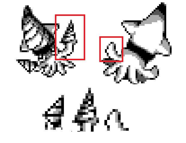 Now, there are reasons to think 380 isn’t related to these back sprites. First, you might ask which of the unused Squids 380 was based on? It doesn’t seem to be either, as its head and body are proportioned differently from either. If it was an updated version of the squids, 380 was most likely an amalgamation of both designs, rather than just one or the other. The second objection is that 380’s tentacles don’t look anything like those of either squid: it’s got short stubby tentacles, while they have long, tentacool-like ones. However, maybe that’s the reason 380 got smaller tentacles: to differentiate it from tentacool. Furthermore, we know that designs brought back from Red and Green underwent heavy transformations before they were transferred to the Korean Index: just look at how different the unused elephant’s initial design was from ID 309, or how much Politoed changed from it’s origins as Missingno. 84. ID 380 certainly doesn’t look any more drastically different from the squids than those Pokemon do. So why did the team decide to use Mantine in the end, rather than 380? We can only speculate. The choice could have been about balancing reasons: maybe in the initial Spaceworld ’97 version of the game, there just wasn’t a good environment to find a water/ground Pokemon, while Water/Flying fit into the world more easily. It could also be that the team liked the new design of Mantine more than they liked this hastily pulled together reuse of a previous design: Mantine would have looked a lot more fresh and original to the team than 380. Maybe it was luck: whoever designed the drill squid may have begun to work on other projects, and thus when it came time to choose between it and Mantine, Mantine had the more developed and cleaner sprite. We’ll unfortunately never know the truth. In the final game, the team solved the lack of water Pokemon diversity by adding secondary types to other water Pokemon. By Spaceworld ’99, Quagsire and Qwilfish both got a secondary type. Quagsire’s typing could be because the team liked the idea of introducing the heretofore unknown Water/Ground typing, even if they ultimately rejected 380. Certainly, Quagsire doesn’t look obviously like a Ground type, so the change must have been for more reasons than its flavor. In the end, the extra ground moves and typing in Quagsire might be the last legacy of 380: having proved that a Water/Ground Pokemon would be a neat addition to cover new Ground, the team found another Pokemon better able to fill that design space. ID 381: Mantine (Haneei) 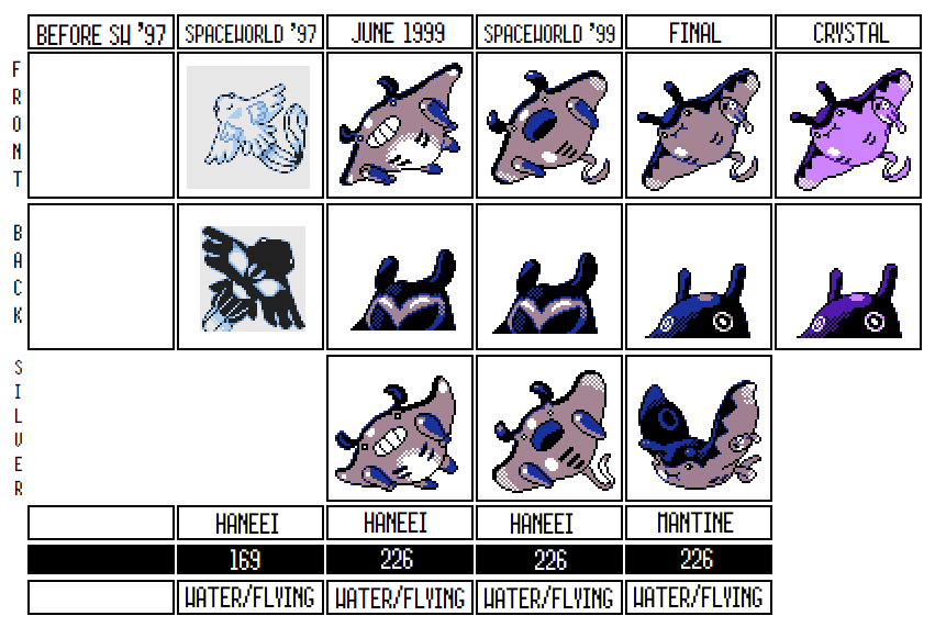 Mantine started life looking very different, but the core concept remained more or less the same in the final. Probably designed around either the brief “create a water/flying Pokemon” or the broader mandate, “create a water Pokemon with an unusual second typing,” Mantine’s original design seems closely designed to answer that exact question. By the final game, they’ve toned down Mantine’s associations with the flying type , but it gained an interesting relationship with Remoraid which gave it a unique twist. Like I discussed in the opener, ID 380 and ID 381 were probably designed to compete for the same slot in the Index. While ID 380 was probably derived from pulling an old design from the archives and improving it, Mantine was a fresh idea. In its earliest form, Mantine had fins styled after feathers, an obvious start if a designer was trying to imagine “what would a water type look like if it could fly?” The decision to use a manta ray as the base inspiration also makes sense from this foundation. A Manta Ray has large fins that seem akin to wings, and overall looks like a living kite, further giving Mantine a thematic link to flying Pokemon. It’s original name, Haneei, which was used for almost the entire time in development, even means “Winged Manta Ray,” or “Jumping Ray,” showing that the inspiration for this guy wasn’t exactly nuanced. 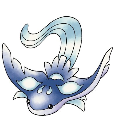 (Credit to @RacieB) The original design also drew a little more obviously from Manta Rays in that it had a sinister face on its back. It’s meant to mimic the elaborate designs on the backs of real manta rays, which often look like faces, or at the least a Rorshach test.
This is a striking design element: this evil-looking pattern visibly contrasts against the graceful, more angelic bottom half. Sadly, this trait was ultimately watered down, not unlike a lot of ther Gen II designs, not sticking around past Spaceworld ’97. The final version of Mantine still has two dots on its back, possibly a leftover or an evolution of its original design's evil face motif. This face also reminds me of Spinarak and Ariados, which were also designed in Period 2b and originally both had a face on their back as a central design element. Maybe the same developer made Mantine and the Spinarak family; maybe they liked the design on Mantine and it inspired them to try it on a creature who fit the idea better? 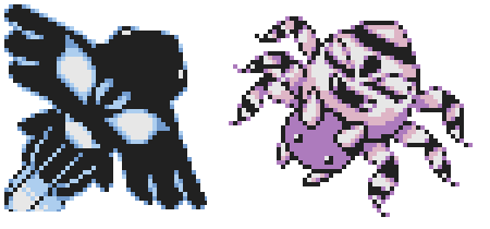 ...I mean, the face looks very similar to Ariados's Spaceworld '97 design. When the team redesigned Mantine, the team completely changed its look. Like most of the redesigns the team undertook in the transition from Spaceworld ’97 to the final, this one made Mantine’s core properties subtler and more nuanced; unlike most of those redesigns, this one actually made Mantine resemble a real life animal more, rather than abstracting away from it. The new Mantine is less sleek and now looks like a grey Manta Ray; except for a vague sense of it soaring through the air in its sprite, any indication that it’s flying--like the defining "feathers" of the SW'97 design--are now gone. Mantine’s also now grown some horns/antennae on its head, and interestingly enough, torpedoes under its wings. 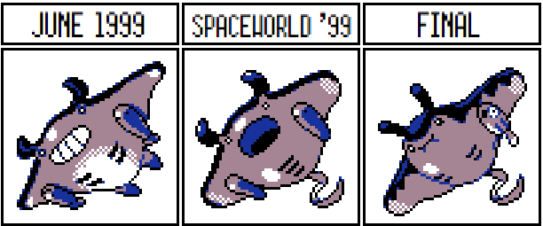 Maybe taking a page out of Octillery’s book, the team decided to base the new Mantine vaguely off of a submarine, further divorcing it from it’s original origins as a showcase for a water/flying type. It could also be a fighter jet, since it still kept its Flying typing and even gained Wing Attack, a flying-type move, by the time of the final. Speaking of its moveset, almost all of Mantine's moves were changed in the redesign. None of them really changed it's flavor but instead just fit its body type more. The new Mantine doesn’t pound or thrash at its enemies, but instead tackles and slams into them with its bulk. The new redesign isn't a drastic rethinking of Mantine, but even though each piece is small, it adds up to an almost completely different Pokemon. My favorite bit about Mantine is how the designers weren’t really sure what it’s face should look like. In succession, the team tried out a Mantine with a giant grin (my personal favorite), then one that looks like it's screaming, and then finally a smaller, cartoonish, closed mouth with puffed cheeks. The grin is… a lot, design-wise, and while it may have been deemed to be too human-like, the "scream" face is a bit too bland and realistic for its own right. Personally, I think it was a bad choice to get rid of these unique facial designs. The final Mantine seems to lack the ''je ne sais quoi'' that the earlier iterations had. The last change to Mantine was to its "torpedoes." In the initial redesign of Mantine, he had gained some grey torpedoes/missiles just under his fins, to go with the submarine/jet aesthetic. It looks like the very earliest designs for these were simple torpedoes; however, by June 1999, each of them has gained two tiny black dots, resembling tiny eyes. Who knows what the design team’s intention for the torpedoes was at this point; the two dots are barely visible and might not even have been intended as eyes, or perhaps Remoraid was supposed to "evolve" in a way similar to Slowbro's Shellder. The torpedoes stayed like this until right before the release of the game: even by Spaceworld ’99, three months before release, they were still torpedoes. Only in the final game were they replaced with a single Remoraid hanging from it’s left wing. While it still somewhat resembles a torpedo, the connection is much less obvious. What happened? My guess is that the torpedoes disappeared for the same reasons that Octillery stopped looking like a tank and Remoraid became less obviously a gun. Fears of parents objecting to weapon Pokemon, especially in the wake of the Columbine shooting, could have contributed to the team deciding to back off of any designs that resembled real world war materiel. All three lost their weapons designs in the same span of time (three months before release), further making me think the redesigns were all linked. However, while this hurt Remoraid and Octillery’s overall design, it ended up helping Mantine. For the first time since Slowbro, the team designed a Pokemon that had a relationship with another species depicted in its sprite. It’s an underused idea, and one that makes Mantine memorable; in Generation IV, they even made the proximity of a Remoraid integral to evolving its baby form, Mantyke. Interesting enough, the first time this relationship between Mantine and Remoraid is referred to isn’t in Mantine’s sprite. Instead, it shows up in Remoraid’s Spaceworld ’99 Pokedex entry: “It uses its modified, suction cup-like dorsal fin to cling onto a Haneei, with which it shares leftovers.” The final Mantine Pokedex entry makes reference to this same idea, but it was put into the game three months after this Remoraid entry. At the time the team had written this Remoraid entry, Mantine still had the old torpedoes present in its sprite. This either means that the team hadn’t yet updated the sprites (but were planning to), or more intriguingly, they hadn’t yet come up with the idea to depict Remoraid on Mantine’s sprite. It’s possible that whoever wrote this Pokedex entry just had a fun idea for relationship between Mantine and Remoraid, and the team liked it so much they updated the sprite to match. Either is possible, but the latter possibility is interesting to me because it reflects a more freeform, improvised creative process, like the process we know was the case for the development of Red and Green. Like I said in the above entry, ID 380 was never reworked and was dropped from the games before it could live, while Mantine was iterated over and over until the team got it just how they liked. Again, this could be luck, or it could be because Mantine had a champion in the design team that the squid lacked. Either way, Mantine was probably the right choice: it’s relationship to Remoraid is very memorable and it’s a likable Pokemon that I think many people have fond memories of. 
6 Comments
|
AuthorMy name's Aaron George, and I'm both a historian and a fan of Pokemon, especially of development. Reach me at @Asmoranomardic ArchivesCategories |
 RSS Feed
