|
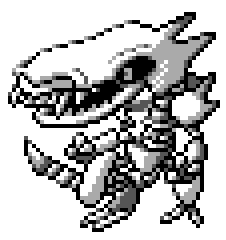
When we reached the end of Era I, I noted there how the last eight Pokemon designs, which I designated “Period 1e”, were an odd, disconnected bunch. Of those eight, seven of them didn’t even make it into Spaceworld ’97, and the one that did was soldered onto two completely unrelated Pokemon to make a new evolutionary family. Period 1e also didn’t fit much with what had come before it: 1d and 1c had obvious signs that they were made mostly by Nishida and Sugimori. Period 1e didn’t really fit well anywhere, its designs were odd and mostly based off of generic animals. All of them looked like rough drafts that didn’t have much work done on them. Period 2d is a counterpart to 1e in pretty much every way. Fitting awkwardly in between Era II and Era III, Period 2d doesn’t really match up with the rest of the designs in Era II, which tended to focus on Pokemon that were needed for balance and to introduce new concepts into the games. Instead, Period 2d is a section where all the designs went unused and all seem to be more or less randomly inspired, rather than created according to a larger plan. Like Period 1e, these designs are Animal+ ones and they show signs of being very rough. I’d say it’s most likely whoever designed Period 1e also designed these and added them into the Index after the main work by the central Pokemon team was done. If I’m right, Era II can be demarked by the fact that the rough draft of the new Generation II lineup was substantially complete by its end. Era II ends at ID 400, which means that the team would have created 101 new 'mons, exactly as much as they'd have needed to get to #252. If this is the case, then Period 2d was an afterthought or an appendage to the designs above it. All seven of these are also very isolated: they don’t look like the stuff around them, and none of their designs reference any of the other Pokemon designs around them. Likely, the person who designed these seven Pokemon was outside the main group of Pokemon designers and was making designs without much input on what the team’s goals for designs were. Like with Period 1e, this designer’s sprites were almost completely unused in Spaceworld ’97, which suggests someone who didn’t have a close connection to the rest of the team or the art direction that Sugimori was giving. Thus, these end up looking a bit random. Given how few 1e and 2d designs were used at all, I wonder how seriously any of these were ever considered by the team. It's possible that ID 400 was part of this group too, as with 397; Twinz and Ledyba could have overwritten two other unused designs in Period 2d, making it look as though 397 belonged to a different set of designs. Conversely, 400 has a strange look that fits in with these seven, and it's just as likely it fits in Period 2d and is does where I placed it, in 2c. I placed it there because I thought it was likely enough to be a Drowzee baby that it fit conceptually with the other baby Pokemon in 2c, but if you don’t buy that argument, it should probably be the first design here. One last thing to note is that there are a lot of theories that 2d Pokemon were redesigned into Pokemon from later Generations. ID 406 could have eventually become Cranidos, some claim, and 407 could have become Cherrim. In fact, 403 or 405 could have been early Yanma, for that matter. While I’ll examine those theories in more detail when we get to those numbers, I will say I’m pretty skeptical that anything in this Period went anywhere all that interesting. Assuming they were made by a minor designer, it’s unlikely that anyone would have paid them enough attention to make a return. ID 401: ??? 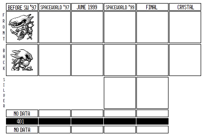 ID 401 comes ready with a smile. He’s a gigantic skeleton monster, with a huge snout and tiny beady eyes in his skull. He’s got huge teeth, spiked shoulders, and a skeletal tail, all ready to face down even the fiercest Pokemon. While 401 never got all that far, out of everything in Period 2d, he’s the one that most intrigues me and has the most interesting hook, in my book. Probably inspired by a lot of the earlier designs from Generation I, ID 401 was probably unused not because it was a bad or “un-pokemon” ish design, but simply because it wasn’t made by the main design team and thus wasn’t designed to fit a particular need. It's likely it just didn’t really have a place in the final product. 401’s main design inspiration is obvious: he’s a spooky skeletal dinosaur. Can’t really get more in depth than that. He is distinctive because he has that long snout, and the good people at TCRF think he looks a little like the Alien from…”Alien,” but I don’t really see it. You might think that he's a dead version of another Pokemon, but unfortunately not: no other Gen I or II Pokemon seems to have a snout like that, so there doesn’t seem to be any clear connection to anything else. On the other hand, it’s possible the team could have designed a living version of 401 if they decided to move forward with this design.
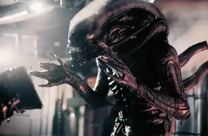
The art style on this guy doesn’t really match anything Nishida, Morimoto, Fujiwara or Sugimori did; it doesn’t have the proportions of a Nishida design, nor the shading and outlines of a Sugimori design, and while it matches the “grotesque”, bizarre aesthetic of a lot of Morimoto designs (like Mankey, or Crocky), it has too much filled in detail to my eyes to fit Morimoto either. We don't have a lot of examples of designs we're sure were done by Fujiwara, but his designs tend to have a flat look to them, which is not the case here. The high detail in the sprite also makes it a bit hard for the eye to interpret, especially on a small Gameboy screen. I suspect if this design was used, someone would have redrafted it to make it simpler and let it jump out more at the viewer. For instance, the detailing on the bone joints on this guy doesn’t work too well and is confusing to the eye: look in particular around the arm and rib joints and how it’s not always clear what’s background and what’s bone. It’s clearly rough and would have gotten further refined. In general, 401's sprite is just very overcomplicated and hard to read, in a way that's not usually seen in finalized designs. The ribs on the backsprite are very difficult to discern; it isn't clear what's connecting the right arm to the body in the backsprite; all of the detailing on each individual bone makes it almost impossible to tell what's white space and what's another bone. While I think Periods 1a, 1b, 1e, and 2d all probably are predominantly the same artist (especially 1e and 2d), the closest design relatives 401 has are 309 and 349. Notice a similar eye on each, and similar feet. The slightly overcomplicated detailing on 349’s fur, as well, bares a similarity with the bones on 401, and make me think the same person worked on them. 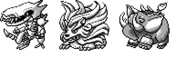 So let's discuss a little about what could have been going on with this guy. When this design was first discovered, the leading theory was that this was just a fossil sprite, like those that exist for Kabutops and Aerodactyl (I wonder why Omanyte never got one? UPDATE: OrangeFrench has reminded me that squids don't have skeletons). This was discarded pretty quickly. Obviously, we don’t have a sprite which would be a living version of this fossil, but beyond that, this guy shows obvious signs of being alive. First, it has those eyes, which wouldn’t appear on a fossil; it also has an active battle pose, and what looks to be gums on the upper part of its mouth. At least, that’s how RacieBeep interpreted that part of this sprite when she made her (well done) art of 401: 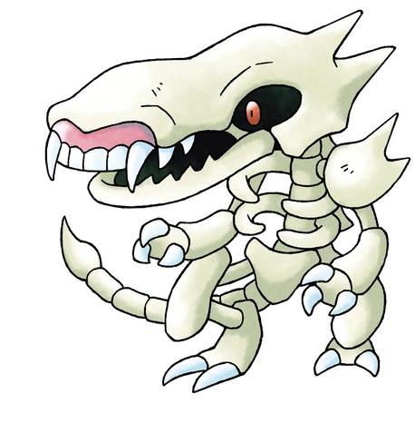 It’s also notable that the skeletons in Generation I were shaded completely differently than 401. That either means that 401 isn’t quite finished, or it’s evidence that 401’s designer (and thus the designer for 1e et al) may have been one of the new designers brought on to the team after Red and Green were finished. 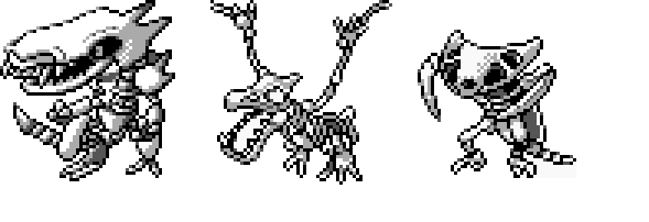 Another unlikely possibility is that 401 was designed as an alternative evolution, or a third evolution, for Cubone and Marowak. You could easily imagine a Ground/Ghost evolution of Cubone in which the bone mask comes alive and envelopes the entire creature, or one in which the Cubone dies and gets animated by the bone mask. It doesn’t fit very well with the lore of Cubone, admittedly. Overall, this isn’t likely at all to me, especially because of the isolated nature of 1d, but it is a theory. 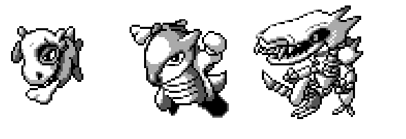 The most interesting similarity to me comes from comparing 401 to the earliest design for Generation I, which were usually inspired by Kaiju from Godzilla or Ultraman. While 401 doesn’t specifically resemble any other Pokemon, it does share a lot of similarities—in terms of its pose, the squareness of its sprite, the fearsomeness, even the “Dinosaur+Gimmick” style of its design—with those early ‘mons, like Nidoking, Kangaskhan, Gyaoon, and Omega. Omega in particular is an interesting comparison. Omega was a robot Kaiju, made of metal but otherwise not really different from the Kaiju design features (t-rex body, large nose, two smaller arms and a powerful tail) that inspired a lot of other early Pokemon. While 401 obviously doesn’t have any inspiration from Omega, the idea is the same: it’s a generic dinosaur Kaiju made of a gimmicky substance, in this case, bones. I don’t think this guy predates Generation II, but I also think he would fit right in with those old Generation I designs had we discovered him in the Blue source code. Futhermore, many of the earliest Generation I Pokemon designs were based on common RPG tropes: Grimer was a slime, Voltorb a mimic, etc. Skeletons are an extremely common RPG enemy, which further makes 401 feel like those early Pokemon designs. Maybe Cubone was the Pokemon team's attempt at a skull enemy, and they just decided they didn't need another one? 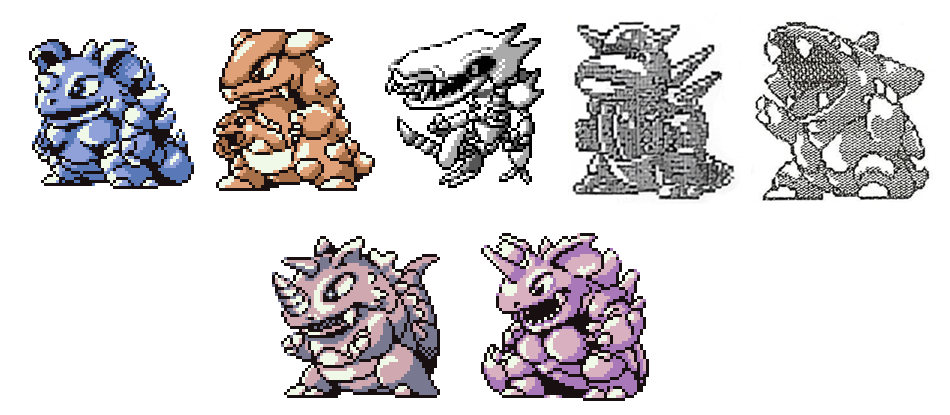 Whatever inspired this guy’s design has been, of course, lost to history, and unfortunately we’ll never know if he was just an angry bone dinosaur, or if there was more here than meets the eye. UPDATE: Two readers on twitter have informed me of their own theories on the existence of 401. Their theories are honestly better than anything I had, so I think it's worthwhile to consider these ideas as well. First, @KeithGeek indicates that my observation above about 401's relationship to other Kaiju-like Pokemon might have more significance than I originally realized. @KeithGeek pointed out to me that there was a kaiju in Ultraman (the show that heavily inspired Tajiri and Sugimori when they were making Generation I) that looks an awful lot like 401. Here's Seabozu: 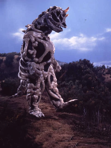 Obviously it's not an exact match, but we really aren't looking for an exact match here; Seabozu could have just been an inspiration. Apparently, Seabozu features in a pretty well known episode, as an undead Kaiju trying to find its rest in a kaiju graveyard. It makes perfect sense to me that 401 might have been based on this episode, as a intentional throwback to the kaiju designs of Pokemon Red and Green. Who knows, maybe it was thrown into Period 2d because Tajiri and/or Sugimori liked the idea of another Ultraman homage, but the team just didn't have enough room to include it in the end. Our second theory comes from @FreeeknU, who reminded me of the original premise for one of the Pokemon movies written by Takeshi Shudo (the sources I have say it was supposed to be the third movie, after the one featuring Lugia, but I've always heard this was the initial plot for that movie before Lugia was created; not to mention Shudo mentioned that he came up with the idea while Gold and Silver were still delayed). In Shudo's original idea for this movie, he imagined that a dinosaur fossil was discovered in the Pokemon world. That fossil would then come to life, and then cause mayhem as it left destruction in its wake. It's a very out-there premise, and I'm sure it was rejected because it added real world creatures (dinosaurs) into the Pokemon universe. Still, Shudo himself was excited about the concept. We know that the design team eventually added Lugia into Gold and Silver after Shudo had come up with the idea of Lugia. Could 401 have been an attempt to add a version of his original Pokemon movie idea? Maybe in one version of his draft, the discovered fossil was more akin to 401: a skeletal kaiju Pokemon that Ash and his friends would have to defeat. I don't think this theory is entirely likely, but it is interesting, and if the dinosaur-plot was originally created for the second movie, the timeline would fit (401 was probably created very late 1996 or early 1997). I don't quite know what to make of it, but I think its a cool theory to consider. ID 402: ???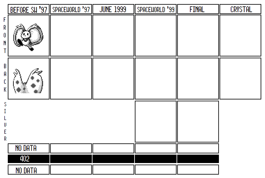 402 is a cute rabbit, skipping through the grass. Or it’s a land oyster, jealously protecting its pearl. Or it’s a relative of Dragonair (and Aqua, for that matter): after all, it seems to share the same pearl around its neck that they have. Or maybe it’s all three? Who knows? 402 stands out in Period 2d for a couple of reasons. First, it’s the only “cute” design; 406 and 407 have some cute elements, but the rest of this section of the Index are clearly much either fierce or just weird looking. 402’s sprite is also substantially higher quality than the rest of the sprites in this section; its shading is much more thorough, it uses multiple types of spritework on different sections of the sprite. Notice how the feet are blurry at the outline, while the rest is clear? Or how it has an outline that uses multiple colors rather than just all black? Thirdly, 402 does have some similarities to Pokemon designs earlier on the list: like I said, its “pearl” around its neck looks quite a bit like Aqua’s, and its face looks suspiciously like the unfinished Puffball Pokemon in slot 305, though in both cases, its eyes and its pearl are different enough from those Pokemon that it’s clear 402 wasn’t made by the same designer. 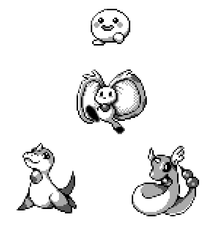 Of all the designs in Period 2d, 402 is the most likely to have been seriously worked on; it's possible it was even in a slightly earlier build of Gold and Silver before Spaceworld ’97. The work put into the sprite makes it clear that this wasn’t a first draft like the rest of 2d. On top of that, some of the unique features of the sprite. Most prominently, notice how the outline of 402 uses multiple shades of gray and not just black; compare that to most other sprites, like Aqua, above. This sort of outline is uncommon, and usually shows a sprite designer with a lot of experience. 402 also looks more like a Pokemon design they could have used than its surrounding neighbors: once you add color to the sprite, it fits in pretty well with Spaceworld ’97 Pokemon like Sneasel and Marill.  So...what is 402? It looks most like a rabbit, but its strange ears suggest something more is going on in this design. Recently, many people have noticed the similarity between 402 and Elfilin from the newest Kirby game, Kirby and the Forgotten Land. They both have the same large ears, and a similar pose. Maybe 402 was a design sent back in time from 2022 to the developers, and they incorporated it into the Korean Index?
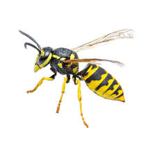
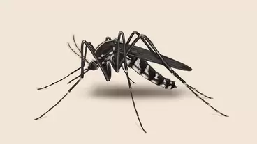
(402 was transformed into an Elfilin sprite by OrangeFrench) But more seriously, there are a couple possibilities that could have inspired 402. Upon first impression, 402 seems like a rabbit. It has large ears, its pose makes it look like it's running or hopping, which brings to mind a a small mammal, and its face resembles a rabbit’s, right down to the black nose in the center. …Unless that nose is actually a small mouth, which it absolutely could be. On the other hand, lots of people have noticed that 402’s large ears might in fact not be fluffy appendages but instead hard clam shells; this is more apparent if you look at the back sprite, which gives makes the ears look more like they are meant to clamp together. If this is the case, then the pearl necklace our little rabbit has around its neck might itself be a pearl, like clams have, that it is trying to protect; when under attack, maybe this guy shuts its ears closed to defend itself. I guess what I’m trying to say is that it’s possible this guy is a close relative of Cloyster. Also possible is that 402 is at least partially inspired by a Venus fly trap. Instead of protecting itself with the clam shell, maybe 402 has a cute and unassuming face in order to trick predators to get closer, where it would then SNAP its ears together and eat its enemy! The team already had those sorts of creatures in mind when designing Gold and Silver: Gurotesu was designed after an angler fish that is known for tricking prey in this exact same way, and the final version of Wobbuffet—which has a fake body and a small black head on its tail that it protects—both function similarly to a Venus fly trap. The spots on the back of the ears give some credence to this idea: other plant based Pokemon, like Bulbasaur or the unused Tsubimotto are often depicted with spots akin to these. The main problem with this theory is that 402 doesn’t have obvious teeth on the ends of its ears. It does have spines at the top of the ears (which could just be fluffy hair if this guy was supposed to purely be a rabbit), but not much more than that. If Venus Fly Trap was an inspiration for 402, subsequent drafts probably moved it away from this initial design idea. Any of these guesses have implications for the other features of this guy. If the design intention to make a pure rabbit Pokemon with large, goofy ears, then 402 was probably a simple Normal-type Pokemon meant to populate some of the early areas of the game. Like the Koala and Tanuki Pokemon discussed earlier, 402 was likely made because the team wanted some more Pokemon that could fit into forest-like landscapes and be relatively easy to catch. Its movelist, in this case, would be anyone’s guess: probably simple moves like Body Slam, Agility and maybe Double team which would reflect its quick nature, as well as High Kick to reflect the powerful legs of a bunny. It would probably also have a brown palette. If it were based on a clam, however, than maybe this guy would have been a water-type Pokemon, and probably have had a blue palette to reflect the typing. In that case, you could imagine that it would have had a similar moveset to Shellder: probably moves like Water Gun and Clamp. It would probably also have Protect in this case: Protect seems to have been given to a lot of Water Pokemon in Spaceworld ’97, and would make perfect sense for a Pokemon which could hide itself in its clamshell when in danger. Finally, if it really was a Venus Fly Trap Bunny, 402 probably had Bite as a move, along with some of the standard Grass-type moves, like Razor Leaf or SleepPowder. It would probably have had a green palette in that case.  (Colorizations by OrangeFrench) It’s anyone’s guess why 402 didn’t show up even in Spaceworld ’97. Like I’ve mentioned, this guy seems to have had more work put into its sprite than the surrounding mons, so it sure does feel like it was under consideration. But I have my hunches. If 402 was meant to be a water or a grass Pokemon, I can see it being scrapped just because its design doesn’t really convey those concepts very well: if it was meant to close its clamshell, there’s not really a way to express that concept in a static sprite like Pokemon have. Certainly, the sprite 402 has barely broadcasts the idea of clamshell; you'd need an animated sprite, like the team used in Crystal, to convey this idea. In addition, the games already have Cloyster, and it isn’t clear they would need another clam Pokemon, especially with how many water Pokemon are already in the Korean Index. On the other hand, if 402 was just a generic bunny, then it was probably not chosen for the same reason that most of the more basic, Animal+ designs in the Korean Index were dropped. They just weren’t distinctive enough to drape an entire Pokemon concept over. Just in the last couple entries, we’ve seen a ton of Animal+ designs that never made it into SW’97: IDs 380, 386, 387, 392 and 397 all never made it past the Index, and so there’s a case to be made that the team, at this point, were very uninterested in this style of design. As it is, I don’t see that ID 402 has enough of a hook to get a player to know what its “deal” is simply from viewing the sprite: if it couldn’t really explain its concept to a player, it’s a prime candidate to get cut. Saying that, my gut instincts are that 402 was close, and if we had any builds just a little bit earlier in time, we’d have seen more of what this guy was like. There’s something special and interesting about 402’s concept, enough that the team clearly tried to make it work. From our view trying to reconstruct it, however, that unique hook just isn’t quite clear. ID 403: ???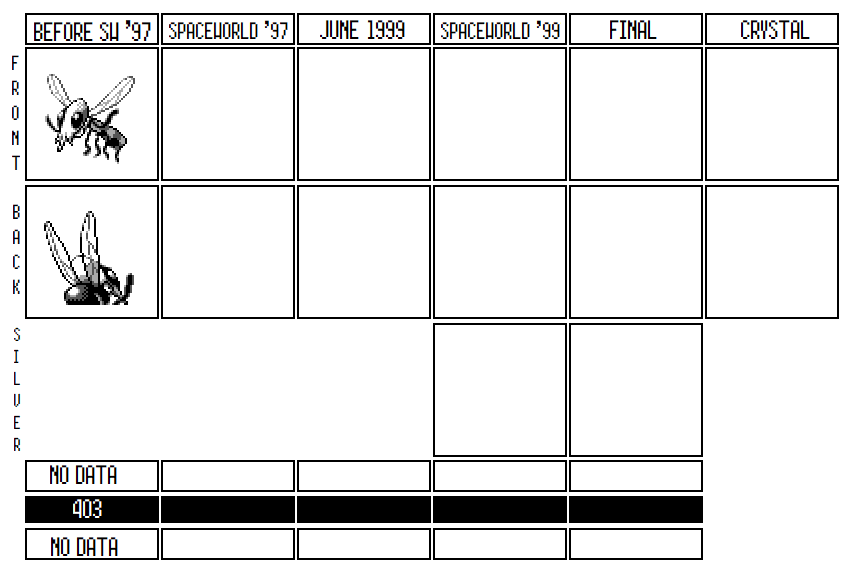 403 is a bug. It’s a weird looking bug, with a face that doesn’t really resemble any other Pokemon up to this point. Oddly, 403 is also in a humanlike pose; it uses its front two legs to make a shrugging gesture. One of the more sketchy looking sprites in the entire Index, the only thing I’m confident about in this case is the 403 was never really in consideration for inclusion in Gold and Silver. Everything’s a bit off about this guy’s sprite. No other bug Pokemon has thin black little lines as arms; even Beedrill’s legs have more definition to them than these indistinct pipe cleaners. 403’s strange ganglia from its mouth are not something we’ve seen on any Pokemon sprites before this, and the unshaded stripes on its abdomen look very unfinished compared to how other Pokemon are drawn. Its eyes and wings are drawn quite similarly to the sprite that beedrill has in Spaceworld 97, making we wonder if the same artist made that Beedrill sprite: 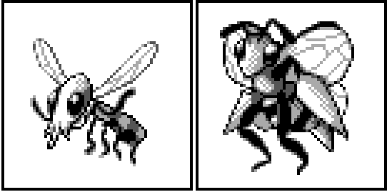 If these really were made by the same artist, then it's possible 403 was made by someone hired to work on new sprites for already existing Pokemon. We have some evidence that the newer designers were first tasked with doing alternate sprites for Pokemon Blue or Yellow; maybe this was a way of giving them experience drawing Pokemon's style? It could easily be the case that whoever designed the Pokemon of Period 2d was hired on as a minor sprite artist. That would explain why Periods 2d and 1e feel so out of place compared to the sections around them: this new designer may have made their own designs in their free time, independent of the main team that was creating new design. Cutting Room Floor speculates that 403 might have been based on prehistoric gigantic bugs. It’s possible, but I don’t think we need to posit a connection between 403 and ancient bugs, given that Pokemon like Beedrill clearly show that giant bugs are already a normal phenomenon in the Pokemon universe. Instead, this guy looks to me like he was equally inspired by wasps and by mosquitoes. 403 has some pretty obvious stripes on its back abdomen, as I mentioned, which look very similar to the markings on the back of a yellowjacket, the most common bee where I grew up. They look a little like the stripes on Beedrill, but as I noted, Beedrill's are properly shaded, while 403’s stripes look pretty basic and are one solid color. In addition, the eyes of 403 are very clearly wasp eyes, as can be seen by comparing them to Beedrill's. While obviously wasps don’t have a penchant to make human-like gestures with their arms, everything else about this guy looks like a wasp to me.
However, there’s also an argument that 403 is instead a mosquito. The stripes could just be segmented parts of the abdomen, like mosquitos have if you view them carefully. The eyes could also just as easily be the compound eyes of a mosquito, though obviously those are less prominent than on a wasp. But wasps don't have probosci nearly as prominent as 403 does, while mosquitoes do. In addition, given that Pokemon already has a wasp-inspired Pokemon, basing 403 on a mosquito would be a way to find a new real-world animal to draw inspiration from. We already saw in Period 2b and 2c how the team was trying to create more bug Pokemon for the first draft of the roster, and so 403 could also have been an attempt by a green designer to throw their hat in the ring. Less likely—but still possible—is that 403 is a very early concept for the Pokemon that eventually became Yanma. If TCRF was right about 403 being based on a prehistoric insect, then Game Freak might have originally designed it to reflect an ancient type of fly, before moving in the direction of the dragonfly, which is much more iconic as an ancient ancestor to modern bugs. Meganeura, a giant sized ancient version of the Dragonfly, are very often seen in films and television about dinosaurs because they first evolved during the Jurassic era. If this really is the precursor of Yanma—and to be clear, I doubt it, given that Period 2d seems to have been discarded before even Spaceworld ’97—then it’s a pretty distant cousin of Yanma, given all the changes it needed to go through to get there.  Most Bug-type Pokemon evolve at least once, and it appears that 403 was no different. Just two entries after 403, ID 405 looks exactly like the sort of thing that would evolve into 403. Or, at the very least, the two could be related, such as counterpart Pokemon. It’s likely the designer of Period 2d designed these two close together because they were connected. I’ll compare their sprites in much more detail once we get to 405, but suffice to say there are enough differences in the sprites to doubt a strict evolutionary relationship. 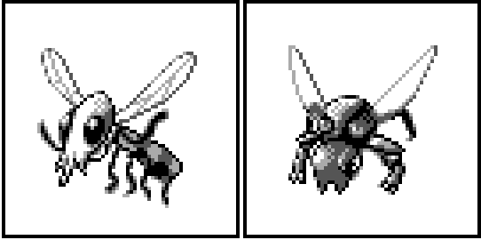 Other than what I’ve already discussed, there’s not much to say about 403. It’s unlikely he ever got a moveset, or much lore behind him. 403 is about as close to a basic Animal+ design as you get, and its no surprise that the team didn’t go any further with this design. ID 404: ??? In ID #404, we find yet another strange design that we don’t have a lot of information about. Unlike the three entries above it, there are at least two theories as to what’s going on with 404. Both theories have holes in them, but at least they give us more to think about than we had looking at, say, 403 the mystery bug. So let’s shoot into these theories. Most simply, 404 is a Cyclops-plant of some sort. It’s got a critical expression on its face, though of course since its face is just an eye, that’s open to interpretation. It also has three leaves around its body, and roots that function like feet. It’s unclear what its head actually consists of: it could be a generic flower head, flat with an eye in the middle, or it could be more spherical, and resemble something like a spiky globe. The first would make it just a flower, while the latter might indicate it has a flower bud for a head, ready to sprout, or something even stranger, like a exploding mine for a head. 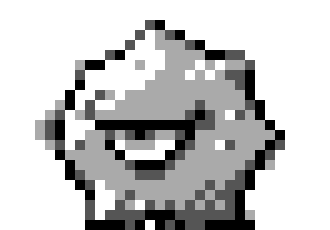 Or, looking at it in more detail, is that really an eye, or is it sticking out its tongue at us? You be the judge. The spritework on 404 is pretty good, at least better than 403; the eye is detailed, the body and feet are distinct, and there is shading throughout. Saying that, 404's backsprite feels oddly unfinished. While the front seems to triangular spikes all over the sides of the head, on the back these spikes aren’t nearly as apparent. Where the spikes were supposed to be (at least by comparing the front sprite) instead we just have a blurry outline. Maybe the intent was to give the sprite more depth, and suggest the spikes were facing towards the camera? The effect, however, is that the head looks far more smooth and circular on the back than on the front. It seems like this was something that might have been worked out in later drafts, if they had ever been serious about this design. And what are those three dots on the back of the head? It's unclear to me what exactly this guy's head is supposed to look like.  The first theory about 404 is that it was intended as a pre-evolution of Sunflora. Putting their sprites next to each other, you can easily imagine that they could go together: 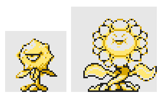 (404 colorized to match Sunflora's SW'97 palette by OrangeFrench) In Sunflora’s final sprite, it has legs, but in this earlier version, it has roots for feet which look very similar to the roots found at the base of 404. In addition, their bodies are similar, and they've got about the same size of head as each other, as long as you don’t count Sunflora’s petals. In this imagining, 404 is the bud of a flower, and Sunflora is what happens after 404 blossoms. In this reading, 404 might be viewed as a prototype of Sunkern, Sunflora’s pre-evolution in the final. We’ll get to Sunkern eventually, but one notable thing about Sunkern’s development is that the team went back and forth on including it at all. In the post- SW’97 builds we have, the design team had already created Sunkern by April 1999, but then deleted him by July 1999, only to bring him back—with a completely unfinished sprite—in August of 1999. First, this indicates that the team changed their minds about giving Sunflora a pre-evolution later in the development of Gen II, which could suggest that maybe they were also ambivalent about giving it a first form before Spaceworld ’97 as well. This would be a good explanation of why we don’t see 404 in Spaceworld ’97. Secondly, when Sunkern was put back into the game, it had a placeholder sprite in place, implying that its final design wasn’t made until just before release. While the sprites we have from June show it without any sprite at all, this could be because the team was in the process of deleting Sunkern, and it's possible it had an earlier design before June which got scrubbed. It’s at least feasible that this was that design. 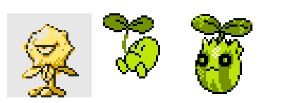 There’s one key problem with this theory: Sunflora appears after 404 in the Korean Index (ID #417), which suggests that Sunflora was created after 404. That just doesn’t seem likely, given the design concepts behind the two. Sunflora’s got a very simple design gimmick: it’s a (sun)flower; 404, on the other hand, is a much weirder concept, and only really makes sense if the designer already knew that it was going to sprout into a flower. I mean, look at it: without already knowing that Sunflora exists, would you ever guess that 404 was a flower bud waiting to bloom? I don’t think there’s any chance 404 was created first and that Sunflora was created as an extension of the same idea. It is possible that 404 is out of order in the Korean Index and it overwrote something else—and I did note how, unlike the surrounding ‘mons, 404 looks as though it could have been a Sugimori design, which Sunflora is as well—but we don’t really have any evidence for this, and that’s complete speculation. I’d say it’s still possible 404 was designed as Sunflora’s first stage, but unlikely. On top of that, something about the two sprites just doesn’t match up to me. Despite both 404 and Sunflora having a dual color outline on their sprite, possibly indicating Sugimori’s handiwork, everything else indicates they were drawn in different styles. Sunflora’s eyes are happy anime eyes, while 404’s singular eye has a pupil and is drawn far more realistically. Sunflora’s roots, while they are shaped similarly to 404’s, are shaded completely differently, and look white in parts, while 404’s are darker. Finally—though we shouldn’t make too much of it—404 has three leaves on its body, while Sunflora only has two. I don’t know how much to make out of these sprite differences, but they’re just enough that I’m uncomfortable with saying that these two are related for sure. The second possibility is that 404 wasn’t related to Sunflora, but was instead meant to be a pre-evolution for Hanamogura, the strange plant-like Pokemon that took the place of Bayleef in Spaceworld ’97. If you compare the sprites, you can see similarities here as well. Unlike Sunflora, 404 and Hanamogura’s root-feet look very similar and have almost exactly the same coloring on them. 404’s strange, bulbous head also looks more suited to opening up like the petals that Hanamogura has. Of course, this isn’t perfect; the eyes are still not a match, and Hanamogura has spots on its petals that are absent from 404’s face. But maybe these parts of the design would have been revised had the team worked on it more, so who knows. 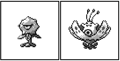 In this scenario, there are two possibilities. First, 404 might have been created while Hanamogura was just a single stage Pokemon, unattached to Meganium. That would probably mean that Hanamogura was never meant to have anything to do with the Meganium family and thus was thrown into Spaceworld ’97 at the last minute as a placeholder sprite for a second stage Meganium that did not yet exist.
Conversely, if it had already been decided that Hanamogura was too different from Meganium to remain the Grass starter, then this might have been an experiment to divide Hanamogura off of the Meganium family and give it a new first stage. If the latter’s the case, the experiment was unsuccessful, because as of Spaceworld ’97, Hanamogura was still connected to Meganium and Chikorita. If I had to bet on what I thought was most likely, I’d personally say 404 was not related to either Sunflora or Hanamogura. In my opinion, it’s far more likely that 404 was just a strange idea, designed on its own, and then dropped for better designs. However, that’s not to say the above theories are implausible, and I would be unsurprised if either of them turned out to be correct. Of course, we’ll never know for sure. Until then, we can wonder whether we really do have a proto-Sunkern on our hands.
7 Comments
|
AuthorArchivesCategories |
 RSS Feed
